


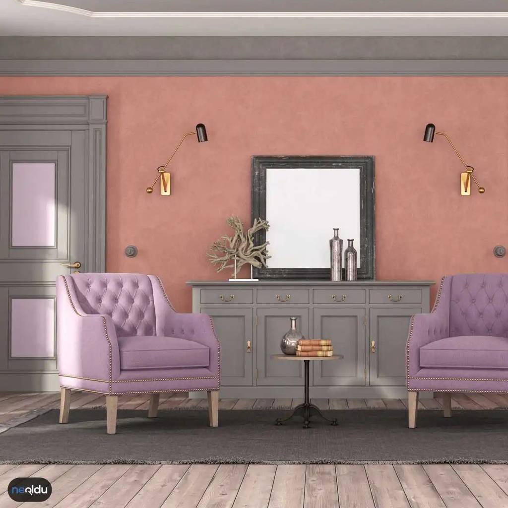
Purple isn’t just a color. It’s a statement. When you bring it into your home, you aren’t just painting a wall. You are setting a tone. A moody, mystical one. But getting it right means more than slapping on some lavender paint and calling it a day. You need to understand how this bold hue interacts with light, space, and the other colors around it.
The key to using purple in home decor lies in balance. Done poorly, it can feel overwhelming or dated. Done well? It creates a sanctuary. Think deep eggplant in a reading nook. Think soft lilac in a bathroom that feels like a spa. The effect depends entirely on the shade you choose and how you pair it.
Choosing the Right Shade of Purple
Not all purples are created equal. The intensity of the pigment changes the entire vibe of a room. Before you buy a single can of paint or throw pillow, you need to decide on the energy you want.
Deep, Dark Purples
Plum, aubergine, and midnight blue-purple shades work best in rooms where you want to create intimacy. A dining room painted in a deep plum can make meals feel more formal and cozy. A bedroom with these tones encourages sleep and relaxation. These dark shades absorb light, so they work best in rooms with good natural light or where you plan to use layered artificial lighting.
Medium Tones
Lavender and wisteria are safer bets for most homeowners. They add character without demanding too much attention. These shades work well in hallways, guest rooms, or any space where you want a touch of whimsy without the drama.
Light, Airy Purples
Pale violet or lilac can make small rooms feel larger and more open. They reflect light better than darker shades. If you are worried about making a space feel closed off, start here.
Pairing Purple with Complementary Colors
Purple stands alone, but it rarely shines alone. The magic happens in the combination. You need to pair your primary purple with colors that either complement it or provide a neutral grounding.
Neutral Backdrops
Gray, white, and beige are your best friends when working with purple. A white wall with purple trim creates a crisp, classic look. A gray accent wall behind a purple sofa grounds the boldness of the couch. Neutrals allow the purple to be the star without competing for attention.
Metallic Accents
Gold and brass add warmth and luxury to cooler purple tones. Copper and rose gold bring out the red undertones in deeper purples. Think about your hardware. Purple cabinets with gold handles? Instant upgrade. Silver fixtures tend to clash with warm purples, so stick to brass or copper if you are going for a richer look.
Nature-Inspired Greens
Green is opposite purple on the color wheel. This makes them complementary colors. A sage green accent chair in a lavender room feels fresh and organic. A deep forest green rug under a light purple sofa adds depth. This combination works because it mimics nature—violets and leaves often grow together.
Bold Contrasts
Yellow and orange create high-energy contrast. Use this sparingly. A single mustard-yellow pillow on a purple couch adds a pop of energy. Too much yellow, and
Finding the Right Shade of Purple for Your Walls
Let’s be honest: purple is high-stakes. Get it wrong, and your living room looks like a bruised peach. Get it right, and you’ve got a space that screams sophistication without trying too hard. The key isn’t just picking “purple.” It’s picking the right purple for the volume of the room.
Dark, saturated purples—think eggplant or deep plum—dramatic, yes. But they also shrink walls. If you’re dealing with a small bedroom or a narrow hallway, go easy on the intensity. Pale lavender or lilac bounces light around, making tight spaces feel breathable. And if you’re worried about going full-on royal? Pair it with white or crisp neutrals. It creates a buffer. A visual breath.
Furniture as Focal Points
You don’t need to upholster your entire sofa in purple. That’s a commitment. Instead, treat purple furniture as an accent piece. A velvet armchair in aubergine? Instant luxury. A dining chair in lavender? A subtle nod to trend without overwhelming the palette.
The trick is contrast. If your table and shelves are wood or neutral-toned, a purple chair pops. It becomes the conversation starter. Don’t be afraid to mix tones. A dusty rose chair next to a deep violet sofa can work if the textures align. Velvet next to linen. Smooth next to woven.
Accessories: The Low-Risk, High-Reward Move
If you’re hesitant about committing to paint or big furniture, start with accessories. This is where you can experiment. Throw pillows. Curtains. Vases. Picture frames.
These items are movable. If you hate how the plum-colored drapes look with the gray rug, you can swap them out in five minutes. Layer different patterns here. A solid purple cushion against a striped curtain adds depth. A glossy purple vase on a matte shelf creates texture play. It’s about adding color without changing the architecture.
Lighting: Setting the Mood
Lighting changes everything. Literally. A warm white bulb makes purple look softer. A cool LED makes it look clinical, almost electric.
Consider lamps with amber or purple-tinted glass. Or simply a purple fabric shade. It casts a shadow that’s warmer, more intimate. It’s not just about illumination; it’s about atmosphere. Dim the lights. Turn on a purple-hued lamp. Suddenly, the room feels like a lounge. Mysterious. Cozy.
How to Match Colors with Purple in Interior Design
So, you’ve chosen purple. Now what? The biggest mistake people make is treating purple as a solo act. It doesn’t work alone. It needs partners.
The Safe Bets: Neutrals and Earth Tones
Gray is the safest companion. Charcoal gray makes deep purple feel grounded. Light gray makes lavender feel airy. Beige and cream warm it up. If purple feels too cool, bring in wood tones. Oak, walnut, ash—these natural elements bridge the gap between the boldness of the color and the calm of the space.
The Bold Choices: Complementary Colors
Yellow is purple’s opposite on the color wheel. That means they’re complements. High contrast. High energy. Use this sparingly. A small yellow cushion on a purple sofa? Magic. A yellow wall next
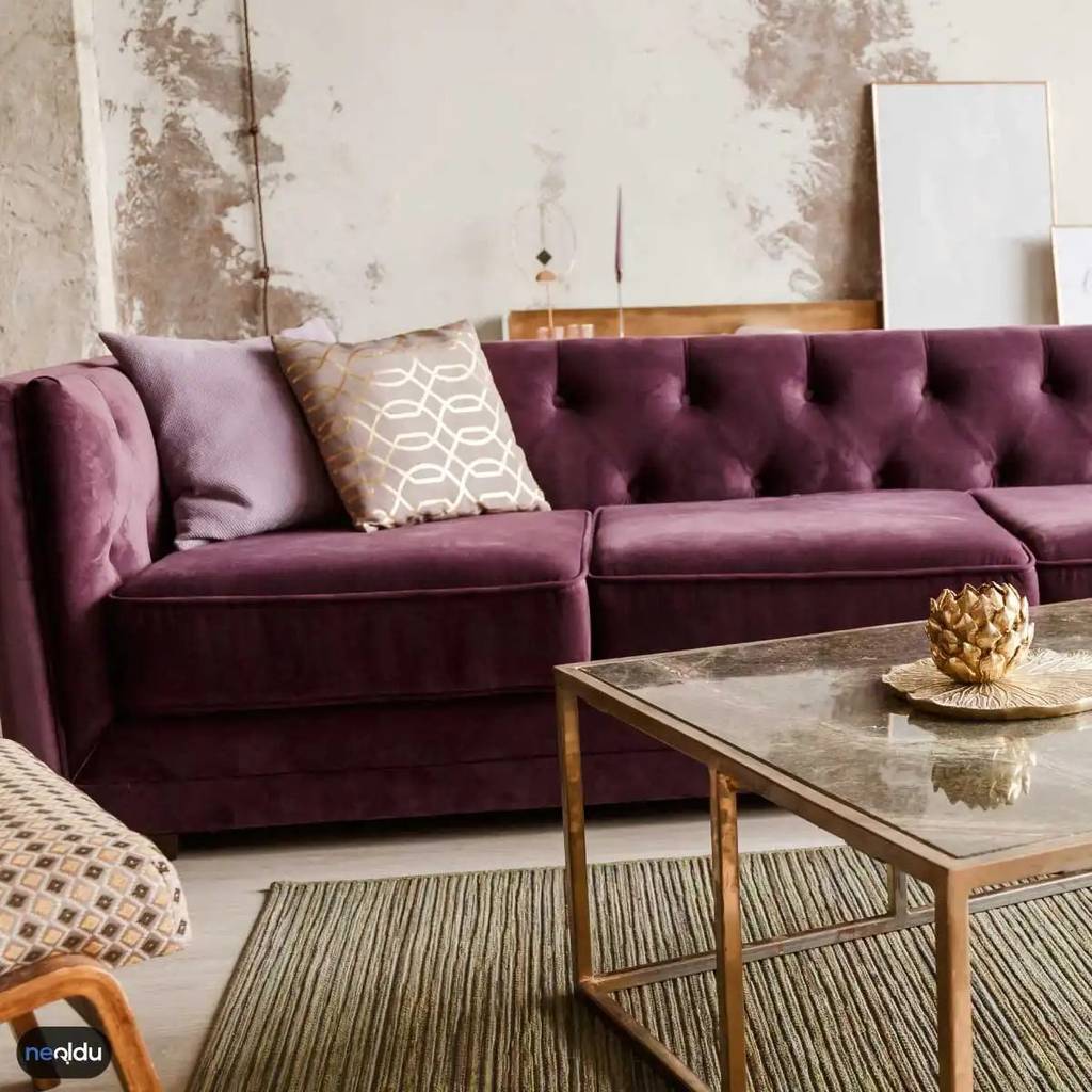

Mor koltuklar odanın kalbi olabilir ama yanındaki duvarlarla başa çıkmak bazen zorlayıcıdır. Renk psikolojisi derinleştiğinde, seçim yapmak yerine strateji geliştirmeniz gerekir. Doğru paleti bulmak, sadece estetik değil, aynı zamanda mekandaki hissiyatı da kontrol altına alır.
Temel Renk Paletini Belirlemek
İşin başında ana rengi netleştirmek şart. Mor gibi baskın bir tonla çalışırken, geri kalan paletinizi nötrlerle dengelemelisiniz. Beyaz, gri veya bej gibi tonlar morun enerjisini kırılmaz, onu çerçeveleyerek daha olgun bir hava katar. Bu kombinasyon, odaya hem modern hem de sakin bir hava verir. Eğer morun tonunu açık tuttuysanız, daha koyu gri aksanlar derinlik katabilir. Tersini yaparsanız, koyu morun altındaki açık gri detaylar mekanın nefes almasını sağlar. Dengeli bir görünüm için ana renkleri seçerken odaya giren doğal ışığı da hesaba katmalısınız. Kuzey cephe ise moru daha solgun gösterebilir, bu durumda sıcak nötrler tercih edilmeli.
Renk Tezgahı ile Uyumu Sağlamak
Renk tezgahı sadece teori değil, pratik bir haritadır. Morun tamamlayıcı rengi olan sarı veya yeşil tonları, odaya canlılık ve enerji katar. Ancak bunları duvar boyası olarak kullanmak risklidir. Bunun yerine, sarı bir yastık veya yeşil bir saksı bitkisiyle tamamlayıcı etkisi yaratabilirsiniz. Analog renkler ise daha güvenli bir liman. Morun yanında duran maviler veya pembe tonları, yumuşak bir geçiş sağlar. Bu uyum, göz yormayan bir akış yaratır. Tezgahınızı oluştururken, her rengin oranını düşünün. %60 ana renk, %30 ikincil renk ve %10 aksan kuralını uygulayın. Bu oran, görsel kaosun önüne geçer.
Odalar Arası Geçişleri Yumuşatmak
Evinizi renklerle haritalandırırken, odalar arasındaki geçişleri ihmal etmeyin. Mor koltuklu oturma odasından mutfak veya koridora geçerken ani renk değişimleri baş ağrıtıcı olabilir. Bunu önlemek için ortak bir dil kullanın. Örneğin, tüm evde aynı beyaz tonundaki kapılar veya mobilya ayakları, görsel bütünlük sağlar. Koridorlarda nötr geçiş renkleri tercih etmek, odalardan odaya geçerken zihninizi dinlendirir. Aksesuarlarda ise aynı renk ailesinden parçalar kullanarak bağlantı kurabilirsiniz. Bu bağlantı, evin bir bütün olduğunu hissettirir.
Desen ve Doku ile Derinlik Katmak
Düz renkler bazen düz kalabilir. Mor bir duvar veya koltukla oynarken desen ve dokuyu ihmal etmeyin. Kumaşlarda geometrik desenler veya dokulu halılar, odaya derinlik katar. Desen seçerken ana renklerle uyumlu tonlar kullanın. Örneğin, mor koltuklu bir odaya, gri ve beyaz tonlarında desenli bir halı yerleştirebilirsiniz. Doku zenginliği, mekana lüks ve konfor katarken, renk uyumunu da destekler. Saten, kadife veya keten gibi farklı kumaş türlerini bir araya getirmek, görsel ilgi noktası yaratabilir. Unutmayın, aynı renklerde bile farklı dokular, kontrast yaratır.
Renk Dengelemesi ve Mevsim Faktörü
Oda boyutu da seçimlerinizi etkiler. Küçük bir odada yoğun mor tonları baskın gelebilir. Bu durumda açık mor veya lavanta gibi pastel tonlara yönelmek, mekanı daha geniş gösterir. Büyük odalarda ise koyu morlar rahatlıkla kullanılabilir. Dengeyi korumak için morun yoğunluğunu nötr mobilyalarla hafifletin. Mobilyaların rengi
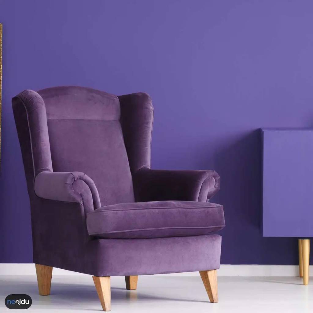
Mor bir koltuk almayı planlıyorsanız, duvar rengini doğru seçmek işi bitirir. Ya da bozar. Yanlış ton, o pahalı mobilyanın etkisini hemen yok edebilir. Doğru seçimle ise oda anında bir galeri gibi parlar. Odak noktası koltuk olmalı. Duvarlar arka plan. Sessizce desteklemeli.
Neden Nötr Tonlar En Güvenli Seçimdir?
Beyaz, gri, bej. Bunlar koltuğunuzun yıldızı olmasına izin veren renkler. Mor oldukça güçlü bir ton. Bazen agresif bile olabilir. Nötr duvarlar bu gücü dengeleyerek koltuğun ön plana çıkmasını sağlar. Sadece renk olarak değil, atmosfer olarak da sakinleştirici etki yaratır.
Odanız küçükse bu strateji daha da kritik. Açık gri veya kırık beyaz duvarlar alanı görsel olarak genişletir. Dar ve karanlık bir köşede mor koltuk kullanıyorsanız, duvar rengi mutlaka açık ve yumuşak olmalı. Koyu bir duvar, koltuğu yutar. Beyaz duvar, onu aydınlatır.
“Nötr tonlar, morun doğal parlaklığını bozmadan oda bütünlüğünü korur.”
Pastel Tonlarla Yumuşak Bir Atmosfer Yaratın
Daha az dramatik, daha fazla huzur arıyorsanız pastel seçeneklere yönelin. Lavanta, açık pembe veya soluk mavi… Bu renkler, mor koltukla uyum içinde çalışır. Koltuğun canlılığını korurken odada hafif, sakin bir hava yaratır.
Bu kombinasyon özellikle yatak odaları veya oturma alanları için idealdir. Göz yormayan bir uyum kurarsınız. Mor koltuk, pasteller arasında bir vurgu noktası gibi durur. Fazlasıyla abartılı olmadan, renk cümbüşü yaratır. Ancak dikkat: Morla pastel pembiyi çok yakından komşu yaparsanız oda rengarenk bir tatil köyüne dönüşebilir. Ton farkını açık tutun.
Tonlamalı Renkler: Monokromatik Uyum Arıyorsanız
Mor koltuğunuz koyu bir menekşe tonundaysa, duvarlarda soluk bir lavanta kullanabilirsiniz. Tam tersi de geçerli. Açık mor koltuk varsa, duvarlarda daha derin, zengin bir mor tonu tercih edebilirsiniz. Bu monokromatik yaklaşım, odada derinlik katar.
Renk paletinde tek bir rengin farklı doygunluk seviyelerini kullanmak, modern ve sofistike bir hava yaratır. Ancak aynı aileden olsalar bile tonlar arasında net bir ayrım olmalı. Yoksa oda bulanık görünür. Koltuk ile duvar arasında en az iki ton farkı bırakmak, görsel hiyerarşiyi korur.
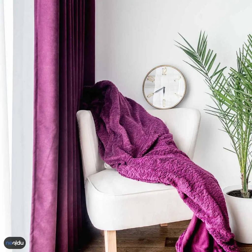
Gray and White: The Neutral Anchors
Purple is intense. It demands attention. You can’t just slap it on a wall and hope for the best. You need counterweights. That’s where gray and white come in.
Gray isn’t just a backdrop. It’s a dampener for purple’s high voltage. Dark purple meets charcoal gray, and you get contrast. Sharp. Modern. The purple pops because the gray holds it back. But go lighter. Pale gray walls with a plum sofa? That’s airy. It feels expensive, not heavy.
White is the ultimate reset button. It strips away the visual noise. A bright white wall makes a violet accent chair look electric. Clean lines. Sophisticated. If you’re worried about a room feeling too small or too dark, white floors, white trim, and white ceilings will stretch the space. The purple stays the focal point, but the room breathes.
Green and Yellow: Nature’s Contrast
Want energy? Mix purple with green. It sounds chaotic until you try it. Think of a deep eggplant wall with a single, lush fiddle leaf fig in the corner. The natural greens ground the artificial depth of the paint. It’s not clashing; it’s complementary. You can pull this off with plants, rugs, or even abstract art. It feels organic.
Yellow is riskier. But when done right, it’s sunshine. A mustard yellow throw pillow against a lavender wall? Soft. Romantic. A bright lemon yellow cushion against a deep plum armchair? Electric. Bold. Use yellow sparingly. It’s an accent, not the star. Too much yellow and the purple gets lost in the noise. Too little, and the purple feels gloomy. Find that balance.
Styling the Purple Wall
Purple walls aren’t one-size-fits-all. They adapt.
- Modern/Minimalist: Stick to clean lines. Let the purple be the only color. White furniture. Concrete floors.
- Boho/Vintage: Here, purple works with textures. Velvet drapes. Macrame. Earthy woods. The purple becomes part of a layered, eclectic story.
The key is context. Don’t let the wall shout. Let it whisper.
Balancing the Furniture
Got a purple sofa? Don’t paint the walls purple too. That’s a trap. Keep the walls neutral. Beige. Light gray. Soft white. The furniture becomes the statement. If the walls are already purple, tone down the furniture. Black leather. Oak wood. Silver metals. Let the accessories carry the weight.
Curtains and Lighting
Curtains should frame the purple, not compete with it. Sheer whites or light grays let the light in. They soften the edges of the room. Heavy, dark purple curtains can work, but only if you want a cocoon-like feel. Usually, they’ll make the room feel smaller.
Lighting changes everything. Purple absorbs light. It makes spaces feel darker. You need warm tones. 2700K to 3000K bulbs. Avoid cold white LEDs; they’ll make purple look muddy. Use layering. Ambient light from the ceiling. Task lights for reading. Accent lights to highlight the texture of the paint or fabric. Candles? Yes. They add a romantic glow that plays off the richness of the hue.
The Accessory Mix
Small touches matter. Gold hardware. Silver frames. Black picture frames. All of these work. Gold adds warmth. Silver adds coolness. Black adds definition.
And don’t forget nature. Fresh flowers. Greenery. A vase with eucalyptus sticks. It breaks up the monotony of solid colors. It reminds the eye that there’s life outside the paint can.
Why does it work? Because purple sits between red and blue. It has warmth and coolness in equal measure. Lean into that duality. Use warm metals with cool purples. Use cool whites with warm purples. Create tension. That’s where the style lives.
You don’t need to repaint the whole house. Start with an accent wall. A single chair. A rug. See how it feels. If it’s too much, pull back. If it’s not enough, add another layer. It’s a process. Not a destination.


