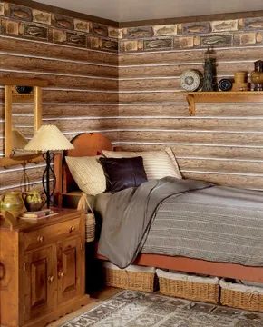
Fresh country style isn’t just a trend. It’s a practical response to modern chaos. We want homes that feel casual but look sophisticated. It’s comforting after a long day. It also signals that we’ve lived a life and learned from it. The pull of the past is a bonus, not the main course.
Spotting this look is simple. It’s clean. It lacks the cold edge of minimalist design. It’s chic without chasing every fleeting fashion. The warmth is genuine, not banal. And it connects to nature. But skip the dried strawflowers and mauve ducks that defined country decor decades ago. That stuff is out.
Curating Authentic Country Decor
Instead of clutter, you want drama. A single sunflower. A bouquet of old-fashioned roses. A hand-carved frog infused with the artisan’s soul. This style is intelligent. Organic. Sometimes slightly off-beat. It fits the current moment perfectly.
It works for families. It’s kid-friendly. But it also respects art history. You aren’t just stacking pillows. You’re using a quilt for architectural impact and cuddles. You choose wood plank floors for texture and comfort while cooking. A cedar-lined hope chest stores board games today, just as it once held wedding linens.
Key principle: Furnishings in fresh country style never exist to impress neighbors. They aren’t there to fill empty space. There are fewer items to dust. Fewer things to dry-clean or break. These are better pieces. They are carefully chosen to meet physical and emotional needs.
Originally, country homes used what was practical and at hand. Today, the result looks similar. You might use a bureau from your grandmother. A table from your parents’ first apartment. Side chairs bought at a flea market years ago. The ethos hasn’t changed. If a piece works, you keep it.
What’s new? The luxury of choice. We now combine practicality with an educated eye. Personal flair matters. Where you’ve been tells your story. So does mixing heirlooms with new finds. The goal is a space that feels lived-in but intentional.
Identifying the Right Fresh Country Style
This isn’t a one-size-fits-all aesthetic. There are variations. You’ll need to pick the right furnishings. Select textures that breathe. Choose accessories that speak to you. The next section breaks down the specific types of country decor available. This helps you build the look you want.
Which Fresh Country Style Fits Your Home?
Before diving into specific variations, consider what “fresh country” means for you. It’s not about replicating a farmhouse from 1950. It’s about curating a collection that feels authentic. Start by evaluating your existing pieces. Does that table from your parents fit the scale of your dining room? Yes. Keep it. Does the flea market chair match the room’s tone? Maybe not. Replace it with something that offers better comfort or visual weight.
Focus on materials. Wood, linen, cotton, and stone are staples. Avoid synthetic blends that look cheap. Look for natural variations in grain and weave. These imperfections add character. They prove the space is real, not staged.
How to Incorporate Artisan Details
A key differentiator in fresh country style is the inclusion of artisan-made items. Hand-carved wood. Pottery with visible fingerprints. Textiles with irregular weaves. These pieces bring personality. They prevent the space from feeling like a showroom. When shopping, look for makers. Read about their process. A piece with a story holds more value than a mass-produced duplicate.
Consider placement. Don’t crowd surfaces. Let a single dramatic sunflower stand alone on a clean table. Group old-fashioned roses in a simple vase. The goal is impact, not volume. Negative space is part of the aesthetic. It allows the eye to rest.
Balancing Kid-Friendly and Art-History-Influenced Decor
Parents often struggle to find styles that are durable yet refined. Fresh country solves this. Use a quilt as a throw on a sofa. It’s cozy. It’s also a design statement. Choose wood floors that can withstand spills and running feet. They offer texture underfoot. They look better than carpet over time.
Storage is crucial. Use furniture that serves multiple purposes. A hope chest can store toys. It can also display books. A sturdy table can double as a homework station. This dual purpose reduces clutter. It keeps the space functional.
Practical Steps for Your Own Space
- Audit your current furniture. Identify pieces with history or utility. Keep them.
- Declutter ruthlessly. Remove items that don’t serve a purpose or bring joy.
- Introduce nature. Fresh flowers. Potted plants. Natural light.
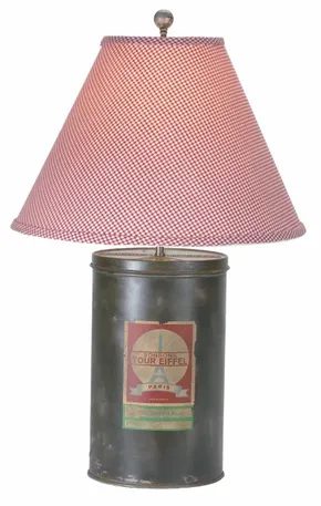

Sourcing Authentic Country Style
Country decor isn’t a trend. It is a centuries-old aesthetic that has survived industrialization and modern minimalism. The appeal lies in its history. You are buying into a narrative of rough-hewn goods and tender sentiments.
Start with the basics. Heirlooms that work today match those from “way back when.” Look for quilts. Their geometric shapes and colors often feel surprisingly contemporary despite their age. Heavy cutwork table runners add texture. Pewter candlesticks provide weight. Copper pots bring warmth. Real wood furniture anchors the space.
Budget-friendly options exist. Pine and oak are accessible. They age well. For a more elegant touch, consider maple or cherry wood. These materials last. They have soul.
If you prefer a lighter look, turn to wicker and rattan. These materials have been front-porch favorites since air conditioning was nonexistent. They breathe. They fit the casual vibe of country living.
Buying Antiques vs. Reproductions
When seeking special pieces for fresh country rooms, do not rule out real antiques. Cost is not always a barrier. Depending on rarity, an antique may cost no more than a modern reproduction.
People assume antiques are fragile. This is often false. Many were made by hand to last for generations. They were built to be used.
Factory-made Industrial Age pieces from the mid-1800s to the 1930s offer another path. They have earned a patina of age. They typically cost much less than you might expect.
There are limits to what you can buy used. You will not find a modern queen- or king-size bed among antiques. Sizing and ergonomics have changed. Also, safety is a concern. Choose a reproduction high chair or crib for infants. Do not risk it. Otherwise, antiques deserve a second look.
Another option involves searching for beloved icons as reproductions. Sources include Colonial Williamsburg and Jefferson’s Monticello. Many other vendors offer similar styles.
The goal here is not a period-perfect room. That is a museum. The goal is a space that resonates with the soul-restoring warmth of history. It should be updated for life today.
Global and European Influences
What if you crave more exotic inspiration? Many homeowners look to the colorful heritage of “the old country.” This could be your own family’s country of origin. It might not be.
Our enduring affection for European country style stems from this romantic perspective. It is part of the same lineage.
But the influence extends further. There is a love of furnishings from other cultures around the globe. Look to Eastern Europe. Look to the Far East.
These influences add depth. They break the monotony of standard Western country decor. They create a layered, lived-in feel. You are collecting stories, not just objects.
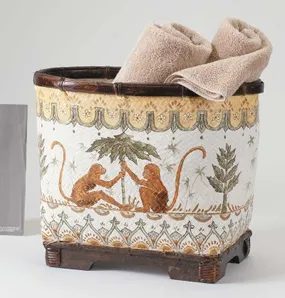

Since the days of sailing ships, American homes have been enriched with rugs from the Orient, porcelain from China, silver from Mexico, and so on. Since the 1960s, our modern outlook has placed new value on “primitive” artifacts, so intricate baskets, dazzling silks, wood carvings, and woven rugs from developing countries have also found a home with us.
So what’s the new difference? Careful editing that keeps the warmth and leaves the clutter behind. That’s the essence of country decor!
One thing you will appreciate is that country pieces from various cultures tend to go surprisingly well together. A reproduction French armoire from the local furniture store, a pretty mix of odd-lot English teacups from a neighborhood flea market, and an old print from your college trip to Italy can be charming together.
For a look that’s a bit more eclectic, try a bold, carved mask from Africa instead of the print from Italy and a cinnabar box from China instead of porcelain from England.
Pieces from different eras can be a bit trickier to mix, but you can balance smooth and rough, opulent and simple for exciting results. For example, a 1940s fruit-motif tablecloth can keep company with a Della Robbia-style still-life if it’s displayed in an unpretentious frame, and an ornate, gold frame can dazzle, empty, on a simple white mantel.
And, since we’re talking country here, remember that a genuine bird’s nest, shell, or piece of driftwood has a natural grace that’s worth displaying in any decor. When it comes to fresh country style, it’s all in the mix.
And, chances are, the mix is already a factor, since you probably aren’t starting with an empty house or apartment. If you’ve inherited or found pieces that you love, they may already go together, since the things people like usually share certain consistencies.
If your current mix doesn’t quite mesh, relax. In this article, you will see ways to use color, visual balance, and other design strategies to create a coherent, pleasing look, using furnishings you already own.
Once you’ve decided on a general look that appeals to you and fits your lifestyle, you can shop intelligently for necessary pieces and collectible accents that work. And here’s a nice bonus: Knowing your style means that you will be able to spot the bargains and the one-of-a-kind treasures.
Let Your Rooms Evolve With Genuine Finds
When you’re out there shopping, do remember that “fresh” isn’t often found in stale, mass-produced attempts to replicate nostalgic, rustic finds. Fresh country may be a bit sentimental, but it’s not corny. Some new retail or craft-fair accessories designed to summon a country feeling miss their mark, because the cute or rustic effect is too calculated.
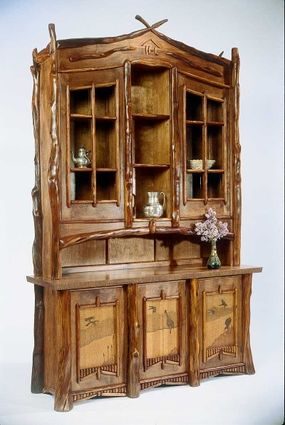

Curating Authentic Pieces
Pick your items with intention. Skip the mass-produced clutter. Hunt for genuine old finds or handmade artifacts that display real craftsmanship. They need to mean something to you.
Clear the decks before you buy. Sell or donate the junk you dislike. List the major pieces you must replace before you get rid of anything else. You might spot perfect candlesticks while hunting for a dining table. But what if you already own the table?
Fresh country living demands you resist boring accessories.
Your space doesn’t have to look empty while you wait for those special accents. Paint the walls a rich, deep color. Line a craft basket with a colorful leftover napkin. Fill it with supermarket apples or oranges. Put fresh flowers in a plain water glass. Make the glass about a third as tall as the blooms. Stack some bargain-bin hardcovers you’ve always meant to read. The result is instant style. No compromise needed.
Defining Your Style
Which fresh country approach fits your life? You can blend styles if you’re skilled. For easier results, stick to one of the new classics. Don’t worry about being boxed in. Even within a single category, there is a wide range of looks. The furnishings make the difference.
New Traditional
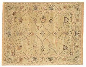
This aesthetic suits those who appreciate order and elegance. Think golf or tennis in a pristine setting. Enjoy the symphony, opera, or historical museums. You use good silver and china once a week, even for takeout. You love Oriental rugs. They are elegant and hide daily messes with kids. Would a visit to Jefferson’s Monticello or Washington’s Mount Vernon inspire you?
If you believe laid-back and gracious can coexist, new traditional is your lane.
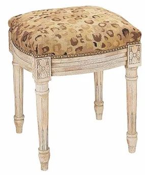

New Traditional: Symmetry Meets Comfort
It’s symmetrical. It’s graceful. It’s elegant without the stiff upper lip. New traditional style draws its roots from Georgian and Federal designs—the ones popular around the Revolutionary War. Those old styles still carry a pedigreed air. They took a beating in the 1950s when uptight decor fell out of favor. Now, they are back. Big time.
The modern take swaps small tea tables for hospitable coffee tables. It keeps traditional wood pieces but adds cushy, comfortable upholstery. The result is a look that feels lived-in rather than museum-bound.
Neoclassical white trim stays fresh when paired with bold wall colors. Think bright turquoise, jade, coral, or cranberry. These tones are historically accurate. They create a vibrant background for heirloom furniture, crisp white linens, and the sparkle of brass, glass, and silver. Want something airier? Paint the walls cream, peach, or celadon. The pale gray-green offers a subtle contrast to the white trim. It feels more contemporary.
Eighteenth-century furniture is the key to this aesthetic. Genuine Queen Anne, Sheraton, Hepplewhite, Duncan Phyfe, and Chippendale pieces are out of reach for most budgets. Their prices are stratospheric. But the popularity of the style has flooded the market with beautiful reproductions. You can find them at all price points.
Don’t overlook Oriental rugs, Chinese porcelain, or other finds from the Far East. Your nearest ethnic shop likely has them. These treasures add depth and resonance to your rooms. Just as in days of yore, they anchor your lifestyle in something larger than yourself.
American Rustic: For the Rough-and-Tumble
Do you love camping? Hiking? A fast game of touch football in the backyard when you should be raking leaves? If yes, American rustic style might be for you.
This look is friendly and down-to-earth. It dates back to pioneer ranchers and farmers carting their few handmade possessions into new territories. Today, you see it in cozy cabins, massive log ski lodges, prairie farmhouses, and Southwestern adobe pueblos. You can also bring it to a suburban house.
Pine or oak furniture in Shaker or Arts and Crafts style sets the tone. Pair it with simple cotton or wool fabrics. Use rustic implements made of weathered brass, copper, pewter, or tin. The atmosphere is invigorating. It’s no-fuss. It’s perfect for rough-and-tumble family life.
If you make family dinner a priority, this style supports it. Whether it’s scratch-made chicken and biscuits or a quick version, the setting feels welcoming. It’s about savoring simple pleasures. The heartfelt and homespun.
European Country: Romance and Culture
Gardening? Long, brisk walks? Exploring art museums and old cathedrals? If these drive you, consider European country style.
This aesthetic brings the romance and culture of European life into your home. It suits those who read English-set mysteries or 19th-century classics. It’s for the person who tries new wines and recipes to turn everyday dinners into romantic adventures. A French or Northern Italian restaurant isn’t just a meal—it’s a way to broaden horizons.
For those dreaming of visiting Europe, this style lets you live a piece of that experience. It’s not about perfection. It’s about the joy of exploration. The culture. The history. It’s a way to bring a bit of the Old World’s charm into your daily routine.

Add Your Own Cultural Footprint
Victorian England handed us the casual flowered chintz (inspired by British India but rooted in our own lush gardens), dogs in the living room, fine porcelain, and shelves groaning with books. The Italian and French countryside gifted us colorful Provençal fabrics, wondrous art, and a food philosophy that marries passion with freshness.
These are world-class aesthetics. But if you pull them out of the predictable, you can make room for cultural accents from your native land or favorite travels. Whether that’s Ireland or India, Poland or Puerto Rico. In the global village, country rules.
Vintage Charm
Do you love an endless stroll down the streets of old towns? A leisurely swim at a vintage resort? Is your idea of fun browsing flea markets and antique shops? Do you collect old cookbooks or make Grandma’s favorite recipes around the holidays, no matter how frantic things get? Would you rather eat in a retro roadside diner or an old country inn than a swanky four-star restaurant? Do you adore old vanity sets, quirky vases, sentimental children’s books, and funky kitchenware? Do you love the cottage look of whitewashed wood and painted wicker furniture even if your mother says they’re a bit on the shabby side? If you love to mix the funky, sentimental, pretty, and whimsical, come home to vintage charm.
Once-loved old furniture, cookware and dishes, knickknacks and fabrics from the 1920s to the 1950s are still fairly plentiful and affordable. So if you didn’t inherit them, check out the resale shops and estate sales. Pastel-colored quilts and chenille bedspreads from the 1930s, bits of old lace, crystal-drop chandeliers and sconces, and maple and walnut dressing tables and dining room groups can give your home a look that’s chic, fun, and familiar.
Some old favorites, such as pastel Depression glass, can be expensive. But you can pick up some wonderful bargains. If you find furniture that’s still sturdy but the finish is worn, that’s part of its charm. If you want a cooler, more unified look, swath everything in white paint. When it’s dry, use fine-grit sandpaper to “distress” the new finish and give it the patina of age. This trick works with new, unfinished furniture, too.
Modern manufacturers now offer many vintage-look items at retail. This can help you fill in major pieces in sync with the look you love.
Contemporary Country
Do you love racquetball or tennis but dream of hang gliding? Are you energized by the latest night spots and modern art exhibits, but are just as happy with a pick-up ball game in the park? Were you quick to rediscover retro comfort food along with the latest ethnic fare, and do you make time now and then to create a dish or two yourself? Do you love serene neutral tones sparked with strong colors and have no problem weeding out clutter? If this is your scene, take a look at contemporary country.
Forward-looking and flexible, contemporary country makes a statement that’s at home anywhere. This free-spirited look is just as suited to urban pioneers as to those in the wide-open spaces. Contemporary country thrives on a variety of designs with strong, simple lines and great colors. Check out African or Native American handicrafts, Shaker furniture, and handmade, one-of-a-kind ceramics and art furniture.
Warmth matters. Where modern style may be steel and black with a jolt of red, contemporary country is more likely to be brass and deep chocolate or taupe, accented with coral, cranberry, or other off-red hue.
While it’s most dramatic in a modern architectural setting with lots of windows on the great outdoors, contemporary country can also thrive in a vintage walk-up or a loft with exposed brick walls. The secret is to pare down to the essentials, then add back the dramatic finds that speak to you.
Contemporary country is inspired by low-slung prairie style and mid-century modern style. But any design with strong and simple lines works fine. Antique Shaker-style or hearty Arts and Crafts-style furniture are great examples of the unity of form and function modernists prize. Luckily, you can easily find affordable reproductions of these two popular styles.
Other sure bets are your favorite finds such as old farm implements, baskets, and strongly patterned Native American weavings. Mix them in with modern upholstery for a look you can live with anywhere.
Eclectic Country
Do you love soccer, yoga, or just about any kind of dance? Do you appreciate Asian art, old French furniture, early American wrought iron, and modern-design fabrics? Do you enjoy fusion cuisine, down-home cooking, and ethnic fare of all kinds? Is your dream trip an international cruise with many ports of call? If this sounds intriguing to you, explore eclectic country style.
Eclectic country style may be the freshest take on country yet. Not since the 1960s has America been so tuned in to the cultural richness of the world. Today’s eclectic country style borrows freely from a wealth of exotic, organic influences.
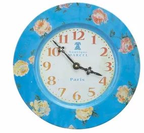

American homes have always borrowed from the seas. Ships brought back paisley shawls, Oriental rugs, and Chinese porcelains. African mahogany and jewels joined the mix. These were the treasures of the East. They embellished Western life for centuries.
Today is different. We don’t collect for the sake of clutter. The Victorian era hoarded. Now we curate.
Eclectic style isn’t about acquiring everything. It is about selection. Pick pieces you love from various eras and cultures. Arrange them in a way that is livable. Balance is key. You want a home that breathes.
Mixing Origins
Pottery from Asia sits well with basketry from Africa. Throw a sari-silk pillow on a sofa. Lay a dhurrie rug on the floor. It creates visual interest.
These global elements work against traditional American furniture. An antique armoire provides weight. A modern serpentine sectional adds flow. A plain Shaker table grounds the space.
Eclectic country decor is worldly. It is never too serious. It invites the world inside with deft diversity.
The result is excitement without chaos. The style is eclectic country. It respects history while embracing modern comfort. It is not a museum. It is a lived-in space.
Look Ahead
You have the basics. Now apply them. Look through the pages for fresh ideas. Think about your own country home. Let’s start with a new take on traditional styling.
For more decorating ideas, see:
- Cabin Decor Ideas
- Modern Decor Ideas
- Window Treatment Ideas
- Decorating Ideas
- Kitchen Decorating Ideas
- Dining Room Decorating Ideas
- Bedroom Decorating Ideas
- Bathroom Decorating Ideas
- Home Office Decorating Ideas
- Home Spaces
- Interior Decorating
Throw Traditional a Curve
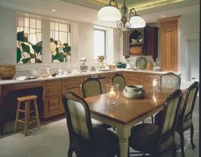

Blending Country Comfort with High-End Eclecticism
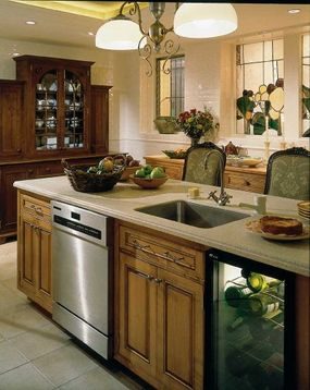
Achieving a fresh country style that feels both stripped-back and luxurious is a tricky tightrope walk. Most people lean too far into rustic clutter or sterile minimalism. This kitchen sidesteps the trap entirely. It proves you can have a pared-down aesthetic without sacrificing pampered comfort.
The secret lies in the specific mix of eras. You aren’t just picking furniture. You are curating a timeline. Art Nouveau curves meet 18th-century French restraint. Then 19th-century modern lines cut through the softness. It should sound chaotic. It isn’t. The result is a captivating spirit of fun that grabs attention but never feels jarring.
How does this work? Color. The palette is the anchor. Neutral tones dominate the background. Natural materials ground the space. The soothing backdrop allows the eclectic elements to shine without screaming for help.
The unusual mix captures attention without being jarring, thanks to the soothing palette of neutral and natural tones used throughout.
If you are looking to replicate this balance, start with the base. White, cream, or light gray walls. Walnut or oak floors. These natural tones create a calm canvas. Then layer in the period pieces. Don’t match sets. Mix them. A French armchair next to a modernist lamp. It creates depth.
The key is restraint. Too many styles fight for space. Too few feel flat. This kitchen strikes the right note by keeping the palette unified. The variety comes in shape and history, not in color.

Mixing Wood Tones Without Muddying the Room
The secret to avoiding a brown-brown-brown disaster lies in contrast. This kitchen proves you can layer several wood hues if you give the eyes somewhere to rest. The cabinets aren’t a single flat color. They are a mix of antiqued honey, taupe, and brown wood. Each tone flows into the next. It feels organic. Not chaotic. Just carefully balanced.
If you tried this with dark walls or busy wallpaper, it would look muddy. Instead, the background is stark white. Subway tiles line the backsplash. Limestone covers the floor. These are fresh, clean surfaces. They act as a canvas. They let the decorative elements—the wood, the hardware, the textures—take center stage.
How to Replicate This Look on a Budget
You do not need expensive custom cabinetry to achieve this layered effect. Here is the practical breakdown.
- Pick a Base Tone : Choose one main wood color for your primary cabinets. Let’s say a warm honey or light oak.
- Add Depth with Contrast : Use a darker or more muted wood for an island or upper cabinets. Taupe-stained wood works well here. It bridges the gap between light and dark.
- Keep Surfaces Neutral : Your countertops and walls should be light. White subway tile is the standard for a reason. It reflects light. It creates boundaries. Limestone or quartz floors in a pale beige or grey keep the foundation solid.
Why Contrast Matters in DIY Renovations
Homeowners often fear mixing woods because they worry it will look dated. It only looks dated if everything competes. When you have strong white backgrounds, the wood becomes the feature. It stands out.
This approach also hides wear better than solid dark cabinets. Scratches show up less on varied tones. Fading from sun exposure blends in across different stains. It is a practical choice for high-traffic areas.
Materials and Tools You Will Need
If you are painting or staining to achieve this mix, you need the right supplies.
- Sandpaper (120-220 grit) : Essential for prepping surfaces. You need a smooth base for the stain or paint to adhere properly.
- Wood Stain or Paint : Choose two distinct tones. One light (honey/oak), one medium-dark (taupe/walnut).
- Clear Polyurethane : Protects the wood. Matte or satin finishes look more contemporary and hide imperfections better than high-gloss.
- Brushes and Rags : Use high-quality synthetic brushes for paint. Wipe-on stains work best with cotton rags for even application.
Safety First
Working with stains and finishes requires ventilation. Open windows. Use fans. Wear a mask if the fumes are strong. Keep rags away from heat sources. They can spontaneously combust if piled up.
The result is a space that feels collected over time. Not staged. The white backgrounds keep it crisp. The wood adds warmth. You get both.

For more decorating ideas, see:
- Cabin Decor Ideas
- Modern Decor Ideas
- Window Treatment Ideas
- Decorating Ideas
- Kitchen Decorating Ideas
- Dining Room Decorating Ideas
- Bedroom Decorating Ideas
- Bathroom Decorating Ideas
- Home Office Decorating Ideas
- Home Spaces
- Interior Decorating
Fresh-Picked and Pretty
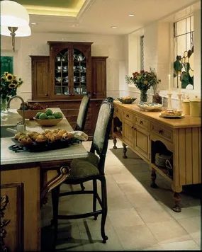
Too much ornate carving kills the vibe. You want the rich look, but you have to dial it back. Subtle details work best. Too much detail and that special appeal vanishes. The chandeliers help. They curve in an art nouveau style. They draw your eye to the casual dining table. They also highlight the sink island. These are grace notes. They feel grand but stay lighthearted.
Nature offers a better blueprint for decoration than complex carvings. A flower garden is a starting point. You can bring those motifs inside. This is how you get that country style without clutter.
Start by looking at your own yard. What blooms there can guide your palette. Use those colors in textiles. Pick up the shapes in your hardware. Keep it natural. Don’t force it.
The goal is to mimic the ease of a garden. It shouldn’t look manicured. It should look picked. Freshly picked. That’s the difference.
How to Bring Garden Motifs Indoors
You don’t need a landscape architect. Just observation.
-
Color Palette
Match your walls or rugs to your petal tones. If your garden is heavy on lavender, go for soft purples in the kitchen. If it’s all reds and yellows, lean into those. -
Materials
Use wood. Use stone. Let the textures match the outdoors. Rough-hewn shelves. Woven baskets. These echo the garden’s raw edge. -
Patterns
Florals are obvious. But try leaves. Try stems. Subtle vine patterns on curtains or tablecloths. They whisper the garden’s presence. -
Accessories
Real flowers are best. Even dried ones. If you can’t keep them alive, use silk. Just avoid shiny synthetics. Matte finishes look more natural.
Where to Start in Your Home
The kitchen is a good place to begin. It’s the heart of the house. Add a floral runner. Put a vase of herbs on the counter. Use ceramic dishes with botanical prints.
The dining room needs the chandelier’s attention. But the table setting can reflect the garden. Linens with leaf patterns. Wooden chargers. It’s about the feel.
Your bedroom should be a retreat. Soft colors. Floral bedspreads. Curtains that filter light like leaves. It’s a sanctuary.
Why It Works
It connects you to the outdoors. Even if you’re inside. It’s calming. It’s familiar. We evolved with nature. Our brains like it.
It also makes the space feel larger. Light colors. Organic shapes. They don’t box you in. They open you up.
Which Styles Complement This?
Country style pairs well with farmhouse. It works with rustic modern. Just keep the natural elements strong. Avoid overly polished surfaces. Stick to matte. Stick to texture.
How to Maintain the Look
Keep it lived-in. Don’t over-decorate.

Bring the Orchard Indoors for Timeless Kitchen Charm
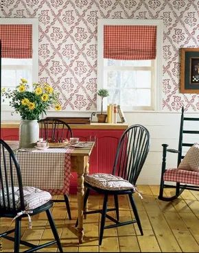
If you’re staring at a dull kitchen or dining nook and wondering how to inject warmth without a full remodel, look outside. The orchard and garden offer a cheat code for that specific, cozy country aesthetic. It’s sentimental, sure, but it works because it’s rooted in nature’s own patterns. These motifs don’t age. They just sit there, quietly charming, year after year.
Start with the palette. You don’t need a rainbow. Pick one or two colors that actually make you hungry. Think ripe peaches, deep plums, or leafy greens. These shades put people in a good mood the second they walk in. It’s subtle psychology. A cheerful table setting does half the work for you.
Then there’s the walls. This is where the theme gets tangible. Wallcoverings or art featuring fruits and flowers anchor the space. You want something that feels personal. Not generic supermarket art, but the kind that reflects what you actually grow or love to eat.
Botanical prints are the heavy lifters here. They’re huge right now, just as they were in the 1700s. The trend isn’t new; it’s persistent. If you prefer realism over abstraction, look for prints that show plants in various stages of life. Close-up details of stems, seeds, and petals add texture. They bring the outdoors in without the maintenance of real vines.
Choosing Between Realism and Abstraction
When selecting your botanical art, the level of detail matters. Realistic images appeal to the eye’s desire for order and recognition. You know exactly what you’re looking at. A detailed rose has history. It has context.
Abstraction might be more modern, but for a country style, realism wins. It connects the room to the garden outside. It bridges the gap. If you’re DIYing this, you can source prints from estate sales or online marketplaces. Look for vintage frames if you want to lean into the 18th-century vibe. The frame is part of the art. A distressed gold or black wood frame often works better than a shiny new plastic one.
Why Botanical Prints Endure
Botanical illustrations aren’t just decoration. They’re scientific records disguised as art. That’s why they feel so substantial. Each print has a story. It’s not just a pretty flower; it’s Rosa gallica, documented in a specific year. This adds depth to the room. It gives guests something to actually talk about.
For a dining area, this creates a relaxed atmosphere. People eat better when they feel grounded. The connection to nature lowers stress. It’s not about being trendy. It’s about being timeless.
Practical Application for Homeowners
You don’t need to wallpaper an entire room. One accent wall is enough. If that feels too permanent, framed prints arranged in a gallery wall work just as well. Mix sizes. A large central piece with smaller surrounding details creates visual interest.
Consider the lighting. Natural light is best for botanical art. It brings out the true colors. If your space is dark, use warm-toned bulbs. Cool white light can make greens look sterile. You want them to look lush.
Materials matter too. If you’re printing these yourself, use matte paper. Glossy finishes reflect light and can look cheap. Matte mimics the look of
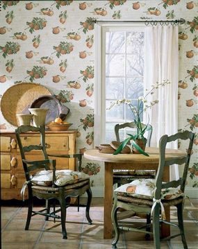

If you’re aiming for a relaxed, lived-in aesthetic, traditional designs offer plenty of options. You can easily find patterns that mimic old-fashioned roller prints, giving your walls or textiles a historic feel without the hassle of hunting down actual antiques. The trick is to complete the scheme with matching or coordinating fabrics in the same color palette. It’s about cohesion. Put on the kettle and take your time with it.
Balancing History and Comfort
The new traditional style isn’t about creating a museum piece. It’s a specific blend of 18th-century-style furniture paired with light, bright colors. Think airy whites, soft creams, and pale blues. To keep it from feeling stiff or stuffy, you add casual, down-to-earth romantic accents. This combination prevents the space from looking too formal. It invites you to stay and relax.
Sourcing Vintage Elements
To get that authentic 18th-century look, you need the right furniture. Look for pieces with clean lines but subtle curves. Wood tones should be warm but not overpowering. Pair these with modern, light-colored upholstery to keep the vibe fresh. This contrast is key. It’s how you achieve that loose, inviting look mentioned earlier.
Color and Texture Pairing
Color coordination is essential. Stick to a unified palette across your window treatments, rugs, and throw pillows. If your walls have a roller print pattern, your fabrics should echo those same hues. This creates a visual thread that ties the room together. Don’t overcomplicate it. Simple repetition of color and pattern works best.
Adding Romantic Accents
Romantic accents don’t mean clutter. They mean softness. Think lace trims, delicate floral patterns, or plush textures. These elements soften the hard lines of traditional furniture. They add warmth. The goal is a casual, down-to-earth feel. It should look collected, not curated.
Where to Find Inspiration
If you need more ideas, explore these categories:
- Cabin Decor Ideas
- Modern Decor Ideas
- Window Treatment Ideas
- Decorating Ideas
- Kitchen Decorating Ideas
- Dining Room Decorating Ideas
- Bedroom Decorating Ideas
- Bathroom Decorating Ideas
- Home Office Decorating Ideas
- Home Spaces
- Interior Decorating
Final Thoughts
The new traditional style is about balance. It’s not about copying the past exactly. It’s about using historical elements as a foundation and building a comfortable, modern life on top of it. Start with the furniture. Add color. Then layer in the accents. See where it takes you.
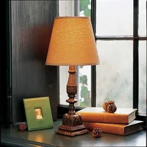

Mixing Heritage with Modern Comfort
New traditional design offers surprising flexibility for homeowners looking to blend old-world charm with contemporary ease. It isn’t just rustic farmhouse decor. It is a more refined take on the country aesthetic, one that values the history in antique pieces and the quality of high-end reproductions.
But don’t mistake elegance for stiffness. The style draws heavily from the Georgian and Federal eras—the same periods that shaped the nation’s early political landscape. You are looking at structured 18th-century furniture silhouettes. Think straight lines, balanced proportions, and classic wood tones.
Yet, it refuses to feel like a museum exhibit. The trick lies in the softer elements.
New traditional style mixes historic furniture with light, bright upholstery and casual, romantic accents to keep the look grounded.
To achieve this balance, you need to be intentional about your materials. Swap out heavy, dark velvets for linen, cotton, or light silk blends. These fabrics reflect light and make the space feel airy rather than enclosed.
How to Layer the Look
Start with the foundation. Choose furniture with established forms—a Chippendale chair or a Queen Anne table. These pieces provide the necessary dignity and structure. Then, introduce contrast through textiles.
- Upholstery: Use pale neutrals or soft pastels. Avoid heavy damasks unless they are tonal.
- Wall Treatments: Consider subtle wallpaper or crisp paint colors. White, cream, and soft grays work best to keep the room from feeling too dark.
- Accents: Add romantic, casual touches. A floral pillow, a woven basket, or a vintage-style mirror can soften the rigidity of the classic woodwork.
This approach allows you to appreciate the patina of older items without letting them dominate the room. It is about creating a space that feels lived-in but polished. Not stuffy. Not cluttered. Just right.
The goal is a home that feels historic but functions for today. You are building a layer of comfort over a foundation of style. If you get the balance wrong, you either end up with a cold palace or a messy cottage. But when it clicks, it feels effortless.
It is not about buying expensive antiques. It is about curating a collection that tells a story while remaining comfortable to sit in. Can you imagine your Sunday mornings in such a space? With coffee in a simple ceramic mug and sunlight hitting the hardwood floors?
That is the new traditional appeal. It respects the past without being trapped by it. And that leeway gives you plenty of room to experiment with colors and textures until the space feels truly yours.
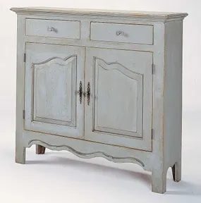

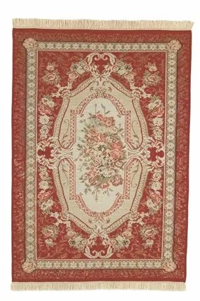

You can pair simple ticking stripes with luxurious kilim rugs. It works because they share soft palettes. The contrast is there but it feels harmonious.
combining disparate furniture styles
Pretty little tables sit next to massive china cabinets. This juxtaposition only works if both pieces share fanciful detailing. The scale is different. The style matches. That is the trick.
using stars and stripes as an accent
A surefire accent is anything that tastefully suggests the Stars and Stripes. It is a classic winner. Do not overdo it. A single throw pillow or a framed print keeps it subtle. Overwhelming the space with red white and blue feels cheap. Keep it refined.
Any tastefully suggested patriotic motif serves as a reliable anchor in eclectic rooms.
Think about the materials. Kilims are wool. Ticking is cotton. The textures interact. The colors blend. You do not need to match them exactly. You need them to agree on tone.
When placing a small table near a large cabinet. Look at the legs. Look at the trim. If both have scrollwork or carved elements. The room feels intentional. If one is modern and sleek. The other ornate. You get visual noise.
Patriotic decor often gets a bad rap. It can look like a Fourth of July party that never ended. But done right. It adds structure. It feels nostalgic without being kitschy. Pick one item. Let it breathe.
Where do you start? Check the existing textiles. Do you have red in the rug? Blue in the sofa? Then a small striped flag or a navy and white clock bridges the gap. It ties things together. Without screaming for attention.
Does this approach work for every room? Maybe not. But for a living area or a guest room. It adds character. It shows you know how to mix high and low. Luxe and casual. Old and new. That is the goal.

8 Tips for Creating a Rustic, Pioneer-Inspired Interior
If you want to lean into that rugged, simple aesthetic without turning your home into a museum exhibit, you don’t need expensive antiques. You just need to strip away the noise. The goal here isn’t perfection. It’s texture. It’s history. It’s making a space that feels lived-in before you’ve even moved in.
1. Stick to Natural Materials
Pioneer homes didn’t have synthetic fibers hanging from every wall. They used what grew nearby. Wood. Stone. Clay. Wool.
When renovating or decorating, prioritize these elements.
Wood is your best friend. But not just any wood. Look for pieces with knots, grain variations, and imperfections. A smooth, factory-finished table feels out of place. A reclaimed barn wood shelf feels authentic. You can distress furniture yourself using sandpaper and a wire brush. It takes effort but pays off in character.
Stone adds weight. Think fireplaces, accent walls, or even just a large, unpolished stone as a centerpiece on a console table. If you can’t install a real stone wall, a faux stone veneer is a lighter, easier DIY project that mimics the look without the structural load.
2. Embrace Earth Tones and Muted Colors
The pioneer palette wasn’t bright. Dyes were expensive and limited. Colors came from nature.
- Ochre (yellow-brown)
- Rust (oxidized iron)
- Sage (dried herbs)
- Cream (unbleached linen)
- Charcoal (burnt wood)
Avoid stark white walls if you want true rustic charm. They feel too modern. Instead, opt for warm off-whites or pale earth tones. Paint is cheap and easy to change. Start with a sample size. Test it on a large board and watch how it looks in different lighting throughout the day. Morning light is cool; evening light is warm. Your wall color needs to work in both.
3. Focus on Texture Over Pattern
Pattern can work, but it should be simple. Think stripes, checks, or small floral motifs. Avoid large, busy prints that scream “21st-century interior design blog.”
Texture is where the magic happens.
- Linen for curtains and upholstery. It wrinkles naturally. Don’t fight it.
- Wool for rugs and throws. Look for chunky knits or woven patterns.
- Burlap or jute for baskets and storage. They add roughness and visual interest.
- Ceramic for vases and dishes. Hand-thrown shapes with uneven glazes are perfect.
Mix these textures. A smooth wood table against a rough wool rug. A linen cushion on a leather chair. The contrast keeps the space from feeling flat.
4. Select Simple, Functional Furniture
Pioneer furniture was built for use, not display. It was sturdy. It was simple. It often had multiple purposes.
Look for:
- Live-edge tables where the natural edge of the wood is preserved.
- Bench seating instead of upholstered chairs for a more utilitarian feel.
- Wooden crates for storage or as
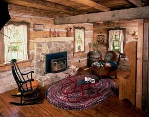

The structure on the screen is a masterclass in minimalism. It mirrors the harsh, beautiful simplicity of early American pioneer dwellings. These homes were hewn directly from local forests. They held only the absolute basics. Decoration was sparse. Just a few accessories. That raw, functional vibe is exactly what this fresh country style captures.
You do not need a full log cabin to borrow these lessons. Most homeowners can adapt these principles. The goal is not to live in the past. It is to strip away the clutter of the present.
Start with Empty Rooms
Interior designers swear by this method. It sounds extreme. It works.
Clear the space. Remove everything. Look at the bare walls and floors. Then, bring back only what you strictly need. This is not a suggestion. It is a strategy for mental clarity.
In the living room shown here, the result is breathing room. There is no visual noise. Items do not compete for attention. You can sit there and actually think.
Mix Eras Without Rules
Here is the secret most people miss. The furniture in this room does not match.
It does not need to.
The chairs are not from the same century as the table. The rug is modern. The beams are rustic. They coexist. They work.
Trying to curate a period-perfect museum piece is exhausting. It is also boring. The beauty here comes from the contrast. Rough wood against smooth linen. Heavy iron against light cotton.
How to Adapt This Look
You are likely not building a cabin. You are likely living in a suburban house with drywall and carpet. That is fine.
- Strip the walls. If you can, remove the pop art or the gallery wall. Let the paint breathe.
- Source local materials. Look for reclaimed wood. Not just for floors. Shelves count. Mantels count.
- Edit ruthlessly. Keep one item per surface. If you put a vase on the table, remove the books. If you hang a picture, remove the lamp.
“Things don’t need to be from the same era to work nicely together.”
The pioneer spirit was about survival through utility. You do not need to survive. But you might benefit from the discipline.
Which items in your home feel like clutter? Which ones feel like tools?
Start there.

Blending Old Charm With Modern Infrastructure
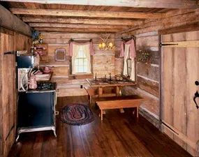
You can chase that cabin aesthetic without sacrificing your sanity. The trick lies in hiding the plumbing and wiring behind wood paneling or reclaimed beams. This isn’t about suffering through a cold winter. It is about looking like you are.
Consider the heating solution in this specific build. It features a heater-fireplace that looks like it was pulled from a 1920s general store. The brickwork is thick. The hearth is deep. But inside? It is a high-efficiency insert. No creosote. No constant chopping of wet logs at midnight. Just clean heat that keeps the indoor temperature steady while the outdoors turns into a whiteout.
Then there is the kitchen. A state-of-the-art gas stove sits where you might expect a wood-burning range. It has the enamel finish. The cast-iron knobs. The retro color palette. But underneath, it offers precise temperature control. You get the look of a rustic forebear without the smoke damage to your curtains.
“Getting away from it all” is often an inside job.
This approach proves that rustic style is a design choice, not a lifestyle penalty. You want the visual warmth of natural materials. The grain of pine. The texture of stone. But you also want hot showers on demand. You want a stove that ignites with a spark, not a match and three days of tinder preparation.
When renovating with this mindset, start with the utilities. Upgrade the HVAC system first. Then, layer on the visuals. Use shiplap or beadboard to cover modern drywall. Install vintage-style fixtures that mimic old-world mechanics. The goal is comfort disguised as hardship.
It changes how you live in the space. You stay longer. The house doesn’t fight you. It just looks like it should be somewhere remote, even if it is ten minutes from a strip mall. That dissonance is the point. It creates a sanctuary that feels removed from the world, even when the world is right outside.
Is it cheating if no one knows? Probably. Does it matter? Not really.
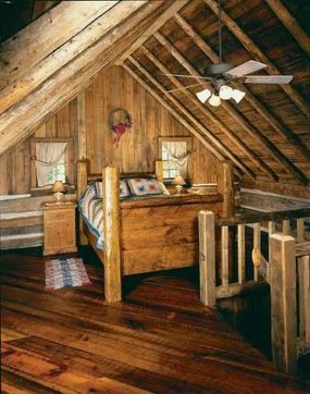

Bringing the outdoors in doesn’t mean buying fake plants or cheap wood veneers. It’s about using materials with real texture. Real stone. Rough-hewn timber. Linen that breathes. These elements change how a room feels. They lower the noise level. They calm you down.
You are building a sanctuary. Not just a decoration scheme.
The shift starts with your senses. Touch the surface of your new countertop. Sit on the woven chair. Look at the grain in the hardwood floor. These things matter. They ground you.
Why Natural Materials Work
Humans are wired to respond to nature. Biophilia isn’t just a buzzword. It’s a psychological need. We relax faster in spaces that mimic the outdoors.
Consider the visual weight of natural stone. It anchors a room. It feels permanent. Unlike paint, it doesn’t fade or peel. It lasts.
Wood brings warmth. But not all wood is equal. Reclaimed barn wood has history. It has knots and cracks. That imperfection is beautiful. It tells a story.
Linen and cotton fabrics add softness. They contrast with hard surfaces. A rough stone table looks better with a soft cotton throw. The contrast creates interest. It prevents the space from feeling cold.
How to Incorporate These Elements
Start small. You don’t need to renovate the whole house.
- Flooring: Swap out laminate for engineered hardwood. Or add a large jute rug. Jute is durable. It hides dirt well. It adds a rustic texture underfoot.
- Walls: Use shiplap. Or apply stone veneer to one accent wall. Veneer is lighter than real stone. It’s easier to install. You can tackle it yourself with thinset mortar and a trowel.
- Furniture: Choose pieces with clean lines. Avoid glossy finishes. Matte surfaces look more natural. They absorb light instead of reflecting it.
- Accessories: Add ceramic vases. Clay pots. Woven baskets. These items hold nothing but air. They are purely decorative. They add volume and texture.
Tools and Materials You’ll Need
If you’re doing this yourself, you need the right gear.
For stone veneer:
– Thinset mortar
– Notched trowel
– Level
– Rubber mallet
– Grout float
For wood treatments:
– Sandpaper (various grits)
– Wood stain or sealant
– Brush or rag
– Safety glasses
Always wear safety gear. Stone dust is bad for your lungs. Sealants often have strong fumes. Work in a ventilated area.
Where to Source Materials
You don’t need to visit a high-end showroom.
Look for reclaimed sources. Architectural salvage yards. Habitat ReStores. They often have old beams or doors. These pieces have character. They are unique.
For fabrics, check local mill sales. You can get high-quality linen at a fraction of the retail price. It might have a minor flaw. A slight uneven weave. That’s fine. It adds authenticity.
Comparison: Natural vs. Synthetic
Which is better? It depends on your goals.
Synthetic materials are cheaper. They are uniform. They are easy to clean. But they lack
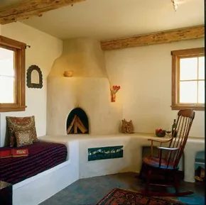
Country style isn’t a monolith. It shifts with climate, history, and local resources. A room in Montana looks nothing like one in New Mexico. This variety is the point.
The Lodge Foundation
A handsome lodge aesthetic relies on heavy, natural materials. Heirloom wood furniture anchors the space. Slate or stone flooring provides a fuss-free foundation. These elements support an outdoorsy, elegant lifestyle. They don’t need polishing. They need endurance.
Southwest Modernism
Southwest style offers a different path. Cool-white adobe walls create a sculpted background. The architecture often features gentle curves. It reads as surprisingly modern. Against this pale backdrop, dark wood and jewel-toned accents pop. They stand out sharply.
If you can’t demolish your walls to build real adobe, fake it with textured white plaster. Add accessories to sell the look. Colorfully striped Mexican serapes drape over sofas. Punched-tin accents hang on the walls. These details bridge the gap between plain plaster and authentic region.
Rustic Simplicity
Rustic decor doesn’t require a budget or a crew. It takes very little to achieve the ambiance. You can bring this feel to an apartment. You can do it in the city. The suburbs work too. The goal is ambiance, not perfection.
The next steps involve adding key touches to your existing decor. Small changes yield big returns.
For more decorating ideas, see:
- Cabin Decor Ideas
- Modern Decor Ideas
- Window Treatment Ideas
- Decorating Ideas
- Kitchen Decorating Ideas
- Dining Room Decorating Ideas
- Bedroom Decorating Ideas
- Bathroom Decorating Ideas
- Home Office Decorating Ideas
- Home Spaces
- Interior Decorating
All in the Details
It’s always the details that break the illusion. Or confirm it. A single wrong texture can ruin a lodge vibe. A misplaced pattern can flatten a Southwest room.
Start with the floor. Stone stays cool. Wood warms the air. Choose based on your climate.
Then look at the walls. Plaster offers texture. Paint offers speed. If you go with plaster, let it be imperfect. The cracks tell a story.
Furniture should look used. Not broken. Used implies history. Broken implies neglect. Heirloom pieces bring that weight. If you can’t find heirlooms, buy distressed wood. Sand it down. O it. Let it age.
Accessories are the final layer. Serapes add color. Tin adds shine. Neither is essential. But together, they create a narrative.
What happens when you mix these styles? A lodge table in a Southwest room. It’s risky. It can work. Or it can look like a thrift store disaster. Start small. Add one element. See how it breathes.
The room evolves. You don’t need to finish it today.

Achieving Rustic Country Style in Urban Spaces
You do not need a sprawling farmhouse or a timber-framed cabin to live in a rustic country style. If you are stuck in a conventional city apartment or a suburban split-level, the vibe is still attainable. It is about suggestion. It is about mood. A few strategic touches can simulate the feeling of a distant cabin without requiring a mortgage on a plot of land.
Think of this as a lightweight shopping list for ambiance. The goal is to lean into the aesthetic without letting it overrun your space.
Textiles and Patterns
If you are looking for the quickest route to a rustic country look, start with fabric. Checks and plaids are the heavy lifters of this style. They communicate “country” louder than almost any other pattern. You do not need to commit to full upholstery. A throw pillow or a simple curtain can anchor the theme.
The key is restraint. Let the pattern suggest the style rather than declaring it.
Accessories with Character
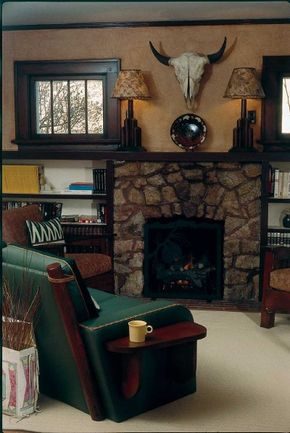
In smaller spaces, every object needs to earn its place. Consider a sun-bleached animal skull. It sounds harsh, but in a cozy bungalow setting, it reads as rugged rather than macabre. Pair it with hand-painted pottery. The imperfections in the glaze matter. They add texture.
These are not just decorations. They are artifacts of a lifestyle that values craft over mass production. A few choice accessories can shift the entire energy of a room.
Niche Spaces Count
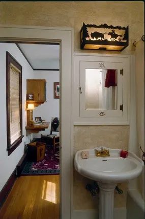
Do not ignore the powder room. It is the perfect testing ground for bolder motifs. Vintage lighting can make a huge difference. Look for pieces with Native American motifs or southwestern influences. Even a matching vintage medicine cabinet can tie the theme together.
It is about signaling interest. It is subtle. It tells guests who you are without you saying a word.
Why Rustic Works in Small Footprints
The beauty of this approach is that it does not require square footage. It requires curation. You are building a narrative out of small details.
“These touches constitute an easy shopping list for creating a rustic ambiance without going overboard.”
This is not about clutter. It is about intention. A skull on a shelf. A plaid cushion on a chair. A light fixture with a story.
What to Look For
When hunting for these items, ignore the pristine. Look for wear. Look for history.
- Patterns: Stick to traditional checks and plaids. Avoid geometric modern prints.
- Materials: Wood, ceramic, and natural fibers. Skip the glossy plastics.
- Motifs: Southwestern, Native American, or generic country cabin symbols.
- Condition: Sun-bleached, hand-painted, or vintage. New items often lack the necessary character.
How to Start
Begin with one room. The powder room is ideal because it is small. The stakes are low.
- Lighting: Swap out a generic ceiling fixture for one with a niche motif.
- Storage: Find a vintage cabinet or add a rustic basket.
- Textiles: Add a plaid runner or a checkered towel.
It does not take much. A few dollars at a thrift store can change the entire feel of a space.
The Risk of Overdoing It
The line between rustic

There is a specific weight to Mission-style furniture. It isn’t just wood. It is heavy, solid, and grounded. When you pull these pieces into a space, they demand attention. They anchor the room.
Pair that heaviness with leather.
Not the thin, synthetic stuff. Real leather. Or high-quality faux that mimics the texture and aging process of the genuine article. This combination creates a fresh take on country style. It moves away from the shabby-chic, floral overload of the past. It is cleaner. Sharper.
Why This Pairing Works
Mission style comes from the Arts and Crafts movement. Think Gustav Stickley. The lines are straight. The joinery is exposed. It celebrates the material. Leather does the same. It ages. It develops a patina.
When you mix them, you get a look that feels lived-in but intentional.
- Durability: Both materials withstand daily use.
- Timelessness: Neither goes out of style quickly.
- Texture contrast: The smooth grain of oak meets the pebbled surface of leather.
How to Integrate Mission Furniture
Start with the big pieces. A Mission-style sofa is a statement. It has a rectangular back. Thick arms. It looks like it could survive a storm.
If you are renovating, look for solid wood frames. Avoid particle board. The value is in the construction.
Place this in a living room with neutral walls. Let the wood be the star. Then, introduce leather accents.
Leather Accents: Where to Start
You don’t need to reupholster everything. Start small.
- Throw pillows: Add leather cushions to a fabric sofa.
- Footstools: A leather-topped ottoman near a fireplace.
- Wall art: Stretched leather panels can serve as unique decor.
- Rugs: Flat-weave leather rugs add texture underfoot.
These accents break up the wood. They add warmth. They soften the rigidity of the Mission lines.
Materials and Tools for DIY Updates
If you are doing this yourself, you need the right supplies.
For refinishing Mission pieces:
* Sandpaper (120 and 220 grit)
* Wood stain (walnut or mahogany tones work well)
* Brush or cloth for applying stain
* Clear coat for protection
For leather care and application:
* Leather conditioner to keep it supple
* Upholstery staple gun if reupholstering
* High-quality leather dye for color changes
Safety first. Wear a mask when sanding. Use gloves when handling stains. Ventilation is key.
Where to Source These Pieces
Mission-style furniture is available at major retailers. Look for brands that specialize in rustic or craftsman design.
For leather accents, check upholstery suppliers. You can buy hides or remnant pieces. This is often cheaper than buying new furniture.
Online marketplaces also have good options. Search for “vintage Mission” or “handcrafted leather goods.”
Avoiding Common Mistakes
Don’t overdo the leather. Too much can make a room feel like a lounge or a den. It can
The Mission Furniture Anchor
You want that warm, lived-in feeling without it looking like a museum. Mission furniture is your anchor here. It isn’t just a style choice. It’s a direct nod to the Arts and Crafts movement of the early 1900s. The goal was honesty in construction. No hidden joints. No fake grain. Just straight lines and solid wood.
This aesthetic recaptures the handmade quality of early settler days. It works well in almost any Fresh Country Style signature. Why does this matter? Because your family might not agree on everything. Your spouse wants rustic. You want clean lines. Mission furniture satisfies both. It’s sturdy. It’s simple. It doesn’t scream for attention.
Natural Wood Choices
Beyond the mission pieces, you’re looking at open-grain woods. Pine and oak are the standard bearers. They breathe. They show their age. You’re not buying plastic-laminate knockoffs. You want wood that has texture.
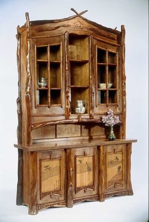
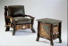
Then there is the more rustic end of the spectrum. Think twig furniture. Or peeled log pieces. These elements add weight and character. They ground the space. They remind you that this is a home built for living, not just looking.
“Mission furniture works well in several other Fresh Country Style signatures, too; a nice bonus if your family has differing tastes.”
It’s about mixing these textures. Start with the mission pieces for structure. Fill in with pine or oak for warmth. Add a twig chair or a peeled log table as a statement. The result isn’t chaotic. It’s layered. It’s real. And it’s ready for your next renovation project.

Boudoirs in Bloom
Leather holds its own here, sure. Classic. Durable. But woven fabrics? They bring that Native American flair or other timeless motifs that anchor the space without shouting. It is about the details that sell the simplicity. Look for whipstitched trim on lamp shades. Small touches. They make the look complete. You do not need much. A few well-chosen elements beat a cluttered room every time.
Now, shift the gaze outward.
Want a garden-inspired bedroom? One that feels fresh? Country-style decorating can transform a boudoir into something floral and inviting. It is not just about putting a flower pillow on the bed. It is about the atmosphere. The light. The textures.
If you want to keep digging into this, check out these specific angles:
- Cabin Decor Ideas: For a rugged contrast.
- Modern Decor Ideas: To strip back the romance.
- Window Treatment Ideas: Crucial for controlling that garden light.
- Decorating Ideas: General principles.
- Kitchen Decorating Ideas: Because flow matters.
- Dining Room Decorating Ideas: For the full house narrative.
- Bedroom Decorating Ideas: More ways to layer the look.
- Bathroom Decorating Ideas: Spa vibes extend to the bath.
- Home Office Decorating Ideas: If you work from home, keep the theme consistent.
- Home Spaces: Broader structural thoughts.
- Interior Decorating: The overarching strategy.
The goal is a flowering boudoir. Not a greenhouse. A place to rest. To breathe. The country style allows for that breathing room.
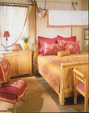

Floral motifs have dominated fabric and wallpaper design across cultures and centuries. They fit naturally into fresh country-style decor. Bedrooms are prime candidates for this lighthearted influence. You do not need an overwhelming pink palette to create a floral sanctuary.
Sophisticated Floral Bedroom Ideas
These examples demonstrate the variety possible with refined floral treatments. The goal is balance. A garden-inspired bedroom benefits from contrast.
Cut the sweetness of florals with rough textures.
Consider rough wood floors. They ground the space. Add sisal rugs for tactile variety. This approach prevents the room from feeling too sugary. It keeps the design sophisticated.
Practical Application for DIYers
If you are tackling this yourself, choose materials that age well. Hardwood floors can be refinished. Sisal rugs are durable and easy to replace.
Select floral fabrics with a mix of colors. Avoid monotony. Use contrasting elements to define the space. This creates a bedroom everyone can enjoy.
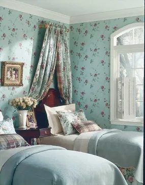

Pairing Florals with Tailored Patterns
Floral prints carry weight. They demand attention. If you let them dominate a room without restraint, the space can feel cluttered or dated. The fix isn’t to remove them. It is to balance them.
Introduce structure through tailored plaids, crisp stripes, or classic checks. These geometric patterns anchor the organic softness of the flowers. Think of it as visual counterpoint. The rigid lines of a plaid throw pillow or a striped rug ground the swirling petals of a curtain or upholstery fabric.
Color selection matters just as much as pattern mixing. Stick to gender-neutral, restful solids. Gray offers cool neutrality. Cream provides warmth. Gold adds a touch of metallic richness without shouting.
Take a tip from nature: pair floral prints with coordinating greens.
Green is the ultimate connector. It appears in the stems and leaves of the flowers themselves. Using a sage, olive, or forest green in your solids bridges the gap between the print and the room. It creates a cohesive loop that feels intentional rather than accidental. This approach keeps the look fresh. It avoids the trap of matching exactly, which often feels stiff. Instead, you get depth. You get a room that breathes.
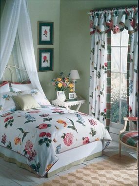

The key to keeping floral patterns from feeling heavy is lightness. Choose window treatments that breathe. Sheer curtains or simple, unadorned panels let the pattern of the room shine without competing with itself. You want the eye to travel, not get stuck.
If you want to dial up the romance, consider a canopy. But keep it restrained. No fussy swags or excessive draping. Just a simple frame and light fabric. It adds structure. It frames the bed like a painting. This is grown-up romance, not a boudoir fantasy.
The style we are looking at here is French Country. It is poised. Chic. There is an exotic edge to it, but one that feels lived-in rather than staged. It draws from the countryside but refines it. It is less about rustic chaos and more about curated elegance.
Why French Country Works for DIYers
This style is forgiving. It does not demand perfection. A slightly worn chair adds character. A mismatched set of vintage plates on a wall shelf looks intentional. You do not need to buy a full set of matching furniture. In fact, mixing eras is part of the appeal.
Think about materials. Linen, cotton, and raw wood. Avoid high-gloss finishes. Go for matte. Go for textures you can touch. The goal is comfort with a side of sophistication.
How to Achieve the Look on a Budget
Start with the walls. A soft, neutral base allows the floral elements to pop. Paint a room in a warm white or a pale sage. Then, introduce the pattern through textiles. Throw pillows. Table runners. A single statement armchair.
Lighting matters too. Iron fixtures or wrought-iron chandeliers add that necessary touch of old-world weight. It balances the airy fabrics. Without it, the room might feel too floating, too insubstantial.
Where to Source Key Pieces
You do not need to commission custom furniture. Look for second-hand shops. Estate sales. Online marketplaces with filters for “vintage” or “antique.” The imperfections are the point. Scratches on a wooden table tell a story. They prove the piece has history.
For the canopy, you can build a simple wooden frame yourself. It requires basic tools: a drill, screws, and a saw. Sand the wood until smooth. Paint it white or leave it natural. Hang your chosen fabric from the top. Keep the sides open for air circulation. This is not just about aesthetics; it is about comfort in warm weather.
Which Fabrics Best Capture the Savoir Faire?
Cotton voile is ideal for canopies. It diffuses light softly. It moves with the air. Linen is great for upholstery, though it wrinkles. Embrace the wrinkles. They signal ease. Avoid polyester blends if possible; they tend to trap heat and lack the drape of natural fibers.
When selecting floral patterns, look for scale. Large blooms can overwhelm a small room. Smaller, more intricate patterns work well on walls or larger surfaces. Use large patterns sparingly, like on a single accent wall or a substantial duvet cover.
Safety and Practicality
If you are installing a canopy, ensure the mounting hardware is rated for the weight of the fabric and frame. Use a stud finder.
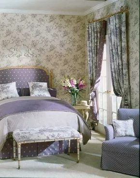

The Secret to Effortless Country Chic
You want style without the stiffness. These rooms walk that line perfectly. Poised and feminine, but not saccharine. There is a formal polish in the fabrics. Think crisp linens or structured upholstery. Yet the colors keep it grounded. Muted pastels bring a young, chic spirit.
It is not about being loud. It is about tone. Grayed tints of plum, green, and blue look sophisticated. They are lighthearted. Pair them with buttercream and white. The result is fresh.
If that specific palette does not speak to you, you have options. You could swap in peach and dove gray. It works. Celadon and cream is another solid choice. So is pale aqua with light taupe. The structure remains the same. The feeling stays easy to live with.
Why This Palette Works for DIY
When you are tackling a renovation, color is the cheapest way to change the vibe. You do not need to replace cabinets. You do not need new hardwood floors. You just need to look at the walls.
Grayed tints are the key. They soften the edges. A bright plum can feel aggressive. A grayed plum feels refined. It lets the light in. It sits well with natural textures. Think wood, linen, and cotton.
How to Execute the Look
Start with your large pieces. The sofa or the drapery sets the formal tone. Choose a fabric with some weight. It should hold its shape. Then move to the walls.
“Muted pastel colors give these rooms a young, chic spirit.”
If you choose plum, go for a dusty, grayed version. It is not purple. It is closer to a dried flower. Paint one accent wall. Or do all four. Just keep the trim white or buttercream.
For green, look for a sage with gray in it. It should not be too yellow. Pair it with white furniture. The contrast makes the green pop without shouting.
Blue follows the same rule. Think slate or sky with a gray undertone. Not navy. Not baby blue. Something in between. It feels airy.
Materials and Finishes
To keep it from looking too sweet, avoid high-gloss paints. Matte or eggshell finishes absorb light. They feel softer. They match the “easy to live with” goal.
If you are painting trim, go with a crisp white. It cleans up the grayed tones. It makes the room feel larger.
For fabrics, stick to natural fibers. Linen wrinkles. That is a feature, not a bug. It adds to the country feel. Cotton works too. But ensure the weave is tight. You want that formal polish.
Avoid synthetic blends if you can. They tend to look cheap over time. Natural fibers age better. They develop a patina.
Which Combo Fits Your Space?
Not every room is the same. Light matters.
- North-facing rooms: They get cool light. Grayed blues and greens work best here. They enhance the coolness.
- South-facing rooms: They get warm light. Peach and dove gray might look better. The warmth balances the gray.
- Small rooms: Pale aqua and light taupe can make the space feel open. But use white for the ceiling. It keeps
The Power of the Single Statement Piece
It’s not about filling every inch. It’s about picking one weird, wonderful thing and letting it breathe.
Take the bedroom. You don’t need a headboard upholstered in velvet if you’re not into it. Try an old white iron architectural fragment instead.
It adds presence above the headboard without demanding attention.
That’s the secret. Confidence comes from knowing exactly why that shard of iron is there. It’s not clutter. It’s character.
Most people play it safe. Beige walls. Neutral bedding. Safe. Boring. Forgettable.
But a homeowner with style? They hunt. They dig through estate sales and salvage yards. They find something broken, beautiful, and slightly ridiculous. And they place it where it matters most.
Above the bed. At eye level when you’re lying down. It becomes a focal point. A conversation starter for guests who don’t know what to say.
Why does it work? Because it’s unexpected. It breaks the pattern. It says, “I made this choice. I didn’t just buy a set from a catalog.”
It’s subtle. It’s playful. It’s entirely yours.
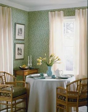
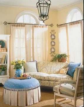
The breakfast room feels lighter thanks to bamboo and cane insets on the antique furniture. It adds a touch of the exotic without feeling heavy. In the sitting room, a whimsical pouf is trimmed with ball fringe. It looks playful. Simple curtains and casually arranged flowers keep the vibe relaxed. You don’t need a massive budget to get this look.
You can give your house a European flair by picking a specific country style. English country is cozy. French country is elegant. Pennsylvania Dutch, which has German roots, is sturdy and practical. Swedish country is clean and bright. Each one has distinct features. The next part of this guide will show you how to apply these styles to your own walls and floors.
For more decorating ideas, see:
-
Cabin Decor Ideas
-
Modern Decor Ideas
-
Window Treatment Ideas
-
Decorating Ideas
-
Kitchen Decorating Ideas
-
Dining Room Decorating Ideas
-
Bedroom Decorating Ideas
-
Bathroom Decorating Ideas
-
Home Office Decorating Ideas
-
Home Spaces
-
Interior Decorating
European Accents
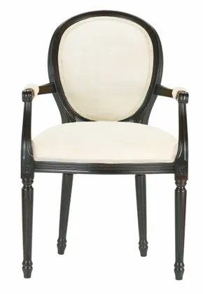

The Enduring Appeal of European Country Styles
You don’t need a genealogy report to justify a farmhouse aesthetic. English, French, Pennsylvania Dutch (German), and Swedish fresh country looks have been staples in American homes for generations. The reason is simple. Many of the earliest settlers came from these exact regions. Their tastes shaped the foundations of American domestic design.
This doesn’t mean you are stuck with historical accuracy. Even if your heritage points elsewhere, you can borrow these popular styles. You can adapt them. Blend them with your own family’s culture. Adjust them to fit your personal taste.
European country design is inherently relaxed. It is not rigid. There is no rulebook. You can mix and match elements freely. Pair a Swedish rustic table with an English floral armchair. Add a touch of French provincial charm to a Pennsylvania Dutch kitchen. The goal is comfort. The goal is a lived-in feel that reflects who you are, not just where your ancestors lived.
Color Stories for Your Porch
You don’t need to repaint the whole house to change its personality. Just look at the trim. Small doses of specific hues can steer a space toward a distinct heritage style without costing a fortune.
For the English garden vibe, go with celadon green. Pair it with antique-white. Add a touch of berry. The result feels soft. Overgrown. Like a cottage that has been there for a century.
If you prefer the French country aesthetic, flip the script. Gallant red. Yellow. Blue. These three colors together create a feeling of boldness. It’s less about hiding and more about displaying history.
Which palette fits your street? The green one blends in. The red and yellow one stands out.
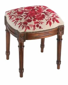
Blue and white china isn’t just a trend; it’s the backbone of almost every variation of this aesthetic. It anchors the room. Toile, originally French, has escaped its borders to become a global staple. Pair it with pretty, upholstered chairs. Throw in a traditional needlepoint pillow. You get instant texture.
The real magic happens when you stop playing it safe. Mix florals with stripes. Or clash plaids with solid blues. The result is irrepressibly romantic. It feels lived-in. It feels like a story.
Why Vintage Accents Define Country Charm
You want that sense of time passing? That’s where vintage accents come in. They aren’t just decorations. They are physical proof of history. A cracked ceramic vase. A faded linen curtain. These items evoke memories of times gone by. They soften the edges of modern life.
Think about how you use these pieces. Don’t display them like museum artifacts. Use them. Drink from the vintage teacup. Sit in the worn armchair. The wear and tear is the design feature.
How to Source Authentic Country Pieces
Where do you find these treasures? Thrift stores are the obvious start. But don’t just look. Scan the shelves. Look for quality joinery in the furniture. Check the fabric weight in the textiles. A heavy oak chair tells a different story than particle board.
Online marketplaces work too, but you can’t touch the material. Read descriptions closely. Look for keywords like “distressed,” “patina,” or “antique.” Be wary of pieces that look artificially aged. Real wear is uneven. Artificial distressing is often too perfect.
Which Vintage Items Work Best?
Not every old object fits the country style. You need items that feel warm and inviting.
- Ceramics: Look for chipped mugs or bowls with hand-painted designs.
- Textiles: Linen tablecloths, quilts, and lace doilies add softness.
- Wood: Wooden crates, cutting boards, or frames with natural wear.
- Glass: Amber or cobalt blue bottles. They catch the light beautifully.
Avoid anything too sleek or industrial. Chrome and glass don’t fit the vibe unless they’re paired with rustic wood.
Where to Place These Accents
Start small. A single vintage pitcher on a kitchen counter changes the whole mood. It doesn’t need to be a whole room overhaul. One shelf with old books and a ceramic jar is enough.
In the dining room, layer a vintage runner over a plain tablecloth. Add mismatched plates. The asymmetry feels intentional yet casual. In the bedroom, a quilt draped over the foot of the bed adds instant coziness.
The Practical Side of Using Vintage Items
There’s a catch. Old things break. They fade. They need care.
- Clean gently: Harsh chemicals can damage patina. Use mild soap and water.
- Rotate displays: Keep delicate pieces out of direct sunlight to prevent fading.
- Accept imperfections: A chip isn’t a flaw. It’s character.
Don’t stress over finding “pristine” condition pieces. The goal is comfort, not perfection. A slightly warped wooden tray adds more charm than a flawless plastic one.
Comparison: Vintage
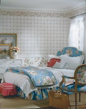

Choosing Wall Coverings That Age Gracefully
The magic lies in the palette. Soft, muted tones. Textures that look like they have been rubbed smooth by decades of use. It is less about decay and more about comfort. You want a room that feels like it has been lived in for fifty years, not just decorated today.
Vintage-style wallcoverings are the heavy lifters here. They set the stage. When you pair them with matching fabrics—curtains, cushion covers, maybe a slipcovered armchair—you get that whimsical, old-fashioned vibe. It is the essence of country style.
Avoiding the Costume Look
Floral prints are the obvious choice. Big blooms. Pastel backgrounds. But there is a trap.
Go too literal and you end up with a theme park version of 1950.
Modern manufacturers know this. They are not just copying the past. They are mocking it gently. You will find designs that wink at you. A slightly off-kilter pattern. A color combo that feels nostalgic but just a little weird.
“Create a setting that reminds you of Grandma’s house without taking it all too literally.”
This is the sweet spot. You get the nostalgia. The smell of lavender. The creak of floorboards. But you do not get the stuffiness. It is a nod, not a reenactment.
Why It Works
The key is restraint.
- Select one focal wall. Do not wallpaper every surface.
- Keep the rest neutral. Let the paper breathe.
- Mix eras. Put a mid-century modern chair in a room with Victorian wallpaper. It clashes. It works.
You are not building a museum. You are building a home that remembers. The textures do the talking. The colors whisper. The rest is just decoration.
If you nail the balance, you will walk into the room and feel that sudden, strange calm. Like you are late for tea but have nowhere to be. That is the goal.
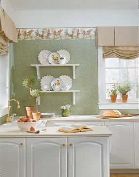

To nail that soft, nostalgic vibe, you need to look at textures first. Think fuzzy chenille trims and matelassé fabrics. These were huge in the thirties and forties. They add weight and warmth to a room. You don’t need to buy brand new everything. Scout resale shops. Hit flea markets. Estate sales are gold mines. Check the classifieds for times. Get there early. Bring cash. Cash moves faster than credit in these places.
If you can’t find the exact vintage piece you want, look at reproductions. Conventional furniture stores sell them now. Vintage style is mainstream. It’s everywhere. You can buy new items that look old.
Still obsessed with floral motifs? Move on to country decorating ideas. They blend flowers and fruit motifs. This keeps the theme consistent.
For more decorating ideas, see:
-
Cabin Decor Ideas
-
Modern Decor Ideas
-
Window Treatment Ideas
-
Decorating Ideas
-
Kitchen Decorating Ideas
-
Dining Room Decorating Ideas
-
Bedroom Decorating Ideas
-
Bathroom Decorating Ideas
-
Home Office Decorating Ideas
-
Home Spaces
-
Interior Decorating
Fruits and Flowers
Floral patterns aren’t just for walls. They work in textiles too. Pair them with fruit motifs. It creates a cohesive look. Think preserved lemons or painted apples on linens. It’s playful but grounded.
Use this combination in kitchens. It feels lived-in. It also feels curated. Don’t overdo it. Pick one or two focal points. The rest should be neutral.
Chenille throws add texture. They contrast with smooth fruit prints. Matelassé bedding adds depth. It catches light differently. This layering is key.
Look for vintage china. It often has both flowers and fruit. Mix it with modern plates. The clash works. It feels personal.
Don’t ignore the garden outside. Plant flowers and fruit trees. Bring the inside out. It extends the theme.
Buy secondhand where you can. Vintage linens fade nicely. They age with character. New fabrics can look stiff. Old ones have history.
Cash is king at estate sales. Be prepared to bid. Be ready to pay full price if needed. The right fabric is worth it.
Reproductions are a safe bet. They mimic the old styles. You get durability too. They’re machine washable often. Vintage might need dry cleaning.
Consider your budget. Vintage items vary in price. Reproductions are predictable. Both achieve the look. Choose based on availability.
Floral and fruit themes are versatile. They fit country homes. They fit urban apartments. It’s about the touch. A small print here. A large print there. Balance is everything.
The goal is comfort. Cozy fabrics invite sitting. Soft textures encourage lingering. Make the room usable. Not just a showroom.
Search online marketplaces too. They have global reach. You might find rare trims. Shipping costs add up. Factor that in.
Inspect items closely. Check for stains. Look for tears. Vintage has flaws. Decide if you like them. Some flaws are charming. Some are dealbreakers.
DIY projects can help. Add chenille trim to existing curtains. It’s a cheap update. It makes a big difference. Simple sewing skills suffice.
Mix
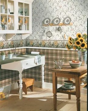
Why vintage floral wallpapers dominate country kitchens
You walk into a country-style kitchen and the first thing that hits you isn’t the smell of bacon or the hum of the fridge. It’s the walls. They breathe. They have character. That’s the power of vintage fresh country decor, where floral and fruit motifs aren’t just decoration—they’re a lifestyle choice.
These patterns take naturally to the space. They soften hard edges. They make a cramped galley feel like a cottage in Provence. But it’s not just about aesthetics. The right wallcovering can fix a room that’s missing something. It adds charm to workaday pieces like a plain white dishwasher or a laminate counter that’s seen better days.
“Fruit- and flower-motif wallcoverings are so popular that they’re available in every style.”
That availability is key. You can match the vibe to your taste. Go contemporary ’40s retro with geometric florals. Lean into American folk-art primitive for that hand-painted, naive look. Or go full opulent English Victorian with damasks and heavy botanicals. The options are endless because the demand is there.
For the DIY homeowner, this means you don’t have to settle. If you’re redoing a small kitchen or dining room, these wallpapers can enliven the space. They draw the eye up and out, making the room feel larger than it is. They cover up lack of elements—like awkward corners or mismatched cabinets.
When choosing, think about scale. A tiny kitchen needs smaller prints. A large dining room can handle bold, oversized blooms. Consider the lighting, too. Floral patterns change in different light. Morning sun might wash out pale yellows. Evening lamps might deepen reds.
It’s about more than just picking a roll. It’s about creating a backdrop that feels lived-in and loved. Vintage styles remind us that kitchens were once the heart of the home, not just a place to heat up leftovers. They bring warmth. They bring history.
And they’re still relevant. Because who doesn’t want to wake up to a bit of botanical beauty?
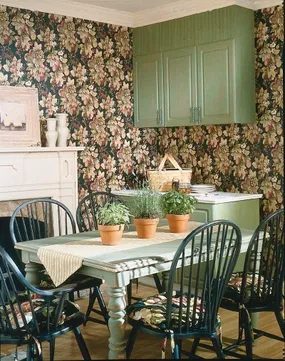
Mixing Finishes for Visual Depth
The real magic isn’t in the theme itself. It is in how you layer the furniture. You want variety. You want charm.
Start with the basics. Cabinets. Tables. Chairs. All of them.
Don’t stick to one finish. That is boring. That is safe. And safe is forgettable.
Mix white painted pieces with natural wood. Then throw in some colorful painted items. Randomly. Or with intention. It doesn’t matter. What matters is the contrast.
White cabinets feel airy. They reflect light. They make a room look bigger. But too much white can feel sterile. Like a dentist’s office.
Natural wood adds warmth. It grounds the space. It feels lived-in. But it can look dated if everything matches too perfectly.
Colorful painted furniture breaks the monotony. A red chair. A blue sideboard. It draws the eye. It creates a focal point.
The key is balance. Not perfection. Just interest.
Try a white table with natural wood chairs. Add a colorful cabinet in the corner. It works. It looks intentional. Even if you just threw it together.
“Charm comes from imperfection. From the mix of old and new. Light and dark. Smooth and textured.”
Think about the motifs again. Are they coastal? Rustic? Modern? The furniture finishes should support that. Not fight it.
If you are doing this yourself. Paint what you want painted. Seal the wood. Leave the grain visible.
It is about texture. It is about story.
Which piece gets the pop of color? Which stays neutral?
There is no rule. Only what feels right in the space.
Keep building. Add layers. See how it settles.
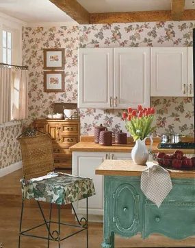
Your cabinets don’t need a full replacement to look new. If the structure is solid, refinishing is the cheaper, faster route. Try splitting the palette. Paint the uppers white. Keep the lowers in a natural wood stain. Pick a third hue for an island or a standalone china hutch.
Color choice matters. Soft greens read calm and classic. They work anywhere in the kitchen. But don’t sleep on red. An antiqued apple red adds warmth. It’s appetizing. It feels lived-in.
This approach keeps the room from looking flat. You get depth without the cost of new cabinetry. It’s a quick win for an aging kitchen.
Working with Nostalgic Palettes
That country vibe relies on history. Not the dusty kind. The fresh kind. Think faded florals. Think worn wood. Think colors that look like they’ve been there for decades.
The next step is layering these nostalgic tones. You want a home that feels collected over time. Not bought in one trip.
More Decorating Resources
- Cabin Decor Ideas
- Modern Decor Ideas
- Window Treatment Ideas
- Decorating Ideas
- Kitchen Decorating Ideas
- Dining Room Decorating Ideas
- Bedroom Decorating Ideas
- Bathroom Decorating Ideas
- Home Office Decorating Ideas
- Home Spaces
- Interior Decorating
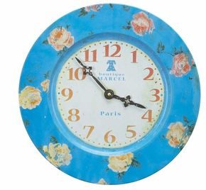

Nostalgic Color Palettes for Country-Style Interiors
You don’t want a museum. You want a hug.
Country style with a vintage twist works because it feels lived-in. It’s not stiff. It’s soft. Think of it like a quilt handed down through your family. Every patch tells a story. The colors are gentle. They whisper rather than shout.
To get that look, you need the right hues. Start with mint green. It’s crisp but not cold. Add in a cheery jonquil yellow. It brings light into a room without being overwhelming. Old-fashioned lilac is another option. It adds depth without heaviness.
These shades weren’t random choices. They were popular from the 1920s through the 1950s. Garden tints were everywhere then. They mirrored the outdoors. Bringing them inside made spaces feel connected to nature.
How to Mix Vintage Tints
Mixing these colors requires a light hand. You aren’t going for a bold, modern statement. You’re going for comfort.
- Use mint green on walls. It’s forgiving. It hides minor imperfections in old plaster.
- Paint trim in white or off-white. This lets the wall color breathe.
- Add jonquil yellow through textiles. Cushions, curtains, or a runner. Easy to swap out if you grow tired of it.
- Incorporate lilac in small doses. A vase. A framed print. A single chair.
Avoid using all these colors equally. That becomes chaotic. Pick one dominant shade. Use the others as accents.
Sourcing the Right Furniture
The furniture matters as much as the paint. Look for pieces with simple lines. Wood should be visible. Maybe a bit of wear. That’s part of the charm.
Metal accents work well here. Brass knobs. Iron lamp bases. They add contrast to the soft colors.
Avoid anything too glossy. High-gloss finishes feel modern and sterile. You want matte or satin. Think of a hand-painted cupboard. Or a wicker chair.
Why This Style Endures
People love this style because it’s reassuring. It feels safe. In a world that changes fast, these colors stay the same. They reference a time when things were simpler.
It’s not about copying the past exactly. It’s about capturing the feeling. The smell of lilacs. The warmth of yellow sunlight. The cool touch of mint.
Start small. A single room. A shelf. A corner. See how it feels. Does it make you want to stay? That’s the sign you’re on the right track.
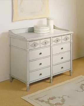

Refreshing Vintage Storage with Beadboard Accents
You don’t need to buy new furniture to get that cozy, cottage vibe. Start by hunting for old favorites. White-painted iron bedsteads are everywhere. They are cheap. They are sturdy. And they fit right into a relaxed aesthetic. Look for open cabinets too. Glass doors or no doors at all let you display dishes and books without clutter.
The real magic happens with wood. Cupboards and armoires with bead-board interiors instantly boost the cottage feeling. It adds texture where you look every day. If your storage doesn’t have it, you can add it yourself.
Here is how to get that look.
Adding Beadboard to Existing Cabinets
You can apply beadboard to the backs or sides of existing shelves. Measure the interior space first. Cut sheets of MDF or PVC beadboard to fit. MDF is cheaper but sensitive to moisture. PVC holds up better in humid kitchens.
Use construction adhesive for a clean hold. Nail it in place if the wood is thick enough. Sand the edges smooth. Paint it white or a soft pastel. The contrast against dark wood frames looks sharp.
Wall Treatments Below the Chair Rail
Beadboard isn’t just for cabinets. Apply it to walls below the chair-rail level. This defines the space. It protects the wall from bumping furniture. It also looks intentional.
- Remove any old wallpaper or loose paint.
- Install the beadboard panels starting from the chair rail down.
- Fill nail holes with spackle.
- Prime and paint the entire section.
This technique works in hallways. It works in mudrooms. It works in kitchens. The vertical lines draw the eye up. They make ceilings feel higher.
Why does this matter?
Modern homes often feel sterile. Beadboard adds history. It adds handcrafted detail. It signals that someone cares about the small things. You don’t need a massive budget for this. You just need a saw, some adhesive, and a can of paint.
Which materials fit your project? MDF is standard. PVC is waterproof. Fiberglass is durable. Pick what suits your room’s humidity.
The result is a space that feels lived-in. Not staged. Not perfect. Just comfortable.
“Texture brings warmth to a room that paint alone cannot achieve.”
Keep building on this foundation. Layer in other vintage finds. Mix patterns. Don’t overthink it. The goal is function with a side of charm.
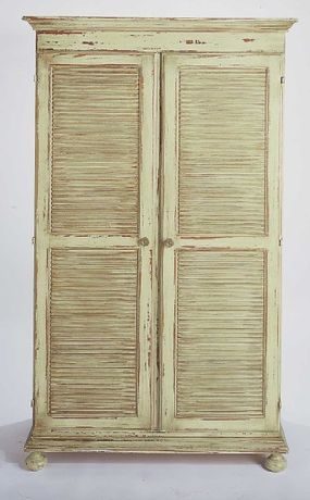

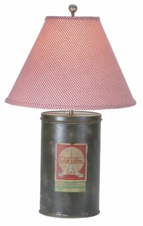

Layer in Soft Textures for Instant Comfort
Start by looking at the floor. A braided rug anchors the space. It’s durable, it’s classic, and it adds a splash of color without feeling permanent. On top of that, throw down a soft chenille throw. The texture is thick. It begs to be touched. This is where you build the foundation of the room’s warmth.
Next, look at the upholstery. You don’t need new furniture. You need old souls with new pillows. Pick up some plump cushions featuring farm-fresh motifs like corn, chickens, or simple wildflowers. They bring a lighthearted vibe. They keep the space from feeling too serious or museum-like.
Display Heirlooms with Purpose
Wall space is valuable. Don’t clutter it. Instead, choose a few treasured old family photos. Frame them simply. Group them together on a single wall or a shelf. The goal isn’t to show off every picture you own. The goal is to create a focal point that invites memory.
“Group a few treasured old family photos, and enjoy the memories.”
Consider adding hand-pieced quilts to the mix. Drape one over the back of a chair. Fold another neatly on the foot of the bed. The patchwork pattern adds visual interest. It also brings in a sense of history. You aren’t just decorating a room. You are curating a story.
Lighting and Final Details
Lighting makes the difference. Swap out harsh overhead bulbs for nostalgically styled lamps. Look for bases that feel aged or textured. The shade should diffuse the light softly. This creates a cozy glow in the evenings. It softens the edges of the furniture.
Check your tools before you start. You’ll need a staple gun for the pillows if you’re re-covering them. A sewing kit is essential for repairing torn quilts or adding appliqué details. Safety first—wear gloves if you’re handling old, dusty fabrics. Dust mites and old lint can be irritating.
Why This Approach Works
This style isn’t about buying the latest trend. It’s about layering what you have. It’s practical. Chenille hides wear. Braided rugs protect hardwood floors. Hand-pieced quilts are reusable and washable. You get a look that feels lived-in. It feels welcoming.
The key is restraint. Too many patterns clash. Too many photos create visual noise. Pick your favorites. Stick to a cohesive color palette. Let the textures do the talking.
Where to Find Materials
You don’t need to shop new. Thrift stores are goldmines for these items. Look for old quilts that may need mending. They are often cheap. The mending process is part of the fun. It connects you to the object.
Online marketplaces are good for specific lamps. Search terms like “vintage brass lamp” or “retro base” work well. Be ready to clean and rewiring them. Safety check is mandatory for any old electrical fixtures.
Common Mistakes to Avoid
Don’t match everything too perfectly. The charm lies in the mismatch. A modern chair can look great with a vintage quilt. The contrast highlights both. Don’t be afraid of the eclectic mix.
Avoid putting too much on every surface. Negative space is important. Let the wall breathe. Let the rug

The old rulebook said country style meant plaid, pine, and heavy floral curtains. That era is over. If you want a home that feels grounded but not dated, you need to strip away the clutter and let the architecture breathe. The trick isn’t to reject the rustic roots. It’s to refine them.
Think of it as editing a manuscript. You keep the best sentences. You cut the fluff.
The Palette: Less is More
Country doesn’t have to be brown. It can be white. Cream. Soft grey.
Start with a neutral base. White walls with natural wood trim. A whitewashed oak floor. This creates a clean canvas. It lets the textures speak without shouting.
Introduce color through accessories, not paint. A sage green cushion. A terracotta vase. These pops of earth tone connect to the outdoors. They feel intentional. Not accidental.
Materials: Texture Over Pattern
Patterns are tricky. A whole room of floral wallpaper feels like a museum exhibit. Instead, focus on texture.
- Linen: For curtains and slipcovers. It wrinkles. It breathes. It looks lived-in.
- Wood: Use raw or lightly oiled wood. Avoid high-gloss finishes. They feel corporate. Matte finishes feel warm.
- Metal: Brushed brass or black iron. Skip the shiny chrome. It’s too sterile for this style.
Mix these materials. A linen sofa with a wooden coffee table. An iron chandelier over a oak dining table. The contrast is what creates interest. Not a matching set.
Furniture: Comfort with Clean Lines
Country furniture used to be bulky. Heavy. Ornate.
Modern country is lighter. It has cleaner lines. Look for pieces with simple silhouettes. A sofa with tapered legs. A dining chair with a slender frame.
You don’t need to buy new furniture. You can update what you have.
- Sand it down. Remove the heavy carving.
- Paint it. White or a soft grey works well.
- Change the hardware. Swap out bulky knobs for simple pulls.
This takes effort. It’s not a weekend project if the piece is large. But the result is worth it. You get the comfort of country with the sophistication of modern design.
Lighting: Warmth is Key
Fluorescent lights kill the mood. They’re practical, sure. But they’re not inviting.
Install dimmers. Always. You should be able to lower the light for dinner. Raise it for cleaning.
Choose warm bulbs. 2700K to 3000K. This mimics candlelight. It makes wood look richer. It makes skin look healthier.
Add layers. A floor lamp in the reading nook. A sconce by the bed. A pendant over the kitchen island. Don’t rely on one overhead light. It’s boring. And it casts harsh shadows.
The Result
You end up with a space that feels like a refuge. Not a showroom.
It’s easy to go too minimal. Or too rustic. The balance is subtle. It’s in the details. The way the light hits the wood grain. The softness of the linen against the hard stone.
“Style is a
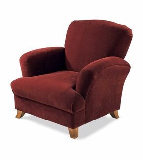

If you want cozy vibes without the visual noise, contemporary country is your move. It takes the soul of old-world craftsmanship and meshes it with how we actually live today. The result feels open. Unburdened. It leans on natural materials, bold but simple lines, and deep, rich colors. Big windows are non-negotiable here—they pull the outdoors in.
This style doesn’t just appear out of nowhere. It borrows heavily from low-slung prairie architecture and mid-century modernism. Think clean geometry. Shaker furniture fits perfectly here because it prioritizes function over fluff. It’s the kind of piece that proves you don’t need ornamentation to have character.
The key is mixing these historic finds with sleek, modern upholstery. You aren’t stuck in a museum. You can take this aesthetic anywhere. It works in a cramped city loft just as well as a sprawling mountain cabin. The clutter-free approach makes it highly adaptable.
How to Achieve the Look
Start by auditing your space. Remove anything that doesn’t serve a purpose or bring genuine joy. Contemporary country thrives on negative space. Let the materials breathe.
1. Choose Natural Materials
Wood is king. Look for pieces with visible grain. Stone accents add texture. Avoid overly processed, synthetic-looking surfaces. The goal is authenticity.
2. Invest in Quality Upholstery
Pair rustic wood frames with clean-lined sofas. Think linen, cotton, or high-quality leather. Stick to solid colors or subtle patterns. Avoid busy prints that compete with the architecture.
3. Prioritize Light
Maximize natural light. Use minimal window treatments. Sheer curtains work well if you need privacy without blocking the view. The connection to the outdoors is essential.
4. Select Simple, Functional Furniture
Look for pieces with strong silhouettes. Shaker-style tables and chairs are ideal. Mid-century modern chairs also work well. The rule is simple lines. Complex carvings or ornate details should be avoided.
Why This Style Works
It’s rooted in American practicality. There’s a freedom in this aesthetic that feels distinctly national. It’s not about showing off. It’s about living well. The style respects the past without being trapped by it.
“A look this clean and uncluttered is as much at home in a city apartment as in a mountain lodge.”
This flexibility is its greatest strength. You aren’t limited by location or budget. You can start small. A single Shaker chair in a modern room can shift the entire vibe.
Where to Start
Begin with the basics. Clear the clutter. Then, add one or two statement pieces. A wooden dining table. A simple sofa. A few natural fiber rugs. Build from there.
The style is about ease. It’s meant to be lived in, not just looked at. If it feels too stiff, you’ve added too much. If it feels chaotic, you’ve added too much stuff. Find that middle ground.
Further Exploration
For more specific applications of this aesthetic, consider these areas:
- Cabin Decor: How to maintain the rugged charm without sacrificing comfort.
- Modern Decor: Integrating sleek elements into traditional spaces.
- Window Treatments: Maximizing light and views with
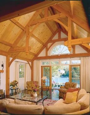
The view is the headline. Living right on the water is a rare catch. You pay for that sightline. But the real story happens indoors. It has less to do with the exterior and more with the choices made inside. The architecture and furnishings work together. They create a fresh country style. It’s casual. It’s modern. Yet it feels familiar. Comforting.
This isn’t about copying a specific coastal cottage. It’s about elements you can find anywhere. Look at the walls. Plain white. Clean. Add exposed beams. Barnlike. Timeless. They anchor the space without shouting for attention.
How to achieve a timeless white kitchen with character
The kitchen needs to breathe. White cabinets. White walls. But don’t let it feel sterile. Enliven it. Start with the counter stools. Don’t buy the generic bar stool. Look for something with character. Distressed wood. Wrought iron. It adds texture. It breaks up the monochrome.
Lighting matters just as much. Playful fixtures. Maybe a pendant light with a unique shape. Or a chandelier that draws the eye upward. It keeps the room from feeling static.
Selecting enduring oak furniture for dining areas
Move to the larger dining area. This is where the family gathers. Oak furniture is the answer. It’s sleekly styled. Clean lines. But it retains warmth. Wood grain tells a story. It ages well. Unlike particle board or veneer, solid oak stands the test of time.
Why does this combination work? Because it balances opposites. Hard wood against soft light. Open space against cozy textures. The result is a home that feels lived-in but not cluttered. You can replicate this. Start with the walls. Paint them white. Find beams. Or simulate the look with trim. Then focus on seating. And lighting. Those are the levers you can pull.
The goal isn’t a museum. It’s a place you actually want to sit.
Safety first when handling wood. Sanding creates dust. Wear a mask. Use proper ventilation. If you’re painting, low-VOC options exist now. They smell better. They’re safer for your lungs.
The style is accessible. You don’t need a huge budget. You need intention. Pick one area. The kitchen. Or the dining room. Strip it back. White walls. Natural wood. A few standout pieces. That’s the recipe.
Does the view make the renovation? No. The details do. The stool you chose. The beam you exposed. The light you hung. These small choices add up. They create the atmosphere. The water is just the backdrop. The real work is inside.
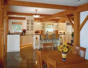

Mixing Silhouettes for Lasting Comfort
You don’t need to choose between vintage charm and modern minimalism to create a living room that feels both styled and lived-in. In fact, blending these contrasting styles is often what stops a space from feeling sterile. Take the approach of pairing conventional easy chairs with a large, modern sectional. The key is to find contemporary pieces that retain warmth. Look for sleek simplicity rather than cold industrial lines.
Add glass-topped porch tables to the mix. The transparency of the glass keeps the visual weight low, allowing the bulk of the sectional to remain the focal point without crowding the floor plan. This combination achieves a timeless livability. It is functional for movie nights and formal enough for guests. The goal is a room that looks intentional but invites you to sink in.
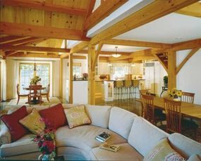

Country Style, But Make It Clean
You want that rustic charm without the dust bunnies. The next wave of decorating leans into a country vibe that feels cool, clean, and surprisingly fresh. It is not about swapping your plaid for plastic. It is about refining the aesthetic. Think less “grandma’s attic” and more “modern farmhouse with a pulse.”
If you are hunting for specific angles, the path splits early. You might need cabin decor ideas if you are dealing with heavy timber or stone walls. Maybe you lean harder into modern decor ideas to cut the visual weight. The goal is balance.
Where to Start Your Refresh
The trick is in the textiles and the light. Window treatment ideas are your first line of defense against clutter. Swap heavy, dark drapes for linen sheers or clean white blinds. Let the light in. It changes the entire temperature of a room.
Kitchens and Dining Rooms
Your kitchen decorating ideas should prioritize open shelves over closed cabinets if you can handle the visual noise. Use simple white ceramic canisters. Clear glass jars. Nothing with a label. The dining room decorating ideas that follow this logic usually involve a natural wood table paired with unexpected chairs—maybe metal or upholstered in a solid, cool tone.
Sleeping and Working
Bedroom decorating ideas under this theme strip away the pattern. Solid color bedding. A simple wood headboard. The bathroom decorating ideas focus on natural stone or large format tiles that reduce grout lines. It looks bigger. It looks cleaner.
Don’t forget the home office decorating ideas. A clean desk surface reduces stress. The home spaces you inhabit directly affect how you work.
The Core Concept
This is interior decorating at its most functional. It is not just about looking good in a magazine. It is about creating spaces that feel breathable.
“A clean country style isn’t empty. It is edited.”
Where to Look Next
You do not have to reinvent the wheel. There are established paths you can follow if you get stuck:
- Cabin Decor Ideas
- Modern Decor Ideas
- Window Treatment Ideas
- Decorating Ideas
- Kitchen Decorating Ideas
- Dining Room Decorating Ideas
- Bedroom Decorating Ideas
- Bathroom Decorating Ideas
- Home Office Decorating Ideas
- Home Spaces
- Interior Decorating
Pick one. Start there. The rest will follow.

Balancing Simplicity and Soul in Country Design
The fresh country aesthetic works because it stops fighting itself. It finds a middle ground between the austere simplicity of the past and the clean lines of today. Both eras share a strict adherence to the rule that form follows function. This doesn’t mean your space has to feel cold. It just means there is no room for clutter or decoration that serves no purpose.
You can mix furniture from vastly different time periods without breaking the vibe. The key is sculptural presence. A piece from the 1790s can sit comfortably next to one designed in the 1990s. It is all about lines and structure.
Early American Shaker style is a classic example of this timelessness. Its durability and clean geometry span centuries. But it is not the only option. Hearty Mission pieces bring a grounded weight. Prairie style adds horizontal drama. Arts and Crafts furniture offers handcrafted texture. These styles from the early 1900s hold their own. They create a timeless atmosphere that feels intentional rather than accidental.
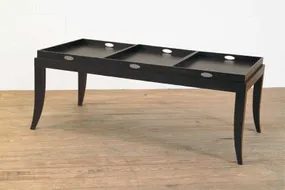

Embracing the Glamour of Art Deco and Art Moderne
You don’t need a mansion to channel the sleek, geometric spirit of the 1920s and 1930s. Art deco and art moderne styles are all about stripping away the fluff. They add glamour without the clutter. The trick is to keep backgrounds cool and clean. Think whites, greys, and muted tones. This creates a crisp canvas for bolder accents.
If you’re looking for how to incorporate art deco design elements into a modern home, start with geometry. Sharp lines. Symmetrical patterns. Metallic finishes. These are the hallmarks of the era. But don’t overdo it. One statement piece is enough. A velvet sofa in emerald green. A chandelier with clean, linear lines. The rest of the room should recede.
Adding Global Eclectic Elements
Today’s world is connected. You can pull inspiration from anywhere. This is where eclectic decor comes in. It’s not about matching everything. It’s about mixing textures, origins, and histories. But there’s a fine line between curated and chaotic.
The next section covers practical advice for an eclectic decorating style. The goal is balance. Take a piece from one culture. Pair it with something from another. Make sure they share a common thread. Color? Material? Mood? Without a unifying element, it just looks like junk.
Where to Find Inspiration
If you want to dig deeper into specific styles, here are some targeted areas:
- Cabin Decor Ideas – For rustic, natural textures.
- Modern Decor Ideas – To contrast or complement eclectic mixes.
- Window Treatment Ideas – Crucial for setting the light and mood.
- Kitchen Decorating Ideas – Where function meets aesthetics.
- Dining Room Ideas – Perfect for showcasing statement pieces.
- Bedroom Decorating Ideas – Focus on calm and comfort.
- Bathroom Decorating Ideas – Small spaces, big style potential.
- Home Office Decorating Ideas – Productivity through design.
The Eclectic Country Vibe
Eclectic country takes the global mix and grounds it. It’s warmer. Rougher. Think worn wood. Woven textiles. Hand-thrown pottery. It’s less about the shine of art deco and more about the history in the grain. You can blend this with sleek modern pieces for a striking contrast. Or lean fully into the rustic. Just remember to keep the base neutral. Let the eclectic pieces pop.
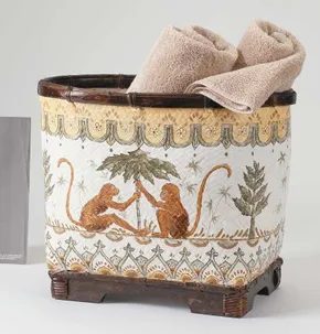

Creating Eclectic Country Style
Want a country look that actually feels alive? Stop copying the catalogs. Go eclectic. It is not about having everything in the house. It is about curating a specific vibe that pulls from everywhere and nowhere.
America has always had these global threads. You see them in the old photos. Paisley shawls draped over chairs. Oriental rugs under antique chairs. Chinese porcelain on a mantel. African mahogany cabinets holding the good silver. We have been importing these treasures for centuries via seafaring ships.
But here is the difference between then and now. The Victorians bought things to show off their wealth. They cluttered every surface. They wanted to prove they could afford the exotic. Today’s eclectic country style is different. It is not about acquisition. It is about selection.
You pick pieces you genuinely love. From several eras. From several cultures. Then you arrange them so they do not fight each other.
The goal is a livable, balanced look. Not a museum. Not a storage unit.
Think of it as a conversation between objects. Take pottery from Asia. Set it on a plain Shaker table. The simplicity of the Shaker wood lets the pottery speak. Add a dhurrie rug from India under a modern serpentine sectional. The clean lines of the sofa keep the heavy pattern of the rug from overwhelming the room.
Use sari-silk pillows on a simple sofa. Hang basketry from Africa on a white wall. Pair it with an antique armoire that has seen some wear. The wear adds history. The silk adds color. The global village feels like home when you mix these textures intentionally.
This style is worldly. It is whimsical. It requires a steady hand. You have to know which piece anchors the room and which one is just there for the eye to rest on.
In the Mix
Mixing styles is not as hard as it looks. You just need a plan.
Start with a base. A neutral wall. A solid wood floor. This gives your global pieces room to breathe.
Then add the anchors. A large piece of furniture. An antique armoire. A modern sofa. Something substantial.
Layer in the accents. The shawls. The pillows. The rugs. These are the colorful bits that tell the story.
Do not spread them out evenly. Cluster them. Put the African basket next to the Indian rug. Let them share space. Create a vignette.
Consider the era. Mix a 1920s vase with a 1990s lamp. The contrast creates interest. If everything matches, the room feels static. Static rooms are boring.
Think about function. You live in the space. The pillows must be soft. The rug must be durable. The table must hold your coffee without wobbling. Beauty without utility is just decoration. Utility without beauty is just a tool. You need both.
This approach works in any room. Try it in the kitchen. A colorful textile behind the open shelves. A unique bowl for fruit on the counter. In the bedroom. A hand-woven throw at the foot of the bed. A vintage mirror on the wall.
The key is restraint. Pick three global influences. Maybe Asia, Africa, and India. Stick to those. Do not add a third or you lose the thread.
Start small.
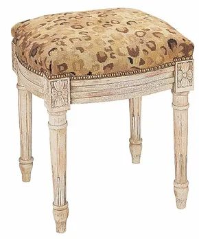

Blending Eras for a Globally Aware Country Look
Country style isn’t a monolith. It shifts depending on where you are in the world. But the core DNA remains the same. Simple. Relaxed. Close to the earth. It’s about syncing with basic rhythms. You don’t need a farmhouse in Vermont to get this vibe. You just need to strip away the noise.
To hit that eclectic sweet spot, you have to mix things up. Don’t stick to one decade or one culture. Pull favorites from different eras. Layer in influences from across the globe. Designers used to call this “worldly.” Now it’s “globally aware design.” It sounds fancier, but the work is practical. You are editing hard. The combinations must be dramatic but clean. No clutter. Just intentional contrasts that feel natural, not forced.
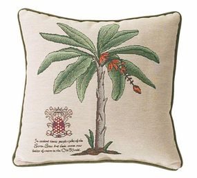

Dark, colonial Caribbean aesthetics offer a romantic, moody take on 18th-century elegance. It’s heavy on drama. But if that feels too intense, the Arts and Crafts style provides a sturdier, more grounded foundation. Think clean lines and honest materials.
To push the exotic vibe further, layer in wicker and rattan. These natural textures break up the darkness. Add Asian artifacts for that global traveler’s touch. It’s about curated chaos, not clutter.
For a chic counterpoint, use sophisticated modern fabrics. Timeless stripes work well. So do faux-animal prints on classic silhouettes. It keeps the room from feeling like a museum.
Bring in colorful art furniture. Bright handcrafted accessories add life. This is how you build a world you actually want to inhabit.
New Traditional
The New Traditional style is a safe bet for homeowners who want elegance without the stiffness. It blends classic elements with contemporary comfort. Start with a neutral base. Walls in warm whites or soft grays. Floors in hardwood or stone.
Then, layer in traditional furniture. A Chesterfield sofa. A mahogany desk. But keep the upholstery modern. Performance fabrics that can handle real life.
Add architectural details. Crown molding. Wainscoting. These define the space without overwhelming it.
Lighting is key. Use chandeliers with clean lines. Avoid ornate crystal. Think brushed nickel or matte black.
Mix in some natural textures. Jute rugs. Linen curtains. Wood accents. This prevents the look from feeling too cold.
Artwork should be timeless. Landscapes. Abstracts with muted colors. Avoid anything too trendy.
The goal is a home that feels collected over time. Not staged for a magazine.
DIY Tips for a Polished Look
You don’t need a designer budget to pull this off. Start with paint. It’s the cheapest way to change a room’s mood. Choose a color that complements your existing furniture.
Sand and refinish old pieces. A coat of stain can transform a dated sideboard. Use sandpaper with decreasing grits. 80, then 120, then 220. Wipe down between coats.
Install hardware. New knobs and pulls can update cabinets and drawers instantly. Measure carefully. Drill pilot holes to avoid splitting wood.
Add trim. Crown molding or chair rails add dimension. Use a nail gun for speed. Caulk the seams. Paint everything the same color as the walls for a subtle effect.
Layer textiles. Throw pillows. Blankets. Rugs. Start with a large area rug in a neutral tone. Add smaller rugs on top for texture.
What Materials Work Best?
Wood is the backbone of New Traditional decor. Oak, maple, walnut. All work well. Stick to solid wood for furniture. It lasts longer.
For upholstery, choose durable fabrics. Velvet is luxurious but can show wear. Linen is breathable but wrinkles easily. A cotton-linen blend offers a good middle ground.
Metal accents add sophistication. Brass. Bronze. Iron. Use sparingly. A few lamps. A mirror frame. Don’t overdo it.
Glass is another option. Table tops. Vases. Mirrors. It adds lightness to heavy wood furniture.
Stone works for accents. Marble trays. Granite countertops. It adds a touch of luxury.
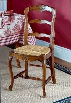
The Roots of Refined Country Style
The founders of this country didn’t just talk about land. They loved it. It was in their bones. That deep connection to the earth shaped how they built their homes. And it shapes what we call “country style” today. It’s not rustic or rough. It’s symmetrical. It’s graceful. It’s elegant.
You see it in Georgian and Federal designs. These styles exploded during the Revolutionary War era. They still dominate our aesthetic preferences now. Why? Because they borrow heavily from ancient Greek democracy. Order. Proportion. Balance.
Think about the 18th century. You had Queen Anne. Sheraton. Hepplewhite. Chippendale. Duncan Phyfe. These aren’t just names. They are blueprints for restraint.
Materials That Speak Volume
The materials tell the story. Deep cherry wood. Rich mahogany. You don’t need to overthink these choices. They ground the space. They feel heavy in the right way.
Fabrics matter too. Damask. Velvet. These aren’t flashy. They are textured. They absorb light. They add depth without shouting.
Silver tea sets sit on the table. Not plastic. Not stainless steel that looks like cheap kitchenware. Real silver. It reflects the room. It signals that someone cares about the ritual of drinking tea.
Gilt-framed mirrors hang on the walls. They catch the light from the fireplace. They make small rooms feel larger. But they also add a touch of gilt. A hint of gold. It’s restrained luxury.
White-painted trim frames everything. Doors. Windows. Baseboards. The white pops against the dark woods. It creates contrast. It feels clean. It feels well-bred.
Elegant, Not Stuffy
Here is the trap. People think “elegant” means “stuffy.” They think you can’t relax in a room with gilt mirrors and velvet chairs. That’s wrong.
Elegant doesn’t mean you can’t live there. It means the space has rules. Symmetry is one rule. Proportion is another. But comfort is the goal.
The furniture is sturdy. The fabrics are durable. The wood is solid. You can sit down. You can put your feet up. The elegance comes from the history. Not from fragility.
This style works for DIYers who want to restore old pieces. Refinish a mahogany desk. Polish the silver. Hang a mirror with a gilt frame. It’s accessible. It’s classic. It’s timeless.
Why chase trends when you can anchor yourself in something that survived centuries? The land loved the founders. The land still loves the style they left behind.
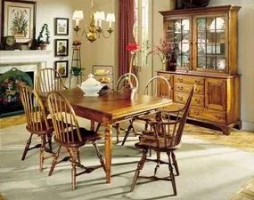
The Weight of History in Light Colors
Wall color does half the heavy lifting. Go historical.
Pastels that lean toward the bright side. Or deep jewel tones. Sapphire. Emerald. Burgundy. These aren’t just paint swatches. They set a stage.
The furniture you place against them needs to match that gravity. Think heirloom quality. Antique finishes. Classic lines. The result is a room that feels both urgent and old. It’s neoclassical. It’s classical.
And it’s not a coincidence. The aesthetic roots go deep. It’s the spirit of the founding era. That kind of style doesn’t fade. It persists.
Finding the Right Historical Vibe
When you’re tackling historical home decor, the goal isn’t museum precision. It’s spirit.
Bright pastels work because they mimic the light filtering through old windows. They feel airy but grounded. Jewel tones add drama. They make the space feel intimate. Like a parlor in 1776.
The furniture anchors the look. You’re not buying reproduction kits. You’re looking for pieces that could have survived two centuries. Solid wood. Hand-carved details. Patina.
This combination creates a timeless interior design that resists trends. Fast-moving modern decor feels cheap next to it. Historical accents hold their value. Literally and aesthetically.
Why This Style Endures
People ask why this look sticks. It’s because it’s rooted in structure.
Neoclassical design borrows from Greece and Rome. Symmetry. Proportion. Order. Classical styles add warmth. Wood tones. Textiles. The blend is stable.
It’s not about copying a specific year. It’s about capturing the gravity of that era. The “spirit of ’76” refers to the revolution in thought. The break from the overly ornate rococo that came before.
Cleaner lines. More light. A sense of civic virtue in the home.
That’s why it works today. We want homes that feel permanent. Not disposable.
Where to Start
You don’t need to gut your house. Start with the walls.
Pick a primary color. Keep it saturated. If you go pastel, don’t let it get muddy. It needs to shine.
Then, bring in the heirloom-inspired furniture. Look for:
– Solid wood frames
– Tufted upholstery in rich fabrics
– Brass or gold leaf accents
Avoid particle board. Avoid plastic. The materials matter. The history is in the weight of the object.
This approach transforms a standard room. It becomes a place with memory. Even if you’re building it from scratch.
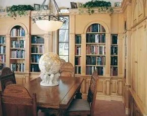
How Early American History Shaped Modern Home Design
You think rustic is just about plaid and worn wood. It’s not. The “fresh county” vibe—casual, sure, but layered with quiet sophistication—has deep roots. It isn’t accidental. It’s a direct result of what happened right after the Revolution.
When the smoke cleared, the elite had more than just land. They had time. Thomas Jefferson and Benjamin Franklin didn’t just fight a war. They studied Europe. They traveled. They absorbed the old-world aesthetics of classical architecture and brought it back to their American estates. This wasn’t just decoration. It was a statement of culture.
If you look at homes from that late Colonial and Federal era, you see the impact. The design owes a massive debt to those European influences. It’s not loud. It’s structural.
The elegance comes from the bones of the house. Look for these specific architectural markers:
- Arched alcoves and cabinet openings. These aren’t just pretty details. They create a graceful mood in the room. They draw the eye and add depth without clutter.
- Coffered ceilings. This is the hallmark of classic dignity. The recessed panels add texture and height. They signal that the space was built with intention.
How do you translate this to your own renovation? You don’t need a fortune. You need to respect the proportions.
DIY Tips for Incorporating Classical Elements
You can’t fake the history. But you can mimic the geometry.
If you’re looking to update a room with this aesthetic, start with the ceiling. A coffered look can be achieved with lightweight foam panels if you’re on a budget. Paint them a flat, matte finish. Avoid gloss. It kills the historical accuracy.
For the arches, you don’t need masonry. Use drywall. Build a simple wooden frame. Curve the edges. Tape and mud it until it’s smooth. Prime and paint it in a soft, muted tone. The goal is subtlety. The shape does the talking.
Why does this matter? Because it anchors the room. Without those architectural features, your “rustic” decor can feel chaotic. It’s just stuff on a wall. With an arched niche or a coffered ceiling, the space has a narrative. It has history.
It’s about creating a backdrop. Let the architecture speak first. Then, add the comfort. The result is a home that feels both lived-in and timeless.
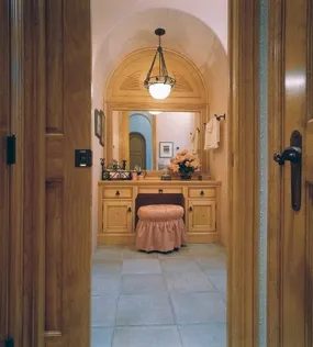

The aesthetic of a true grand country house isn’t just about square footage. It’s in the details. Specifically, the carved plasterwork that crowns the rooms. Limestone floors underfoot. Hardwood floors that have seen generations of footsteps. Cabinetry crafted from the finest woods, where every joint is tight and every finish is flawless. These elements combine to create a timeless impression. The house doesn’t just look old. It looks expensive. And importantly, it looks permanent.
With this level of exquisiteness, the property feels less like a relic and more like a legacy. It has a future as impressive as its past. You don’t just live in it. You inhabit a piece of history that refuses to fade.
For more decorating ideas, see:
-
Cabin Decor Ideas
-
Modern Decor Ideas
-
Window Treatment Ideas
-
Decorating Ideas
-
Kitchen Decorating Ideas
-
Dining Room Ideas
-
Bedroom Ideas
-
Bathroom Ideas
-
Home Office Ideas
-
Home Spaces
-
Interior Decorating
American Rustic
The style leans heavily into authenticity. It’s not about faking age. It’s about honoring the materials. When you walk through these spaces, you’re interacting with stone and wood that have been shaped by human hands. The plasterwork isn’t mass-produced. It’s carved. There’s a rhythm to it. A human error in the best possible way.
Limestone adds weight. It grounds the space. Hardwood brings warmth. The cabinetry ties it together. This isn’t just decoration. It’s construction. It’s architecture. And it’s built to last.
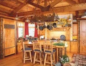

The Evolution of American Rustic Design
The pioneers didn’t have catalogues to order furniture from. They had axes. They had whatever timber fell within reach. This necessity birthed an aesthetic that still defines how many of us view a “home.” It wasn’t about luxury. It was about survival. And that raw, unpolished energy is exactly what drives the modern country style trend today.
You might think rustic design is static. A dusty log cabin forever frozen in 1890. But look closer. The style shifted as the frontier moved west. It started in the wood-heavy east. Then it traveled to the open plains of Michigan and the arid expanses of Colorado and California. Each region adapted the look to its environment. The result isn’t a single look. It’s a collection of regional responses to harsh conditions.
Today, you don’t need a homestead to capture this vibe. You just need to pick a lane.
Choosing Your Regional Anchor
The first step in achieving authentic American rustic style is deciding which history you want to echo. There are three main paths.
- The Cozy Log Home: This is the classic. Think heavy timber, chinking between logs, and a stone fireplace that dominates the room. It works best if you have high ceilings. It feels enclosed. Safe.
- The Prairie Farmhouse: This style spread across the Midwest. Key feature? The porch. Big, wide, welcoming. Inside, you want space. Not clutter. These homes were built for wind and wide horizons. The interior should reflect that openness.
- Southwest or Native American Motifs: As the boundary moved west, materials changed. Adobe. Clay. Bright textiles. If you live in or near the Southwest, this is your anchor. It’s about earth tones. Red dirt. Sky blue. Patterns that tell a story.
Materials and Textures That Work
You don’t need antiques. You need the right textures. The goal is reassurance. A feeling of being grounded.
- Walls: Whitewashed walls are non-negotiable for many rustic styles. They brighten up dark timber frames. They reflect light. They make small spaces feel larger without losing warmth.
- Furniture: Rough pine. Not polished. Not sleek. You want to see the grain. You want to feel the knots. This is furniture that has been used. Scratches are part of the charm.
- Fabrics: Cheerful. Bold. If your walls are white and your wood is brown, your fabrics should pop. Think cotton. Wool. Patterns that mimic nature or traditional motifs.
- Artifacts: Heirlooms. Not mass-produced replicas. A piece of furniture passed down. A quilt made by a grandparent. These items carry weight. They anchor the room.
How to Start Your Rustic Renovation
You don’t need to tear out walls to start. You can layer this style.
Start with the largest surface. The walls. If you have painted drywall, consider a whitewash or a limewash finish. It’s cheaper than wood paneling. It’s easier to apply. It ages gracefully.
Next, look at your wood. If you have laminate countertops, that’s a problem. Swap them for butcher
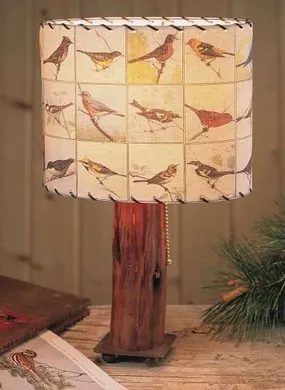

That lingering sense of pride you feel when you walk into a room styled like an early American home? It isn’t just nostalgia. It’s dignity. The simplicity of those lives wasn’t a lack of options; it was a choice of substance over spectacle. And honestly, that aesthetic never goes out of style because it’s built on honesty. You can’t fake the wear of real wood or the patina of age.
### Restoring the Big Sky Country Vibe
We’re talking about Big Sky Country decor now. Specifically, that wide-open, rugged feel you get from places like Montana. It’s not just about putting a cowboy hat on the wall. It’s about capturing the scale of the landscape inside your living room.
Start with the floors. If you have original wide-plank pine, don’t sand it down to a sterile white. Keep the knots. Keep the nail holes. They’re history. If you’re installing new floors, go for reclaimed barn wood or hickory. Hickory is hard. It takes a beating and still looks good.
For windows, skip the heavy velvet drapes. They kill the light and the view. Instead, use simple linen curtains in off-white or oat. Let the sunlight hit the floorboards. You want the room to feel like it breathes.
“The goal isn’t perfection. It’s authenticity. A scuff in the floor tells a story better than a pristine surface ever could.”
### Materials That Last
You don’t need to buy antique furniture to get this look. You can build it yourself.
- Wood: Stick to solid hardwoods. Oak, maple, or walnut. Avoid particle board for visible pieces. It swells with humidity and looks cheap after two years.
- Metals: Wrought iron or black steel. Look for items with hand-forged textures. Smooth, machined metal feels too modern.
- Textiles: Wool, cotton, and linen. Synthetics trap heat and look shiny. Natural fibers matte out and age gracefully.
If you’re doing your own renovation, start with the structural elements. Exposed beams? Good. If you don’t have beams, build faux ones with dimensional lumber. It’s cheaper than salvaging old timber and just as convincing if you stain them correctly.
### Lighting and Atmosphere
Electricity didn’t exist for most of that early American period, so their lighting was warm and flickering. Replicate that with your bulbs. Use 2700K or lower. Anything cooler feels sterile.
Hang a simple wrought-iron chandelier or a set of candle-style sconces. If you’re wiring the house, consider dimmers on almost every circuit. You want to be able to shrink the space at night.
### The Modern Twist
This isn’t a museum. You still need to live in it. So, mix in some modern comforts quietly.
- Kitchen: Keep the open shelving but use sleek, stainless steel appliances. The contrast works.
- Bathroom: Stone vanities are key. Pair them with matte black fixtures. No glossy white porcelain here.
- Office: A solid oak desk. A leather chair. Good light.
Don’t clutter the space. Early American homes were functional. Every
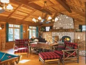

You don’t need a cabin in the Rockies or an old farmhouse in the Appalachians to get that specific cozy, outdoorsy vibe. The secret isn’t location. It’s about curating a few specific elements that mimic the feel of being close to nature.
Let the View Lead
Start with the windows. In a rustic setup, heavy drapes or complex valances fight against the aesthetic. They clutter the walls and distract from whatever you are trying to showcase.
Keep treatments strong and simple. Or skip them entirely.
If you have a decent view of trees or hills, let it dominate. Bare glass or simple linen shades work best. This approach keeps the focus outward. It blurs the line between inside and out. That is the core of the style.
The Fireplace Anchor
A fireplace anchors the room. It provides focal point and warmth—both physical and visual.
Ideally you want a wood-burning stove or masonry hearth. The crackle of real fire adds texture and sound that electric or gas units can’t fully replicate.
But if you live in an apartment or just don’t have the infrastructure, don’t stress. A gas insert works. It provides the visual comfort of a flame without the hassle of wood storage.
The Candle Alternative
Sometimes you don’t even need a real fireplace.
“Make do with a decorative shell in which you burn an array of sizable pillar candles in varying heights.”
This is a valid rustic strategy. Think of it as a “fireplace shell.”
You need a deep hearth or a sturdy tray. Then arrange pillar candles of different heights. The variation in scale creates visual interest. It mimics the uneven, organic nature of a real fire.
This method is safer than a live flame. It requires less maintenance. And it still delivers that warm, flickering glow that defines rustic comfort.
Just keep an eye on any source of live flame. If you go the wood or gas route, safety protocols are non-negotiable. Smoke detectors. Clearances. Ventilation.
The goal is warmth. Not a house fire.
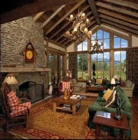

You don’t need structural integrity to get that rugged, exposed-beam aesthetic. Modern lightweight fiberglass beams mimic the look of heavy timber without the cost or labor of cutting into your ceiling structure. It’s a shortcut that actually holds up.
The Timber Illusion
When you pair faux beams with furniture, the material choice defines the room’s character. Strong-grained oak or pine offers a classic, grounded foundation. But if you want to push past the standard, look at unpeeled pole wood or rattan. The rough texture adds immediate visual weight. It feels like the cabin is part of the forest, not just built within it.
“Don’t overlook the appeal of unpeeled pole or rattan for an authentic, rustic vibe.”
Curating the Golden West Style
To nail this specific regional aesthetic, you need to curate carefully. It’s not just about old wood. It’s about the interplay of natural materials and rugged functionality.
Where to Start Your Search
You can find inspiration in several specific decor categories. If you’re stuck, these areas provide the best blueprints:
- Cabin Decor Ideas: Look for the heavy use of stone and raw wood.
- Modern Decor Ideas: See how minimalism can coexist with rustic elements.
- Window Treatment Ideas: Sheer curtains or heavy drapes can change the light.
- General Decorating Ideas: Broad principles of layout and flow.
- Kitchen Decorating Ideas: Focus on durable surfaces and open shelving.
- Dining Room Ideas: Large, sturdy tables are non-negotiable here.
- Bedroom Ideas: Cozy textiles against hard wood surfaces.
- Bathroom Ideas: Natural stone and wood accents for warmth.
- Home Office: Functional spaces that don’t feel sterile.
- Home Spaces & Interior Decorating: The overarching philosophy of mixing textures.
The goal is cohesion. The fiberglass beams blend into the ceiling while the furniture grounds the eye. It’s a balance of fake and real that works because it feels intentional.
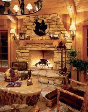
The California Ranch Aesthetic
This isn’t your standard living room. It’s a pool house on a large estate, but the blueprint is versatile enough for a suburban family room or a rustic cabin getaway. The vibe is California ranch style updated with a modern country sensibility. It pulls from the Old West without feeling like a costume party.
What works is the balance. The design is vigorous but understated. It respects tradition while keeping things lighthearted. The key ingredient? Peeled-cedar furniture.
Material Matters
The wood does the heavy lifting here. Peeled cedar has a distinct texture and scent that grounds the space. It’s natural, warm, and ages well in humid pool-side environments. But it’s not just about the wood.
Branded accents add character without shouting. Think subtle logos or hardware details that hint at heritage ranch wear. The look is specific. It’s not over-the-top western. It’s refined.
The goal is to honor the ranch aesthetic without leaning into caricature.
How to Replicate the Look
You don’t need an estate to pull this off. Start with the materials. Look for solid cedar pieces. If that’s out of budget, high-quality pine with a distressed finish works for a weekend project.
- Source the wood. Cedar resists rot. Pine needs sealing.
- Choose accents carefully. Avoid large, obvious logos. Go for subtle branding on leather or metal.
- Keep the color palette muted. Earth tones dominate. Add brightness through textiles, not paint.
Why This Style Endures
It’s practical. The open layout suits both entertaining and relaxing. The materials are durable. And the style doesn’t scream for attention. It just sits there, looking good.
The trick is restraint. Too many western motifs and it becomes a theme park. Too few and it’s just a generic room. The sweet spot is in the details. The peeling of the cedar. The stitching on the leather. The way the light hits the wood.
It’s a mood, not just a decoration. Can you build that mood yourself? Sure. Just don’t overdo it.
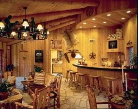
Small Iron Details Make a Big Impact
You don’t need a massive budget to change a room’s personality. Just a few well-placed wrought-iron accents can do the heavy lifting. The key is scaling. If the pieces are too big for the space, they overwhelm. If they are too small, they get lost. Get the size right and you get punch.
This works because the overall aesthetic stays restrained. It creates a blank canvas. Into that quiet background, you can drop bold items without the room feeling cluttered or chaotic. Consider a life-size Native American statue. Or a tom-tom used as a coffee table. In a chaotic space, these might read as kitschy. They might feel like a theme gone wrong. But in a calm, neutral setting, they become delightful focal points.
The contrast is what matters. The iron provides structure. The cultural artifacts provide soul. Together, they stop the room from looking like a showroom. They look lived-in. They look intentional.
Get the size right and you get punch.
It is not about having the most expensive furniture. It is about curating pieces that speak to each other. The iron ties the room together. The unique items make it yours.
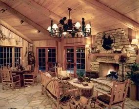

Stop buying the fake stuff. You know the stuff. Those plastic “rustic” plaques and distressed wooden signs that smell like cheap varnish and bad decisions. Tourist traps are full of them. They clutter up spaces and make every room look like a hotel lobby trying to play cowboy.
The owners of this home resisted that urge. They didn’t buy the kits. They didn’t go for the easy, soulless route. Instead, they chose stone. Real texture. Real weight. The result isn’t just a room; it’s a statement. It has personality because the materials have history.
If you are looking for cabin decor ideas that actually feel lived-in and not staged, you need to look at hardscaping. Specifically, how you handle natural materials indoors.
The Appeal of Natural Stone
Why do people love stone veneer? It’s not just about aesthetics. It’s about permanence. Wood rots. Paint peels. Stone sits there, indifferent to humidity, indifferent to your mood.
For a homeowner interested in modern decor ideas or traditional kitchen decorating ideas, stone offers a neutral but dynamic backdrop. It doesn’t shout. It hums.
But installing it is not a weekend project for the faint of heart. It requires precision. It requires patience. And it requires understanding the difference between a real stone and a manufactured veneer.
Choosing the Right Material
Before you swing a hammer, you need to pick your stone. This is where most DIYers mess up. They buy the cheapest option and end up with gaps that look like mistakes.
Here is what you need to consider:
- Natural Stone: Cut from the earth. Heavy. Expensive. Unique. Each slab is different. You need a strong floor. You need a strong backer board.
- Manufactured Veneer: Made from concrete and pigments. Lighter. Cheaper. Consistent. Easier to cut. Looks good if you are honest about what it is.
- Thin Brick: A hybrid. Real clay, but sliced thin. Great for accents. Harder to source in large quantities.
For a bedroom decorating ideas project, you might want something softer. A warm limestone or a sandstone veneer. Avoid the stark gray slate if you want a cozy vibe. It will look like a morgue.
Tools You Actually Need
Don’t show up with a rubber mallet and hope for the best. You need specific tools for stone installation.
- Notched Trowel: A 1/4-inch by 3/8-inch square-notched trowel is standard. It ensures enough adhesive for a strong bond.
- Wet Saw: If you are using natural stone, you need a diamond blade. Dry cutting creates too much dust. It’s bad for your lungs and bad for your finish.
- Level: Long. At least two feet. Stone is not straight. Your lines won’t be straight unless you force them to be.
- Rubber Float: For spreading thin-set mortar evenly.
- Mixing Paddles: A drill-mounted paddle mixer. Mixing by hand is a nightmare. You will get lumps. L
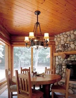

Why Fieldstone Works for Country Style Renovations
Fieldstones have a specific gravity to them. You can’t fake that weight. They were rounded by nature, smoothed by thousands of years of river currents or glacial movement. That history shows in the texture. They are not quarried blocks. There are no sharp edges to chip off during transport. Just organic shapes that fit together like puzzle pieces.
Homeowners in New England know this stuff well. It is in the landscape. But you do not need to be in the Northeast to use it. Fieldstone brings that fresh country style to modest cottages and grand estates alike. It is fireproof. It is timeless. Which makes it a practical choice for any renovation project.
Bathroom Applications
Look at the bathroom example. The stones are embedded almost to mortar level. This creates a nearly flat platform. It surrounds the tub. The surface is smooth enough to walk on but retains the stone’s character. It is not a slab. It is a collection of individual stones working together.
This technique requires precision. You have to set each stone at the same depth. The mortar behind them acts as a base. The visible part is just the stone. It looks like the ground rose up around the tub.
Dining Room Fireplaces
The dining room fireplace takes a different approach. Here, the mortar is nearly invisible. It blends into the gaps. This makes the dimensions of the stones stand out. You notice the size. You notice the shape.
Quarried stone often looks uniform. Fieldstone does not. Each piece is unique. The irregular joints add to the aesthetic. It feels like the fireplace grew there.
Sourcing and Installation
Where do you find them? Look for local suppliers. Regional sources reduce shipping costs. They also match the local vernacular. New England fieldstone is famous. But similar materials exist in other parts of the country.
Installation is labor-intensive. You need a trowel. You need a level. You need patience. The mortar mix matters. Too much mortar ruins the look. Too little and the stones shift.
Safety first. Wear gloves. The stones are heavy. Back pain is a real risk. Take breaks. Lift with your legs.
Does it fit your project? Fieldstone is not for everyone. It is a statement. It is permanent. Once it is up, it stays. But the effect is undeniable. It grounds a room. It adds warmth.
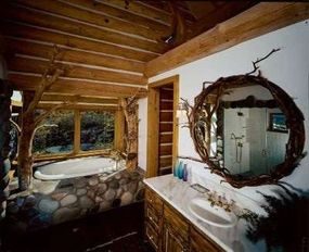

Gray, tan, and violet shades blend softly against honey-brown wood. It’s a warm look. Fieldstone offers a sharper edge against painted plaster. The texture always brings drama.
European Country Style Details
This aesthetic leans on natural materials. Stone is heavy but grounding. Wood adds warmth. The combination feels rooted.
- Cabin Decor Ideas
- Modern Decor Ideas
- Window Treatment Ideas
- Decorating Ideas
- Kitchen Decorating Ideas
- Dining Room Decorating Ideas
- Bedroom Decorating Ideas
- Bathroom Decorating Ideas
- Home Office Decorating Ideas
- Home Spaces
- Interior Decorating
European country homes often feature thick walls. Plaster holds heat. Stone foundations stay cool. You can mix these elements in a renovation. Try rough-cut stone. Pair it with soft paint. The contrast defines the space.
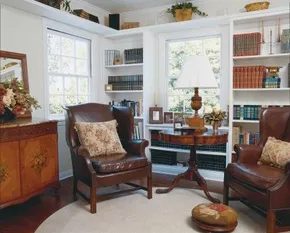

European roots are buried deep under American flooring boards. Immigrants from the continent brought their traditions. Wealthy Americans returned from “Grand Tours” in England, France, and Italy with romantic ideas in tow. Those ideas stuck. They didn’t just fade into history. They evolved.
Today, that love affair is still going strong. But it isn’t one single look. It is a spectrum. You can pick your lane.
English Country: The Floral Anchor
English country style dovetails with America’s obsession with flower gardening. It feels lived-in. It feels soft. Think floral chintz fabrics draped over curl-up cozy chairs. Not stiff armchairs. The kind you sink into after a long day.
Needlepoint pillows add texture. They tell a story. Victorian-era porcelain sits on side tables. Delicate. Fragile-looking but surprisingly durable. The goal here is charm. Not perfection.
Provencal & Tuscan: Warmth from the South
Move farther south. The vibe shifts. Provence brings sunny, primary-color prints into the mix. It is less about the past and more about the light. French country ambiance doesn’t have to be stuffy. It can feel breezy.
Tuscan Italian style leans on sunset tones. Old frescoes inspire the palette. Earthy reds. Ochres. Warm yellows. It recreates the feel of a Mediterranean afternoon. Casual yet sophisticated. There is a look here for almost anyone.
Why It Works (And How to Start)
The secret is layering. You don’t need to redo your whole house. Pick one element. Maybe a chintz armchair. Maybe a terracotta tile backsplash. Start small. See how it feels.
European style is forgiving. It invites imperfection. A crooked painting? Fine. A chipped vase? Charisma. It is not about having the right antique. It is about having your antique.
“Romantic decorating ideas back home” were never meant to be rigid rules. They were suggestions for living beautifully.
Picking Your Palette
- English: Muted florals. Creams. Soft greens.
- Provencal: Bright blues. Yellows. Lavenders.
- Tuscan: Terracotta. Olive green. Warm stone.
Don’t overthink it. Mix them if you want. The European spirit is about freedom. It is about taking what you love and making it yours.
Tools & Materials to Keep in Mind
You don’t need a contractor. You need an eye.
- Fabrics: Look for cotton blends. They breathe. They age well.
- Wood: Distressed finishes work better than glossy ones. They hide scratches.
- Lighting: Wrought iron sconces. Or simple paper lanterns for a Provencal touch.
- Safety: When handling vintage porcelain or heavy textiles, check for stability. Don’t let old things fall on new heads.
Where to Source This Look
You don’t need to fly to Paris. Or Rome. Or London.
- Local Antique Shops: The real deal. One-of-a-kind pieces.
- Thrift Stores: Good for frames,
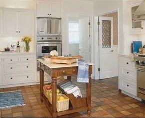

blending European aesthetics with practical function
You often see kitchens that look stunning but fail the usability test. They are showrooms. This one works differently. It pulls from England, Scandinavia, and France. The result is a hybrid that feels modern yet deeply warm. It invites you in. It does not demand you perform.
The hardware backs up the vibe. A commercial-grade range sits ready for heavy lifting. The island features granite with traditional beveled edges. That’s the most-wanted feature list. But those items alone don’t make a space livable. Architecture does. Smart design turns a pretty room into a habitable one.
the bay window as a functional hub
“Maximizing the window’s importance, the owners had a comfortable banquette built in for an informal eating nook, flanked by open shelving.”
Consider the bay window. It’s not just for viewing. It’s positioned close enough to the main work area to be useful. You can chop vegetables and glance out without losing your place. A chef’s advantage.
The owners didn’t leave it empty. They built a banquette. It creates an informal eating nook. It’s cozy. It’s practical. It tucks into the corner. Open shelving flanks the seating. This setup answers common queries about small kitchen storage solutions and how to maximize natural light in cooking areas.
Why build a banquette instead of buying chairs? It saves floor space. It creates a defined zone without blocking flow. The open shelves provide accessible storage for mugs or cookbooks. You don’t need to walk to a cabinet. Everything stays within arm’s reach.
materials that age well
Granite is durable. It handles heat and knife cuts better than quartz or laminate. But the beveled edge adds a tactile quality. It’s softer on the eyes. It hints at traditional craftsmanship. The combination of rough stone and smooth wood (likely in the banquette) creates balance.
If you’re planning a similar setup, measure the bay depth first. Custom upholstery fits better than standard cushions. Secure the frame to the wall studs. Safety matters here. A loose bench is a hazard near a hot stove.
This kitchen proves that style and substance don’t have to be mutually exclusive. The European influences provide the soul. The layout provides the bones. The result is a space that works as hard as it looks good.
What about the lighting above the banquette? That’s a separate consideration. But for now, the natural light from the window is doing the heavy lifting. It changes with the sun. Morning coffee here is different than evening wine. The space adapts.
It’s not about perfection. It’s about intention. Every element has a reason. The range cooks. The island preps. The window looks out. The banquette rests. Together, they create a rhythm. A flow. A home.
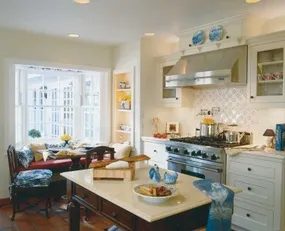

Adding Personality to Heavy Machinery
The stainless-steel range hood is a beast. Industrial. Cold. It dominates the space with raw utility. To keep it from feeling like a commercial kitchen, the owners added a personal touch. They didn’t hide the metal. They softened it.
Above the hood, a simple plate rack holds two blue-and-white plates. The pattern is classic. The placement is deliberate. It breaks up the expanse of steel with a splash of history and color. The blue tones echo the rest of the room’s accent pieces.
Storage beneath the island follows the same logic. Practicality meets timelessness. Angled open racks make items accessible. Wicker baskets hide the clutter you don’t want to see every day. The textures contrast with the sleek appliances. Wood and fiber against metal and stone.
This isn’t just decoration. It’s a way to humanize a high-performance space. The blue-and-white pottery ties the visual narrative together. It reminds you that this is still a home. Not a restaurant. A place where meals are made, not just served.
How do you balance function with feeling in your own kitchen?
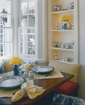

Specialty of the House
If you’re scrolling through Pinterest looking for a signature look, stop for a second. The best homes aren’t defined by a single trend. They’re defined by how they make you feel when you close the front door. You’ve probably seen those magazine spreads where every room matches perfectly. It’s sterile. It’s predictable. It’s boring.
Real style comes from friction. From the clash of old and new. From the weird thing you found at a flea market that somehow fits on the mantel. It’s about curating a space that tells a story, not just displaying objects.
Why “Matching” Is Overrated
Let’s get this out of the way. The era of the “coordinated” living room is dead. You don’t need a sofa, rug, and throw pillows from the same catalog. That’s interior design for a showroom, not a home.
Instead, focus on texture. A rough linen cushion against a smooth leather chair. A metallic lamp on a raw wood table. This creates depth. It creates interest. It keeps the eye moving.
Consider these pairings for instant visual weight:
– Wood + Metal: Warm oak contrasts with black iron or brushed brass.
– Soft + Hard: Boucle fabric against polished concrete or marble.
– Natural + Synthetic: Jute rugs with synthetic velvet upholstery.
This isn’t about being random. It’s about intentional contrast. When every element feels too safe, the room feels flat. Add some tension.
The Role of the Unexpected
What if you leaned into the weird?
Not everything in your house needs to be “decor.” Some items are just functional. A ladder holding blankets. A crate used as a side table. A vintage suitcase stacked for height. These pieces have history. They have imperfections. That’s where character lives.
Think of your home as a collection of moments, not a catalog. Did you inherit that chair? Keep it. Does it clash with the walls? Good. Let it clash. It becomes a focal point. It becomes a conversation starter.
Lighting as Jewelry
You can have the best furniture in the world. If the lighting is flat, it looks like a dentist’s office.
Lighting is the jewelry of your home. It frames the space. It highlights the texture.
- Task Lighting: Under-cabinet LEDs in the kitchen. A focused beam for the home office.
- Ambient Lighting: Paper lanterns. Fabric shades. Warm bulbs (2700K-3000K).
- Accent Lighting: Picture lights. LED strips behind headboards.
Don’t rely on the ceiling fixture alone. Layer your light sources. Use dimmers. Control the mood.
Where to Start?
You don’t need to tear out walls. You don’t need a big budget.
Start with one corner. Just one.
1. Clear the clutter. Remove anything that doesn’t serve a purpose or bring joy.
2. Add a texture. A rug. A throw. A plant.
3. Light it up. Aim a lamp at a wall. Or a plant. Or a piece of art.
4. Step back. Look at it. Does it feel like you?
If yes, move to the next corner. If no, move the texture
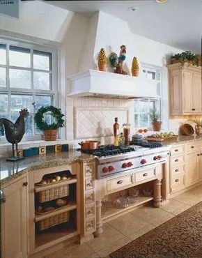
The Art of Aged Mediterranean Kitchens
You don’t need to live in a French chateau to get this look, but you do need patience. The style borrows heavily from the country villas of Italy and France. It mixes rustic warmth with a kind of quiet, expensive sophistication.
Think about it.
If you walked into a servant’s quarter on an old estate, you wouldn’t find beauty. You’d find function. These days, however, the aesthetic has shifted. We take the idea of the Mediterranean estate and polish it up. The goal is a muted, aged, antique vibe. It feels lived-in. It feels like it has history.
The foundation is soft white. But not a stark, clinical white. We’re talking about colors that have mellowed over decades. Think pale bisque. Think linen. Think oyster. These tones look tired in a good way. They look like they’ve absorbed sunlight and time.
If you have the budget, stop here and just paint. The real work happens if you push for authenticity.
Distressing and Glazing for Antiquity
Hand-rubbing taupe or chocolate glaze into wood changes everything. It fills the grain. It sits in the crevices. It creates shadows that flat paint can never achieve.
This is where the “old” look comes from. You aren’t buying fake antique cabinets. You are making them look like they’ve survived.
Hand-distressing is key. Use sandpaper. Hit the edges. Scuff the corners. You want the wear to look natural, not like a factory error. The result is an undeniable look of antiquity. It tricks the eye. It feels grounded.
“The look is muted, aged, and antique.”
This isn’t just decoration. It’s a texture. It’s a feeling. You walk into this kitchen and the noise of the modern world fades. The colors are low contrast. The surfaces are rough. It invites you to stay.
Why does this work? Because we crave comfort. We want spaces that feel permanent. This style offers that illusion. It makes your kitchen feel like part of a larger story. Not just a room for cooking. A place for living.
It’s not for everyone. It takes work. It takes money. But if you want a home that feels like a retreat, this is the way.
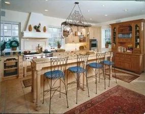
Why Matte Porcelain Beats Real Stone for Budget Renovations
Limestone floors. Granite counters. Lustrous porcelain tiles. They all whisper of that ancient Italian stoneworker heritage. It’s a vibe that has beguiled viewers since the Romans were laying roads. You want that look. You need that durability. But the price tag on genuine stone? It breaks the bank.
If real stone is not in your budget, you have a better option. Today’s matte-finished porcelain tiles look wonderfully like granite, marble, limestone, and slate. They are not just close. They are often indistinguishable to the naked eye, especially when installed correctly.
“Today’s matte-finished porcelain tiles look wonderfully like granite, marble, limestone, and slate.”
How to Use Porcelain Like a Pro
You can use these tiles on floors and countertops. Don’t limit them to walls. The tech has caught up. The density is there. The wear resistance is solid.
Here is what you need to know before you start tiling.
1. Choose the Right Finish
You want matte. Glossy porcelain can look fake under direct sunlight. It reflects too much, exposing the uniformity. Matte finishes hide the seams. They hide the slight variations in tone that mimic natural stone. Look for “rectified” edges if you want thin grout lines. This makes the installation look like a continuous slab.
2. Material Matters
Porcelain is fired at higher temperatures than ceramic. It absorbs less than 0.5% water. This makes it ideal for:
* Outdoor patios
* Kitchen backsplashes
* High-traffic entryways
* Countertops
Check the PEI rating. For floors, you want a PEI of 3 or higher. Countertops need a dense, hard surface. Most high-quality porcelain tiles meet this standard.
3. Installation Tips
Real stone often requires sealing. Porcelain does not. This saves you time and money. But you still need good mortar. Use a thin-set mortar rated for porcelain. The surface is non-porous. Regular mortar might not bond correctly.
Where to Source These Tiles
You can find these tiles at most home improvement stores. Search for “matte porcelain tiles that look like stone.” Brands like Daltile, MSI, and Ann Sacks have extensive lines. Look for terms like “rustic,” “weathered,” or “tumbled.” These finishes add texture. Texture tricks the eye. It makes the tile feel less manufactured.
Cost Comparison
| Material | Avg. Cost per Sq Ft | Installation Difficulty | Maintenance |
|---|---|---|---|
| Real Granite | $60 – $100+ | High | High (Sealing required) |
| Marble | $40 – $80+ | High | Very High (Etching risk) |
| Limestone | $50 – $90 | Medium | Medium (Staining risk) |
| Matte Porcelain | $3 – $8 | Medium | Low (No sealing) |
The savings are massive. You get the aesthetic. You get the durability. You lose the maintenance headache.
Why This Works for DIY
If you are
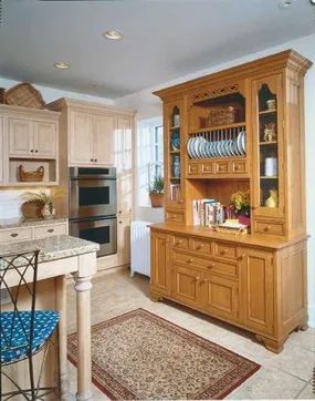
Personal Comforts
The paint is dry. The trim is clean. The floorboards don’t creak anymore. You’ve followed the blueprints. You’ve stayed under budget. So why does the house still feel… hollow?
It’s not the structure. It’s the soul.
Renovation creates the shell. Decoration fills it. But most homeowners skip straight to buying throw pillows because they’re tired. They want to be done. But without personal comforts, a renovated home is just a expensive set. It lacks the friction of real life.
Think about the last time you walked into a hotel room that felt too perfect. No crumbs. No books left open on the nightstand. No smell of coffee. It was sterile. You didn’t want to stay.
Your home needs to breathe. It needs to show who lives there.
The “Lived-In” Aesthetic
There’s a difference between “styled” and “lived-in.”
Styling is for Instagram. It’s curated. It’s rigid. Every vase is placed with geometric precision. Every cushion is fluffed to the same height. It looks good for a photo. It feels cold when you sit down.
Lived-in is messy. It’s warm. It’s inviting. It’s the bookshelf with one row of books sticking out. It’s the scarf draped over the chair because you took it off in a hurry. It’s the slight scuff on the coffee table from moving a box last week.
“A home should not be a showroom. It should be a sanctuary that reflects your actual days, not your idealized ones.”
Don’t be afraid of clutter. Just organize it. A basket of blankets by the sofa isn’t mess. It’s convenience. It’s an invitation to sit down and stay.
Lighting: The Mood Maker
You installed the recessed lights. They’re bright. They’re efficient. They’re also terrible for evening relaxation.
Harsh overhead lighting kills mood. It exposes every flaw in your renovation. It makes the room feel clinical.
Switch to layers.
- Ambient Light: The general glow. Think warm-toned recessed lights or a central fixture with a dimmer.
- Task Light: For reading, cooking, working. Under-cabinet strips in the kitchen. A focused lamp by the armchair.
- Accent Light: The drama. Picture lights above art. LEDs behind a TV. A candle on the mantle.
Dimmers are non-negotiable. If you didn’t install them during the renovation, go back. It’s cheaper now than it will be later. You can dim the lights for dinner. You can turn them up for cleaning. You control the atmosphere.
Textures That Invite Touch
Visuals are easy. Touch is harder.
Your renovation likely featured hard surfaces. Hardwood floors. Granite countertops. Ceramic tile. Glass windows. It’s durable. It’s beautiful. But it’s cold.
Break it up with softness.
- Rugs: Not just for the living room. A small runner in the hallway. A plush bath mat. It changes the acoustics of a room. It deadens the echo of hard floors.
- Curtains: Heavy linen or velvet drapes add weight and warmth. They also help with insulation. That’s a functional benefit you won’t
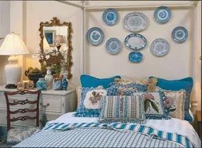

Build a Bedroom That Actually Feels Like Rest
Fresh country style works because it prioritizes comfort over aesthetics. You can have the most stunning French-inspired palette or English cottage accents, but if you can’t sleep, it’s just a showroom. The owners of these rooms didn’t get it wrong by chasing trends. They got it right by putting bedding and lighting first.
Start with the foundation. A mattress older than ten years is just a collection of sagging springs. Replace it. Don’t cheap out here.
Then look at pillows. Keep a variety on hand. Some people like soft. Some like firm. If you have guests, having both options on the nightstand is the difference between a good night and a bad one.
Lighting is non-negotiable. Reading lamps need to be positioned so you can turn them off from the bed. No getting up in the dark. No fumbling for a switch. It’s a small detail that defines the experience.
Install night-lights near the doors. You don’t want to walk into a pitch-black room at 3 AM. It’s a safety issue as much as a comfort one.
Control the light. Good window treatments are essential for privacy and sleep. Heavy curtains or blackout blinds matter more than the frame they hang on.
Don’t forget storage. A bedside chest or a low bookcase works perfectly as a nightstand. It gives you space for books, water, and glasses without taking up floor space. It doubles as furniture and utility.
The goal isn’t to impress your neighbors. It’s to make sure you wake up refreshed.
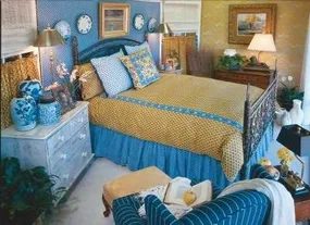

Choosing the right paint and fabric
Now for the fun part. Pick two or three favorite hues. Maybe you love sage green and burnt orange. Or navy and mustard. Pair them with fabrics that hint at your country inspiration. Think tartan for Scotland. Calico for the American South. Linen for Provence.
It is not about buying exact replicas. It is about the feeling. A wool throw with a subtle stripe. Cotton curtains that look worn in.
Where to find the right materials
You do not need a designer. Go to a local fabric store. Ask for remnants. They are cheaper and often have character. Look for natural fibers. They age better than synthetics.
Check the thread count. Higher is not always better for a rustic look. A rougher weave adds texture. It catches the light differently.
How to mix patterns without chaos
Start with a base. Solid walls. Or a solid sofa. Then add pattern on pillows. Or a rug. Keep the scale different. Large print on the rug. Small print on the cushions.
“If you have too many competing patterns, the room feels busy. Not cozy.”
Tools for the job
You will need a tape measure. A level. And a good pair of scissors. For hanging curtains, buy anchors if your walls are plaster. They are brittle. Standard screws might pull out.
For upholstery, get a staple gun. The pneumatic kind. It is faster. And less tiring. But wear safety glasses. Staples fly.
Why this approach works
Personal spaces should reflect the occupant. Not a trend. Trends fade. Your favorite colors stay with you. They make the room feel like yours.
Related searches
- how to mix country style patterns
- best fabrics for rustic home decor
- vintage color palette ideas for bedrooms
- DIY country style window treatments
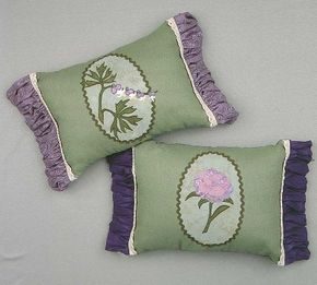

There is a specific gravity to a grandmother’s house. It is less an address and more an emotional anchor. For many, it is the blueprint for “country style” — that warm, unapologetic sentimentality of the old homestead. The appeal is visceral. You walk in and smell old wood, dried lavender, and time.
If you want that look without inheriting it, you have to hunt. Resale shops, estate sales, and thrift stores are your gold mines. The inventory is abundant. The prices are low.
Start with the textiles. Quilts are the heartbeat of this aesthetic. Look for hand-stitched pieces with faded patterns. Needlepoint and embroidery add texture. Old lace, even if it is brittle, can be framed or used as table runners. It adds a layer of history that synthetic lace never achieves.
Sourcing Authentic Country Furniture
Furniture needs to have weight. Look for maple and walnut. These woods age well, developing a patina that speaks of decades of use.
Armoires are practical and pretty. They hide clutter while displaying character. Chests of drawers with brass pulls are staples. Dining room groups — table and chairs — complete the picture. If you find a set with minor damage, consider it a feature. A chipped leg tells a story. Sanding and re-staining can bring it back to life without erasing its history.
Ivory vanity sets (the faux kind) add a touch of feminine elegance. They are often overlooked in modern homes but fit perfectly into a vintage-inspired bathroom or bedroom.
Injecting Mid-Century Edginess
Pure country can feel soft. Sometimes you need an edge. Dip into the 1920s through the 1950s. This era offers a funkier take on nostalgia.
Chenille bedspreads with ball fringe are heavy and tactile. They add visual weight to a bed. Tea towels trimmed with rickrack are cheap and cheerful. Use them as potholders or wall art.
Novelty salt-and-pepper sets — often shaped like animals or food items — are perfect for a kitchen shelf. They are conversation starters. Pastel-tinted Depression glass catches the light beautifully. It adds a splash of color without being loud. Roadside signs from the mid-20th century are iconic. They represent America’s rise as a consumer culture.
Recreating the Atmosphere
Why does this matter? Because these objects anchor us. They connect us to a time when things were made to last. When America was younger, faster, and more optimistic.
Nostalgia is not a weakness. It is a design strategy. It creates comfort.
You can recreate these bygone days by mixing eras. Pair a 1950s chrome lamp with a 1940s quilt. The contrast works. The eclecticism feels intentional.
“Charming old furniture, kitchen implements, knickknacks, and fabrics are still plentiful and affordable, so if you didn’t inherit them, haunt the resale shops.”
Practical Steps for the DIY Homeowner
- Inspect for pests. Before bringing vintage textiles into your home, check for moths or bedbugs. Wash or steam clean everything.
- **Check structural integrity
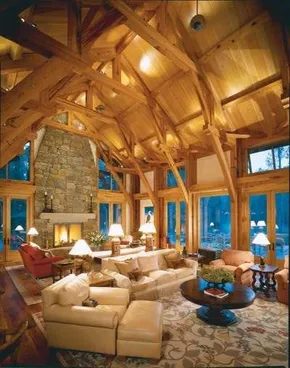
Blending Modern Structure with Country Comfort
“Form follows function.” It sounds simple now. Back when modernism took hold, it was a radical slap in the face. People used to bury function under layers of decorative clutter. This house flips that script. It keeps the airy, spacious feel of modern design. But it strips away the coldness. You get warmth. You get dignity. It feels like a fresh take on country style that could fit any era.
The ceiling does the heavy lifting here. Vaulted cathedral ceilings aren’t just structural; they are an experience. They draw your eye up and make the room breathe. Below that, the fireplace demands attention. It’s not just a heat source. The rustic stone surround has sculptural drama. It anchors the space with weight and texture.
Textiles and Patterns
The furniture mix is intentional. Some pieces are strictly modern. Clean lines. Minimalist silhouettes. They don’t fight for attention. The rugs, however, tell a different story. They feature contemporary foliage patterns. But the root of those designs traces back to William Morris. The English textile designer who championed nature-inspired motifs over industrial sterility.
This combination works because it balances opposites.
– Modern architecture meets traditional warmth.
– Sleek furniture grounds against organic rugs.
– Stone texture softens against smooth plaster.
It’s not about picking a side. It’s about letting the house feel lived-in while keeping the structure honest.
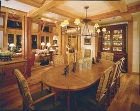

Integrating Contemporary Cabinetry with Architectural Warmth
The bath feels inherently modern. It isn’t just about the sleek fixtures. It’s the clean-lined warmth that comes from the stunning overhead architecture. Then there are the contemporary wood cabinets. They anchor the space.
This isn’t a sterile, hospital-grade white room. The wood adds grain. It adds texture. It fights back against the coldness of tile and chrome.
The right cabinetry can turn a utilitarian wet room into a sanctuary.
When you’re planning a renovation like this, you’re balancing two forces. Modernity. Warmth.
Choosing the Right Wood for Bathrooms
Wood in a bathroom is risky if you don’t prep it right. Humidity is the enemy. Swelling. Warping. Mold. You need materials that can handle the steam.
Sustainable hardwoods like teak, cedar, or mahogany are your best bets. They have natural oils. Those oils repel water. If you’re on a budget, high-quality marine-grade plywood with a waterproof veneer works too. Just seal it. Seal the edges. Seal the back. Use a polyurethane or spar varnish rated for high-moisture environments.
The cabinets in this design are contemporary. That means flat panels. Minimal hardware. Clean lines. No ornate carving. The hardware should be slim. Brushed nickel or matte black pulls. Something that doesn’t distract from the wood grain.
The Role of Overhead Architecture
Look up. The ceiling isn’t an afterthought. In this bath, the overhead architecture does heavy lifting. Exposed beams? A coffered ceiling? A tray design? Any of those add depth. They draw the eye upward. They make the room feel taller. More spacious.
If you’re doing a DIY remodel, you don’t need to tear out the whole ceiling. Sometimes it’s about adding trim. Crown molding. Or even just painting the ceiling a shade lighter than the walls. It creates contrast.
The combination of high ceilings and wood cabinets creates a vertical rhythm. The eye moves from the floor, up the cabinets, to the architectural details above. It’s a layered look.
Fixtures: The Modern Edge
The fixtures are where the “modern” label really sticks. Think frameless glass showers. Floating vanities. Wall-mounted faucets. These elements reduce visual clutter. They make cleaning easier. No toilet tank to dust. No pedestal to sweep around.
But modern fixtures can feel cold. That’s why the wood cabinets are so important. They soften the edges. They bring in an organic element.
When shopping for fixtures, stick to a cohesive finish. Don’t mix brushed gold with chrome. Pick one. Stick with it. The warmth of the wood will provide the contrast you need.
DIY Installation Tips
If you’re hanging these cabinets yourself:
- Study the wall structure. You need to hit studs. Always. Use a stud finder. Mark the locations clearly.
- Level everything. A crooked cabinet line is distracting. Use a laser level for accuracy.
- Pre-drill holes. Wood splits easily. Drill pilot holes before driving screws.
- Seal before installing. If you can, seal the inside of
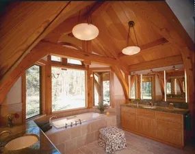

The goal here isn’t to create a museum. It’s to build a space that feels expensive but never stiff. Modern style at its best is rich yet serene. It’s informal. You walk in and you don’t feel like you need to take off your shoes or whisper. You just breathe.
Balancing Texture and Tone
To pull off this look, you have to get the materials right. Smooth surfaces alone feel cold. Add texture. Think matte black fixtures against warm white oak. Or a linen sofa in a soft grey that invites you to sink in. The richness comes from depth, not clutter.
Selecting the Right Materials
You don’t need marble. You need honesty in your materials.
– Wood: Go for light, natural tones to keep things airy. Dark wood can work if used sparingly as an accent.
– Metal: Brushed nickel or matte black. Avoid shiny chrome unless you’re going for a specific industrial vibe.
– Textiles: Linen, cotton, wool. Skip the polyester blends. They don’t age well and they don’t look real.
Where to Start Your Modern Renovation
Start with the lighting. Harsh overhead lights kill the vibe. Layer your light sources.
1. Ambient lighting for general glow.
2. Task lighting for reading or cooking.
3. Accent lighting to highlight art or architectural features.
“Modern design is about subtraction. If you’re not sure if an item belongs, it probably doesn’t.”
How to Keep It Informal
Formality creeps in through symmetry. Break it up. Hang a gallery wall slightly off-center. Mix chair styles in the dining room. Don’t match your pillows perfectly to your drapes. Imperfection is where the warmth lives.
Practical Steps for DIY Homeowners
If you’re doing the work yourself, focus on the big impacts first.
– Paint: Stick to neutral walls. Whites, greys, taupes. Let the furniture pop.
– Flooring: Wide plank wood or large format tiles. Fewer grout lines mean a cleaner look.
– Hardware: Swap out cabinet pulls and door handles. It’s cheap and changes the feel instantly.
Why This Style Works Long-Term
Trends change. A serene, informal modern look doesn’t. It’s adaptable. You can swap out a rug or add a plant without redoing the whole room. It’s sustainable in the truest sense because it doesn’t go out of style in two years.
Which Rooms Benefit Most?
Every room can be modern, but some lend themselves easier.
– Living Room: The anchor. Keep it open and uncluttered.
– Kitchen: Clean lines. Hidden storage. Countertops that are easy to wipe down.
– Bedroom: A sanctuary. Less is more. No nightstands with five drawers if you only need two.
Decorating Ideas That Actually Work
Stop buying trends. Start buying quality.
– Art: Large scale pieces. One big statement is better than ten small ones.
– Plants: Greenery softens the hard edges of modern design.
– Rugs: Define spaces without walls. A large rug anchors a living area.
Home Again
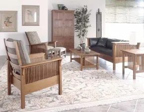

The Arts and Crafts Aesthetic: Beyond the Rustic Lodge
People often lump Arts and Crafts-style furnishings into a single bucket. They picture log cabins. Heavy beams. Smoky fireplaces. It’s a valid association. The style definitely has roots in that rugged, mountain-lodge vibe. But that’s only half the story.
This early modern design language is surprisingly adaptable. It works just as well in a contemporary fresh country home as it does in a timber-frame retreat. The key difference lies in the execution. The aesthetic isn’t about cluttering a room with knick-knacks. It’s about intentional, human-scale comfort.
The furniture pieces don’t scream for attention. They don’t need to. Their shapes are quietly dramatic. You notice the joinery. You notice the proportions. They’re designed for sitting. For lounging. For real life.
Wood Selection Defines the Mood
The material choice dictates the personality of the piece. If you’re leaning toward a warmer, softer look, smooth-grained maple or cherry wood is the way to go. These woods polish up beautifully. They develop a lustrous finish that feels elegant without being flashy. The grain patterns are tight. Subtle.
On the other end of the spectrum, you have coarse-grained oak. This is the classic choice. It’s sturdy. Honest. It shows the work put into it. An Arts and Crafts chair in oak feels grounded. It feels permanent.
When shopping for or building these pieces, look for construction methods that expose the joinery. Mortise and tenon joints. Through-tenons. These aren’t just structural necessities. They’re decorative elements. They tell you how the piece was made.
Upholstery and Textiles
Genuine leather upholstery is a natural fit. It ages well. It complements the wood’s seriousness. But fabric options are where things get interesting.
The fabrics used in this style rarely feature abstract patterns. They favor rich, stylized images of nature. Think botanicals. Geometric leaves. Earthy tones. The imagery is integrated into the design, not slapped on.
“Fabrics captivate with rich, stylized images of nature.”
This approach keeps the room feeling connected to the outdoors. It reinforces the style’s roots in the natural world. It doesn’t fight against the wood. It works with it.
Functional Sparkle
Don’t overlook the smaller items. Handmade pottery and ceramics add functional sparkle. These aren’t just for show. They’re for use. A bowl for keys. A vase for wildflowers. A mug for morning coffee.
The imperfections in handmade ceramics are part of the appeal. They echo the handcrafted nature of the furniture. They add texture to a room that might otherwise feel too uniform.
Why It Works Today
The reason this style resonates now is its lack of pretension. It’s simple. But it’s not skimpy. Every element has a purpose. There’s no wasted space. No unnecessary ornamentation.
You can mix and match. Pair a sturdy oak bookshelf with a cherry sideboard. Use a leather sofa with floral-print armchairs. The common thread is the commitment to quality materials and honest construction.
It’s about creating a space that feels lived-in from day one. Not because it’s
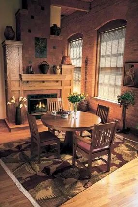

How Wall Color Transforms Arts and Crafts Furniture
Move the heavy timber and leather into a room with exposed brick or dark wood paneling. The style settles in. It feels historic. It feels like it has been there for a century. Take that same set into a stark white modern space. The contrast hits hard. The furniture looks almost aggressively contemporary. It stops being “old” and starts being “statement.”
Then try the wild cards.
Paint the walls ruby red. Go for goldenrod. Or cantaloupe orange. Suddenly the pieces don’t just look like furniture. They look like they belong in an artist’s studio. The colors don’t clash. They elevate.
The Studio Effect
Why does this happen? Because Arts and Crafts design relies on material honesty. You see the grain. You see the joinery. You don’t need to hide it. A neutral background lets the craft speak. A bold background makes the craft scream.
When you choose a hue like cantaloupe, you are borrowing from the Arts and Crafts palette itself. Think William Morris. Think Charles Rennie Mackintosh. These designers loved earth tones. But they also loved bold, natural pigments. Ruby is deep. It grounds the wood. Goldenrod is bright. It reflects the light off the polished surfaces.
Practical Application
If you are DIY-ing this, don’t just pick a paint swatch and hope for the best. Test it. Paint a large board. Look at it in the morning light. Look at it at night.
For a ruby backdrop, you need a deep, matte finish. Glossy paint on a ruby wall will fight with the wood grain. It will look cheap. Matte lets the wall recede. It lets the furniture stand out.
For goldenrod, you need warmth. A yellow with a hint of green will turn muddy. A yellow with a hint of orange will sing. Look for “ochre” or “mustard” undertones. They bridge the gap between the paint and the wood stain.
Cantaloupe is tricky. It is soft. It can look pastel. It can look like a nursery. To keep it from feeling childish, pair it with dark, rich wood. Mahogany. Walnut. Or even a dark-stained oak. The contrast creates sophistication. Without it, you just have a peach room with some chairs.
Which Direction to Take?
You have three paths.
- The Traditional Route: Brick or wood paneling. Safe. Timeless. Less likely to tire you out in five years.
- The Minimalist Route: White walls. High contrast. Makes the furniture pop. Can feel cold if you add too many other colors.
- The Studio Route: Bold colors. Ruby. Goldenrod. Cantaloupe. Risky. Rewarding. Feels curated.
If you go with color, commit. Don’t half-step with a tint. You want the color to feel intentional. Like it was chosen to highlight the craftsmanship. Not just to cover the drywall.
The furniture doesn’t change. The wood is the same. The joinery is the same. But the room around it tells a different story.
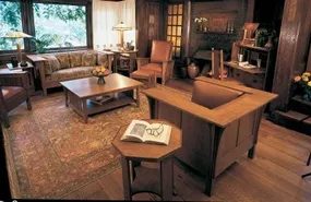

For more decorating ideas, see:
- Cabin Decor Ideas
- Modern Decor Ideas
- Window Treatment Ideas
- Decorating Ideas
- Kitchen Decorating Ideas
- Dining Room Decorating Ideas
- Bedroom Decorating Ideas
- Bathroom Decorating Ideas
- Home Office Decorating Ideas
- Home Spaces
- Interior Decorating
A Personal Haven
There is a specific kind of exhaustion that comes from trying to curate a “timeless” space. You spend months hunting for the perfect neutral sofa. You agonize over paint swatches that promise longevity but deliver boredom. Then you walk into a room where the floorboards are uneven and the walls have scars. You feel grounded.
Real character doesn’t fade. It accumulates.
When you choose pieces with history—whether it’s a reclaimed barn wood shelf or a thrifted armchair with a faded velvet armrest—you aren’t just decorating. You are preserving a narrative. Trends come and go. The mid-century modern craze will likely cool. The maximalist wave will recede. But a piece that feels lived in? That stays.
Think about your own home. Which corners feel most like you? Is it the pristine gallery wall or the stack of well-loved books on the coffee table with the dog-eared pages? It’s the latter. That’s where the soul of a house lives.
“When pieces have this much character, you never outgrow them.”
This isn’t just sentimentality. It’s practical. Swapping out mass-produced furniture every five years to keep up with a catalog is expensive. It’s wasteful. And frankly, it’s forgettable. A handcrafted wooden table with a knife mark from a Christmas Eve dinner in 2014? You’ll be arguing over its placement at your granddaughter’s wedding.
The beauty of character-rich decor is that it anchors a room. It gives new renovations a point of reference. If you’re gutting a kitchen and installing sleek, handle-less cabinets, you need something to break up the sterility. A vintage farmhouse sink does that. A chipped ceramic vase adds that necessary imperfection.
It’s about curation, not collection. You don’t need a house full of antiques. You just need a few anchor points. One statement chair. One unexpected lamp. One mirror with a warped edge.
These are the things people notice first. They stop the scroll. They make guests ask questions. And more importantly, they make you smile when you walk into the room after a long day.
So, stop worrying about whether your mismatched chairs are “coordinated.” They are. They’re coordinated by years of use. That’s a pattern no designer can replicate.
What’s the one piece in your home that you’d fight to save in a fire? That’s your true north. Start there.
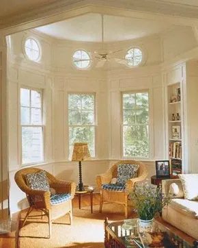

Balancing Tradition and Modernity in Fresh Country Design
Contemporary fresh country style isn’t just a passing trend. It’s sticking around because it solves a specific design problem. We want the cozy, established feel of traditional country homes. We also want the clean, uncluttered freedom of modern living. Getting these two to play nice requires intention.
The rooms shown here prove that clashing elements can work if you handle them right. The secret lies in the color palette. It’s not about bold statements. It’s about creating spaces you actually want to live in.
Color Strategies for Every Room
In living areas, stick to quiet naturals. Think warm beiges, soft grays, and earth tones. These colors ground the space. They make the room feel expansive yet inviting. It’s easy to live with these hues because they don’t compete for attention.
For other spaces, you can introduce more character without losing that serene vibe. Consider a child’s bedroom. Here, softened reds, whites, and blues do the heavy lifting. The red isn’t loud. It’s muted. The blue is airy. This combination feels fresh rather than festive.
“The key is combining unlikely elements into something very inviting through easy-to-live-with color schemes.”
This approach allows you to curate a home that feels both timeless and current. You aren’t bound by strict rules. You’re blending textures and tones. The result is a look that feels personal. It feels lived-in. But it never feels messy.
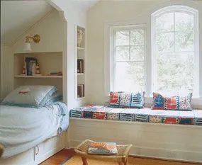

Timeless natural materials do the heavy lifting. Think woven rush, wicker, soapstone, and real wood. They anchor a space with warmth. Even when shaped into sleek, modern forms like a spacious pass-through counter, the texture remains. It stops the design from feeling sterile.
Why natural materials matter in renovation
Homeowners often chase trends that fade fast. Natural elements last. They age gracefully. Soapstone develops a patina. Real wood gathers character. Woven fibers add softness that synthetic alternatives can’t mimic. This approach avoids the coldness of all-synthetic kitchens.
Practical application for DIYers
When planning a pass-through or any built-in, choose materials that connect indoors and outdoors. A wide counter opening improves flow. But the surface needs to feel grounded. Soapstone resists heat and stains. Real wood requires maintenance but feels inviting. Wicker baskets underneath add storage without visual clutter.
Balancing modern function with organic texture
You don’t need to go full rustic. A modern silhouette can house natural materials. The key is contrast. Sharp lines against rough textures. Smooth stone against woven patterns. This creates visual interest without overwhelming the senses. It’s about creating a home that feels lived-in, not staged.
The question isn’t just what looks good today. It’s what feels right tomorrow. These materials stick around. They become part of the house’s story.
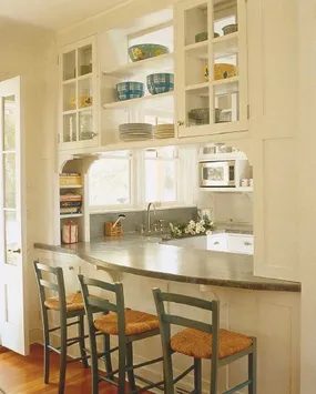

Clutter is a tax on your attention. The fastest way to modernize any space isn’t buying new stuff. It’s removing the junk. Keep what works. Keep what moves you. Everything else goes. That’s not minimalism. That’s freedom.
Sparkling Drama
Light changes everything. It’s not just about visibility. It’s about mood. Consider the difference between flat overhead lighting and layered sources. A single bright bulb in the center of a room feels like a hospital. Three distinct light sources in the same corner? That’s atmosphere.
Why layering matters
Humans don’t experience light in one dimension. We see depth. Shadows give objects form. Without them, a room feels flat and lifeless. Layering creates visual interest. It guides the eye. It makes a space feel curated rather than accidental.
How to layer effectively
Start with ambient light. This is your base. Recessed lights or a central fixture. It needs to be even but not glaring. Next, add task lighting. Where do you actually do things? Reading? Cooking? Working? Put lights there. A desk lamp. A pendant over the kitchen island. A sconce by the bed. Finally, add accent lighting. This is the drama. Pin spots on art. LED strips under cabinets. A candle on the mantel. This is where personality lives.
Which fixtures work best
Not all lamps are created equal. A shade made of thick fabric diffuses light. It creates a warm glow. A metal shade reflects it. It creates a sharp beam. Glass shades scatter it. They create sparkle. Choose based on the effect you want.
Task lighting should be bright and focused. Avoid shadows on your face when shaving or applying makeup. Accent lighting should highlight textures. Brushed nickel reflects differently than matte black. Let that play.
Safety and installation
Electrical work isn’t for everyone. If you’re not comfortable with wiring, hire an electrician. It’s cheap insurance against fire. If you’re DIY-ing, turn off the power at the breaker. Use a voltage tester. Check for live wires before touching anything. One spark can ruin a weekend. Or worse.
Where to place accents
Don’t cluster all your lights in the center of the room. Spread them out. Corners are great for floor lamps. Walls work for sconces. Ceilings for pendants. Vary the heights. A tall floor lamp next to a low table creates contrast. It adds rhythm.
Comparison: Warm vs. Cool
Warm light (2700K-3000K) feels cozy. It’s good for living rooms and bedrooms. Cool light (4000K+) feels alert. It’s good for kitchens and home offices. Mix them carefully. Too much cool light in a bedroom can kill the mood. Too much warm light in a kitchen can make it feel dirty.
The sparkle factor
Crystal chandeliers are cliché if you’re not careful. But a simple pendant with a cut-glass shade? That catches light. It throws prisms across the ceiling. It’s subtle. It’s elegant. It doesn’t scream for attention. It just is there.
Materials matter
Metal finishes change how light behaves. Chrome is bright. Brass is warm. Oil-rubbed bronze is dark. Choose
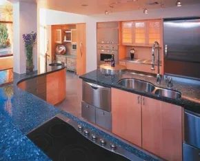
Blending Modern Tech with Rustic Warmth
Modern kitchens often feel cold because they lean so heavily on sleek surfaces and hidden appliances. But there is a middle ground. It is possible to mix high-tech efficiency with the cozy, lived-in vibe of a country home. This style isn’t a contradiction. It is a deliberate contrast.
The trick lies in material selection. You cannot just slap a stainless steel fridge next to distressed wood without a plan. The example we are looking at uses natural and industrial materials in a way that feels intentional. Think reclaimed wood cabinets paired with matte black fixtures. Or concrete countertops against shiplap walls.
The result is witty and sophisticated, but much warmer than you might expect.
This balance avoids the sterility of pure modernism. It also sidesteps the cluttered look of traditional farmhouse designs. The key is moderation. Too many industrial elements turn the space into a loft. Too much rustic charm makes it look dated.
Material Pairings That Work
To achieve this hybrid aesthetic, you need to be specific about what you buy. Here are the materials that bridge the gap between sleek and soulful.
- Concrete: It provides the industrial edge. It is durable and low maintenance. Use it for islands or floors.
- Reclaimed Wood: This adds the warmth. The texture breaks up the smooth lines of modern appliances.
- Matte Black Hardware: Avoid shiny chrome. Matte black feels more grounded and contemporary.
- Stainless Steel: Keep it minimal. Use it for the major appliances only. Let it recede into the background.
Why This Mix Works
People often ask why this style is gaining traction. The answer is simple. We want convenience but we crave comfort. A purely modern kitchen can feel like a showroom. A purely rustic one can feel like a museum. This hybrid approach gives you the best of both worlds.
You get the easy clean lines of modern design. You also get the inviting atmosphere of a country kitchen. The technology is hidden or integrated seamlessly. The materials tell a story.
Practical Steps for DIYers
If you are planning a renovation, start with your big-ticket items. Choose a countertop that can handle both heat and wear. Concrete or quartz are good bets. They offer the smooth surface modernists love but come in earthy tones that fit rustic palettes.
Next, look at your cabinets. Shaker-style doors are a safe choice. They are simple enough for modern tastes but have enough detail to pair with wood accents. Avoid ornate molding. It will clash with the industrial vibe.
Finally, consider your lighting. Pendant lights with wire cages or brushed nickel finishes can tie the look together. They provide task lighting for cooking while adding visual interest.
The goal is not to choose a side. It is to create a space that feels current but comfortable. You can cook a gourmet meal in a space that feels like home. That is the power of thoughtful material mixing.
What happens when you push the contrast further? You might find that the line between “modern” and “rustic” is thinner than you thought. The next step is usually adding greenery or open shelving to break up the hard surfaces. But that is a project for another day.
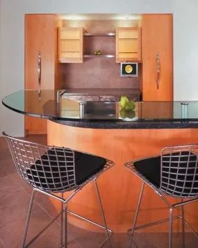
The visual tension in this kitchen comes down to surface finishes. You have the appliances, clad in brushed stainless steel. The texture diffuses light, softening the glow and hiding fingerprints better than a mirror would. It is a practical choice for high-traffic areas where you touch things constantly.
Then there is the counter. Black granite. Highly polished. The finish is so reflective it acts almost like a mirror. But it isn’t just black. Look closer. The stone contains natural mica chips. Those mineral inclusions catch the light, creating a pearly gleam that shifts as you move around the room. It adds depth. The contrast between the matte-sheen steel and the glossy stone defines the space.
How Surface Reflectivity Impacts Kitchen Aesthetics
When you select materials, you are managing light. Brushed finishes scatter reflection. Polished surfaces bounce it. This choice affects how clean the room feels. A high-gloss granite can make a small kitchen feel larger by reflecting ambient light. The brushed steel keeps the eye grounded. It prevents the space from feeling too sterile or cold.
The natural mica chips inherent in the stone give a pearly gleam to the surface.
Why Choose Brushed Stainless for Appliances?
It is not just about looks. Brushed stainless steel is forgiving. Scratches? Less visible. Smudges? They blend in rather than standing out starkly against a mirror finish. For homeowners who cook daily, this matters. It reduces the maintenance load. You wipe it down. It still looks good.
The Role of Mica in Granite Countertops
Granite is igneous rock. It forms from cooled magma. The mica is a mineral component trapped during that cooling process. When the slab is polished, those mica flakes align with the surface plane. They reflect light differently than the surrounding quartz or feldspar. This creates the “pearly” effect. It is unique to natural stone. You cannot replicate it with quartz or laminate without adding synthetic glitter, which often looks cheap.
Balancing Textures in Home Renovation
If you are planning a similar setup, consider the workflow. Polished granite is slippery when wet. Use coasters. Clean up spills immediately to avoid water spots that disrupt the mirror finish. The brushed steel is more forgiving but still requires wiping to maintain its luster. The combination works because they are opposites. One absorbs the visual chaos. The other amplifies the light.
Maintenance for High-Gloss Stone Surfaces
Polished granite is porous, even when sealed. Acidic substances like lemon juice or vinegar can etch the surface over time. This ruins the shine. Use pH-neutral cleaners. Avoid abrasive pads that might micro-scratch the polish. A soft cloth is best. For the steel, a microfiber cloth prevents lint. Follow the grain of the brush when wiping. It keeps the finish uniform.
Which Finish Works Best for Your Lifestyle?
If you have kids or pets, the brushed steel is the safer bet for durability. It hides wear. The granite shows every drop of water. But the visual payoff of the pearly mica is significant. It turns a functional surface into a focal point. The choice depends on how much you value aesthetics versus ease of care. Most homeowners find the contrast worth the extra attention. The kitchen becomes a study
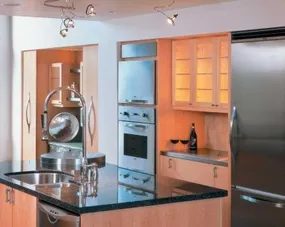
Mixing Wood Tones Without the Chaos
The cabinets look like standard Shaker-style boxes at first glance. Simple. Deceptively plain. But look closer. The design doesn’t sit rigid in a grid. It flows. Curves like a slow-moving stream around the perimeter of the room. This isn’t just about storage. It’s about guiding the eye.
The real trick here is the wood. You aren’t sticking to one species. You’re mixing dark ebony with warm tawny maple and pale birch. It sounds like a recipe for visual noise. It isn’t. The smooth scheme ties it together. The lines keep it clean. It proves you don’t have to choose between loving nature and loving minimalism. You can have both.
Pared-Down Aesthetic
If you’re trying to pull this off in your own home, start with the materials. Don’t buy matching sets from big-box stores if you want this depth. Source contrasting veneers or solid hardwoods. Ebony adds weight. Birch lifts the space. Maple sits in the middle, bridging the gap.
Tools you’ll need:
– Jigsaw for cutting the curves
– Orbital sander for finishing edges
– High-quality polyurethane for durability
“Nature-lovers and modernists can be one.”
Safety first. Those curves create tight corners. Sanding them by hand is a nightmare. Use a flexible sanding pad or a specialized jig for your router. Wear a mask. Fine dust settles everywhere.
For more decorating ideas, see:
– Cabin Decor Ideas
– Modern Decor Ideas
– Window Treatment Ideas
– Decorating Ideas
– Kitchen Decorating Ideas
– Dining Room Decorating Ideas
– Bedroom Decorating Ideas
– Bathroom Decorating Ideas
– Home Office Decorating Ideas
– Home Spaces
– Interior Decorating
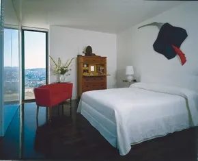

Mixing Modern Lines with Country Warmth
It’s easy to assume that a high-rise home with mountain views demands a sleek, industrial aesthetic. The owners of this particular unit wanted modern style but rejected the sterile, high-tech vibe that often comes with it. They didn’t want their living space to feel like a server room. The solution was blending clean, contemporary lines with the comfort of fresh country style.
This isn’t just about throwing a rustic chair into a minimalist box. It’s about intention. By pairing sharp architectural elements with softer, textured touches, they created a home that breathes.
The Power of Contrast
Take the bedroom. Against a stark, unembellished white wall, a highly detailed wood antique sits as the focal point. This isn’t just decor. It’s a statement piece. The intricate carvings or weathered grain of the wood provide dramatic warmth. It breaks up the coldness of the white paint and adds immediate visual interest.
Color plays a major role here too. You don’t need a full renovation to introduce warmth. A splash of coral-red does the heavy lifting. A love seat in that hue, paired with wall art echoing the same color, catches the eye immediately. It stops the monochrome scheme from feeling flat.
Why This Works for DIYers
You can replicate this effect without tearing out walls. Start with a neutral backdrop. White walls are a canvas. Then, introduce one significant textural element. Maybe it’s a reclaimed wood shelf or an antique mirror. Finally, pick a single accent color. Coral, mustard, or deep teal can transform a room by tying disparate elements together.
The goal is balance. Modern structures provide the skeleton. Country-inspired details provide the soul.
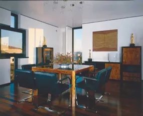
The dining room here is a study in restraint. Modern lines. Neutral palette. It could easily feel sterile if left alone. But then the burlwood enters the frame. That’s where the country soul sneaks in. Burlwood isn’t just wood. It’s nature’s erratic fingerprint. Each grain pattern is unique, wild, and undeniably beautiful. It breaks up the coldness of the modern aesthetic without cluttering the space.
To replicate this balance without overcomplicating your design, start with the foundation. Pick simple, modern furniture pieces. Think clean silhouettes. Minimalist legs. Unadorned surfaces. The key is letting the material do the heavy lifting. If you choose genuine woods for your tables or chairs, ensure they have character. A plain oak slab might work, but burlwood offers that organic texture that feels rooted in the earth.
Then layer in softness. This is where the country vibe solidifies. Avoid synthetic glosses. Opt for natural fabrics like linen, cotton, or wool. These materials breathe. They soften the hard edges of modern design. A linen slipcover on a sleek chair creates a visual tension that feels intentional rather than accidental.
It’s about contrast. Sharp angles against organic curves. Smooth finishes against knotty grain. You’re not trying to hide the modern structure. You’re using natural elements to warm it up. The burlwood acts as the bridge between the two styles. It’s rustic enough to feel homey but refined enough to sit comfortably in a contemporary setting.
When shopping for materials, look for authenticity. Fake veneers rarely capture the depth of real burlwood. The light catches the irregularities in a way that mimics natural growth patterns. Pair that with fabrics that have a visible weave. The tactile difference matters just as much as the visual one.
This approach works because it doesn’t force a style. It allows the inherent beauty of the materials to dictate the mood. The modern structure provides order. The natural elements provide chaos. Together, they create a space that feels both curated and lived-in.
Consider how light interacts with these surfaces. Natural light will highlight the swirling grains in the wood. Evening light will make the soft fabrics look inviting. The interplay is subtle. It’s not loud. It’s quiet luxury.
If you’re planning a renovation, don’t over-accessorize. Let the primary pieces speak. One statement burlwood table. A few chairs in simple shapes. Linen upholstery in earth tones. That’s enough. Adding more will dilute the effect. The goal is a harmonious blend where neither style dominates. Just two languages speaking the same dialect.

Maximize Storage with Custom Cabinetry
Stop letting clutter dictate your room’s vibe. The real magic happens when you collaborate with a specialty closet installer to engineer custom compartmentalized storage. You aren’t just buying shelves; you’re designing a system that hides the mess. Think deep drawers for winter gear, pull-out rods for shirts, and specific cubbies for accessories. The goal is total concealment. Once the bins are tucked away, the space feels instantly larger and calmer.
Layering Textures and Patterns
A sterile closet looks like a warehouse. You need to warm it up. This is where rich texture comes in. Throw in a rug with a heavy pile. Hang a tapestry with intricate patterns. Use baskets woven from natural fibers. These elements break up the monotony of flat surfaces. They also add depth. Without them, the room feels cold and clinical.
Adding Pops of Color
Don’t be afraid of hot color. A single bold accent can transform a mundane storage unit. Think of it as a visual anchor. A bright silk tie. A crimson throw pillow. A vibrant upholstered stool. These pops of color draw the eye and elevate the space from purely functional to deeply personal. It’s about balance. Storage handles the chaos. Color handles the soul.
Exploring Related Decor Styles
If you are building out these systems, consider how they fit into the broader aesthetic of your home. Here are a few directions you might take:
- Cabin Decor Ideas : Embrace raw wood and rustic textures for a grounded look.
- Modern Decor Ideas : Stick to clean lines, neutral palettes, and minimalist hardware.
- Window Treatment Ideas : Use sheer panels to soften hard storage edges.
- General Decorating Ideas : Blend personal artifacts with functional storage.
- Kitchen Decorating Ideas : Apply similar organizational principles to pantry spaces.
- Dining Room Ideas : Use sideboards with custom inserts for tableware.
- Bedroom Ideas : Integrate nightstands with hidden drawers for clutter.
- Bathroom Ideas : Utilize vanity organizers for toiletries and linens.
- Home Office Ideas : Design built-ins for files and electronics.
- Home Spaces : Think holistically about flow and function.
- Interior Decorating : Focus on cohesion across rooms.
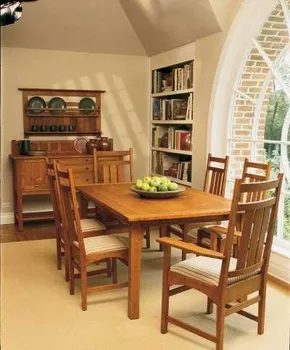

The Reaction to Mass-Produced Clutter
The Industrial Revolution changed everything. It made ornate, traditional furniture affordable for everyone, not just the elite. But the quality plummeted. The market flooded with shoddy pieces. Too much decoration. Not enough soul.
A counter-movement emerged. It had a name. The Arts and Crafts movement. It protested the excess. It celebrated simple elegance. The focus was on handmade furnishings. Think sturdy sideboards. Think serving bowls resting on them. Everything felt intentional.
Why Craftsman Furniture Still Matters
Gustav Stickley stands out. He was a central figure. His original designs are still relevant. The family firm produces them today. A new generation of consumers buys into the vision.
The style is Craftsman furniture. It is defined by simplicity. Solid wood is the primary material. Ornamentation is minimal. You will see a few geometric flourishes. That is it. No gilding. No excessive carving.
This aesthetic bridges two worlds. It appeals to people who love natural materials. It also attracts those drawn to clean-lined modernity. The lines are straight. The structure is honest.
How to Identify the Style
Look for the grain. Real wood has character. The joinery should be visible or at least substantial. Check the proportions. They are often sturdy and grounded. Unlike the delicate, fragile pieces of the Victorian era, this furniture feels like it can survive a real life.
If you are shopping for Arts and Crafts furniture, you are looking for durability. You are looking for a piece that does not shout. It whispers. It relies on the quality of the build rather than the flash of the finish. Stickley’s designs proved that less could indeed be more. The market for this style remains steady. Not because it is trendy, but because it is timeless.
There is a quiet satisfaction in sitting at a table made of solid oak with simple mortise-and-tenon joints. It feels honest. Is that something we can still find in big-box stores? Probably not. That is the point.
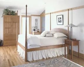
Achieving That Clean, Serene Look
The Craftsman aesthetic is everywhere now. You can walk into any store and find furniture, fabrics, and accessories that nod to the original Arts and Crafts movement. Most of these are reproductions of designs by key artists from the early 1900s. They don’t feel dated. They still look fresh. And free.
But here’s the catch. Just because the pieces exist doesn’t mean they fit together. A room full of Craftsman items can quickly become cluttered. The style demands space. It demands air.
To get that clean, serene vibe, you have to be selective.
Start with the walls. Paint them. Stick to muted earth tones. Think sage green, muted gold, or soft gray. Avoid bright whites. They clash with the wood. You want the color to recede, not shout.
Next, look at the wood. This is where most DIYers mess up. They mix finishes. Don’t do that. If your built-ins are oak, keep the furniture oak. Or at least a matching tone. The grain should speak to itself. Don’t fight it with high-gloss varnishes. Matte or satin finishes work best. They hide scratches and feel more honest.
“Less is more. If you’re not sure if something belongs, it doesn’t.”
Textiles matter too. Linens and cottons only. Skip the polyester. You need breathability. Curtains should hang straight. No heavy drapery. Keep the lines simple. Geometric patterns are fine. Floral patterns from the era are also acceptable. But keep them small. Large florals look like a museum exhibit. You want a living space.
Practical Steps for the DIY Homeowner
You don’t need a contractor for this. You just need patience and the right tools.
- Sand existing wood. If you have old built-ins, strip them back. Use 120-grit sandpaper. Then switch to 220-grit. Wipe away the dust. Every bit of it.
- Apply finish. Use a tung oil or a matte polyurethane. Tung oil penetrates. It makes the wood look wet but feels dry. It’s safer too. Less fumes.
- Choose hardware. Look for bronze or black iron. Nothing shiny. Nothing chrome. Chrome feels modern. It breaks the spell.
Where do you find these materials? Local hardware stores often have basic matte paints. Online retailers carry reproduction hardware. Check for “oil-rubbed bronze.” That’s the key phrase.
Why does this matter? Because a cluttered Craftsman room feels chaotic. A clean one feels calm. The architecture does the heavy lifting. Your job is just to get out of the way.
Modern Touches
Some homeowners worry that sticking strictly to the era looks like a time capsule. It’s a valid fear. But you can modernize without breaking the style.
Swap out old light fixtures. Keep the shape. Match the material. But upgrade the bulbs. LED lights are cooler now. They last longer. They don’t get as hot. Install dimmers. Light control is huge for serenity.
What about electronics? Hide them. Use a media console with doors. Not open shelving. Open shelves show cables. Cables break the flow.
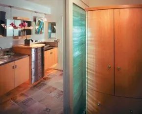

Blending Country Comfort with Asian Minimalism
If your country style feels a bit too predictable, look east. Asian design isn’t just about furniture placement. It’s a philosophy wrapped in wood and stone. The look is deceptively simple. It resonates with nature in a way that feels deep rather than decorative.
This isn’t a new trend. Since the 1950s, Western modern design has been borrowing heavily from Eastern principles. The result? A hybrid aesthetic that refuses to date. It’s timeless. Graceful. Natural. Yet, beneath the soft textures, there’s a rigorous geometry. Lines are clean. Structures are simple.
Why does this combo work for homeowners? Because it cuts through the clutter. Most country homes are stuffed with knick-knacks. This style demands restraint. You aren’t buying more stuff. You’re choosing better stuff.
“Asian style is as much philosophy as it is a decorative approach.”
How to Implement This Hybrid Look
Start with the floor. Hardwood or stone. No shag carpets. If you must use rugs, keep them flat-weave and neutral. The goal is to ground the space.
Next, look at your materials. Bamboo is obvious. But don’t stop there. Think about raw wood. Unlacquered finishes. Let the grain speak. Pair that with stone accents. A slate coaster. A granite countertop. It adds weight. It adds reality.
Lighting plays a huge role here. Avoid chandeliers. Go for paper lanterns or simple pendant lights with rice paper shades. The light should diffuse. It shouldn’t glare.
Choosing the Right Furniture
Which pieces survive the edit? Low-profile seating. Think Japanese floor cushions or low-slung sofas. They change the sightlines in a room. Instead of looking across at people, you look up. It changes the energy.
Keep lines geometric. A square coffee table. A rectangular rug. Contrast this with organic shapes. A vase with a twisted branch. A bowl with uneven edges. That tension between the straight line and the curve is what makes the style pop.
Don’t over-accessorize. One large piece of art. Maybe a calligraphy scroll. Or a single sculpture. Leave the walls bare. The negative space is part of the design.
Maintenance and Reality
This look isn’t just pretty. It’s practical. Fewer surfaces mean less dust accumulation. Fewer decorative items mean less to clean. For homeowners who hate chores, this is a feature, not a bug.
However, be careful with the “eclectic” part. It’s easy to slide into chaos. Stick to a limited color palette. Whites, creams, soft grays, and deep browns. Add greenery. One large plant. Not a jungle. Just one. It brings in the nature element without the maintenance of a garden.
The challenge is maintaining the simplicity. It requires discipline. You’ll want to add that one more vase. Resist. Step back. Look at the space. Does it breathe? If not, remove something.
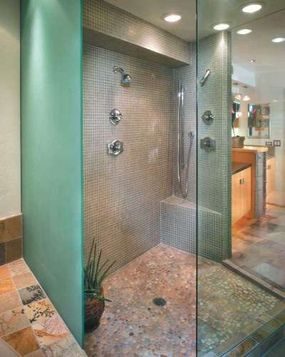
The Texture of Wet Rooms
This bathroom proves that water-resistant zones don’t have to look sterile. The floor uses branched quartzite. It’s exotic. The material is interesting. Common river pebbles sit beside it. Both materials handle moisture well. They are waterproof by nature.
Matte-finished wood adds warmth. It contrasts with brushed metal. You get natural and industrial elements in one space. The mix works because the textures differ. Quartzite is hard. Pebbles are round. Wood absorbs light. Metal reflects it.
Natural materials can be both beautiful and functional in wet areas.
Choose finishes that hide water spots. Matte wood prevents glare. Brushed metal hides fingerprints. The combination reduces maintenance. You don’t need to polish surfaces daily. The design handles the humidity without showing every drop.
Select stones for their durability. Branched quartzite is tough. River pebbles are stable. They won’t crack under weight. They drain water effectively. Use them in showers or floors. Avoid porous stones near sinks. Seal the grout. Keep the wood sealed too. Water damage is the enemy.
The aesthetic is raw. It feels grounded. You walk on stone. You touch metal. You sit near wood. Each material serves a purpose. None of it is decorative fluff. The result is a space that ages well. It doesn’t show wear easily.
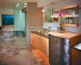

Defining Space with Glass and Greenery
Frosted glass isn’t just a privacy tool. It scatters light. Textured glass adds depth. Clear panels keep the view open. Together, they carve out zones in a bathroom without building walls. The result is a soothing, watery effect. It feels like swimming in a calm pool.
The Final Touch
What makes the look complete? One flower. Not a bouquet. A single bloom. It sits poised. Ready for contemplation. This is the Asian-inspired grace note. Simplicity wins.
More Ideas to Explore
If you like this style, check these links:
– Cabin Decor Ideas
– Modern Decor Ideas
– Window Treatment Ideas
– Decorating Ideas
– Kitchen Decorating Ideas
– Dining Room Decorating Ideas
– Bedroom Decorating Ideas
– Bathroom Decorating Ideas
– Home Office Decorating Ideas
– Home Spaces
– Interior Decorating
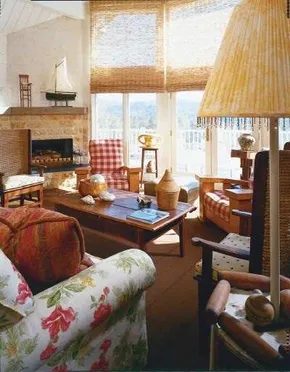

Why eclectic decor works for DIY homeowners
Eclectic style isn’t a new trend. It has been around as long as one generation passed on its treasures to the next and ever since one culture traded with another. Today in America, fresh country style offers more choices than in times past. This applies to both the range of products available and in the acceptance of decorating for personal expression rather than for the neighbors’ approval.
The rooms shown here are comfortable and functional. They are also rich in personal details and eclectic points of view. In the bath, rustic Asian and country French influences mix. The result is a setting that is both dramatic and playful.
Eclectic style isn’t a new trend. It has been around as long as one generation passed on its treasures to the next and ever since one culture traded with another.
This approach allows you to mix materials without fear. You can pair rough-hewn wood with smooth porcelain. Or hang a vintage French mirror above a rustic Asian console. The key is comfort. And function. These elements anchor the bold choices.
You do not need to follow a strict rulebook. Modern homeowners have more freedom than ever. They can choose decor that reflects their true selves. Not what the neighbors expect. This shift in attitude makes eclectic design accessible. It is not just for professional stylists. It is for anyone willing to experiment.
Mixing rustic Asian and country French influences
In the bath, rustic Asian and country French influences mix. The setting is both dramatic and playful. You can achieve this look by sourcing specific materials. Look for bamboo accents. They add warmth and texture. Pair them with painted wood fixtures. Soft blues or whites work well for the French side.
Consider the layout. Place a large mirror to reflect light. This opens up the space. Add soft textiles for comfort. Linen towels in neutral tones bridge the gap between cultures. The goal is balance. Not perfection.
This style encourages creativity. It lets you showcase items you love. Whether they come from a flea market or a high-end store. The mix creates a unique atmosphere. One that feels lived-in. And personal.
Practical tips for creating an eclectic space
Start with a base. Neutral walls provide a canvas. Let the furniture speak. Choose pieces with character. Distressed wood adds history. Polished metal adds shine. Contrast is key. Do not be afraid to break rules.
Safety matters when working with older items. Check for stability. Ensure all fixtures are secure. Use proper tools for installation. A level is essential for hanging heavy mirrors. A stud finder helps locate anchor points. These small steps ensure your eclectic space is safe. And beautiful.
The result is a room that tells a story. Yours. It is not about following trends. It is about creating a space that feels right. For you. And your family.
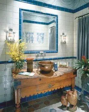
Creating an Eclectic Family Room with Global Accents
The family room doesn’t have to stick to one lane. This space takes rustic American bones and throws in Asian and African accents. It works. Craftsman chairs sit next to beaded lamps. The style is eclectic. The answer to “why not?” is simple: it creates visual interest.
Eclectic style says, why not?
You can pull this off without hiring a designer. Start with a base. Rustic American elements provide stability. Think wood tones. Think sturdy forms. Then add the accents. Asian influence might come through in the lamp shade. African touches could be in a textile or a sculpture. The key is contrast.
Practical Steps for Mixed Style Decor
If you are DIY-ing this look, keep it grounded.
- Choose a Anchor. A Craftsman chair is a good anchor. It has clean lines. It feels solid. Place it where you need seating.
- Add Light. Beaded lamps introduce texture. They soften the hard lines of the wood. Hang them or place them on side tables.
- Layer Textiles. Use rugs or throw pillows to bring in the African or Asian patterns. Don’t match them exactly. Mismatching is the point.
- Balance the Weight. If the chair looks heavy, keep the lamp light. If the lamp is intricate, let the furniture be simple.
Why This Combination Works
People often ask how to mix eras. The answer is texture. Beaded lamps add a tactile element. Craftsman furniture adds a structural one. When you combine them, you avoid a flat look. The room feels lived-in. It feels personal.
For more inspiration, check out cabin decor ideas for rustic bases. Modern decor ideas can show you how to streamline the accents. Window treatment ideas will help you frame the space. Kitchen and dining room decorating ideas offer similar mixing principles. Bedroom and bathroom ideas can help with color palettes. Home office tips might give you layout advice.
Mary Wynn Ryan has written about this stuff for years. She authored The Ultimate Kitchen. She wrote The Ultimate Bath. Her books include Cottage Style, Fresh Country Style, and Garden Style. She edited Design Times magazine for the Midwest. She worked at the Chicago Merchandise Mart’s residential design center. Now she runs Winning Ways Marketing. She knows home design.
The room feels open. Not finished. Just started.