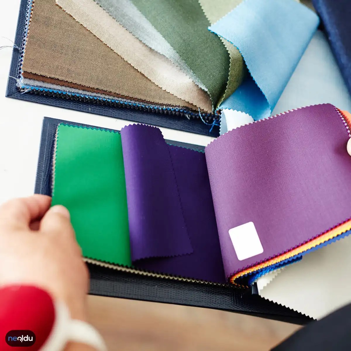
Color is more than just decoration. This is psychology. The walls of your home determine the atmosphere you feel when you walk in the front door. Choosing the wrong shade can make your living room look cold and cluttered. Yes, it feels like a sanctuary.
Most homeowners think that paint is just a trend. it is not. It’s all about functionality. And the atmosphere.
Why colors are important in home decoration
You can’t ignore color theory. Even just changing the pillow.
Each color causes a reaction. Blues calm. Red is full of energy. Yellow stimulates the appetite. This is not magic. This is biology.
“Color has a deeper effect on our emotions than we realize. Colors shape our behavior before we realize it.”
Choosing the wrong color for a space can disrupt the flow. A bright red bedroom? Sleeping is difficult. The dark gray kitchen feels like a cave.
Which color is best for busy traffic?
When renovating, start with the rooms you use the most.
Entryways requires a welcome. Soft neutral or warm taupe colors are suitable for this. It also withstands scuff marks well.
The Living room is a social space. We recommend using earthy tones. Green and brown are reminiscent of nature. It can reduce stress.
Kitchen needs light. White and light gray make the space look bigger. However, don’t make it sterile. Add warmth with wood or yellow accents.
How to test your paint before committing
Big boxes sell small sample bottles. Use them.
Paint a 12×12 inch section. See in the morning light. See with artificial lights at night. The color changes. every time.
If the interior is off-white, avoid testing with white walls. The contrast will fool you.
What tools do I need for DIY painting?
No need for a contractor’s toolbox. But the basics are essential.
- High-quality slanted window frame brushed edges
- Roller stand with medium-sized velvet cover
- Painter’s tape. Yes. the expensive kind. It comes off cleanly.
- Drop cloths. Fabric is better than plastic. plastic slider.
Avoid cheap brushes. They shed bristles. Later you will find hair in the wet paint. This is a nightmare.
Where should I start if I decorate myself?
Choose a room. There’s only one thing.
Doing the whole house at once can be overwhelming. And I was tired. And make mistakes.
If there are cracks in the ceiling, start with the ceiling. And then there are the walls. Then the trim.
Work from top to bottom. Gravity is your enemy here. Drips can ruin your finished floor.
Why some colors run away from home
Have you ever walked into a room and just wanted to leave?
Usually it’s color temperature. Cold blue gives people a calm feeling. Warm oranges can give people an aggressive vibe.
Connect the lights. North-facing rooms receive less sunlight. A warm paint is needed to neutralize the gray color. The room facing south will be blown up. It can handle cool tones.
Stop guessing. Look at the path of the sun. The choice of paint should follow it.
What happens if we ignore color psychology?
The finished house looks like a showroom.
cold. Not welcome. expensive.
people
Red: High energy and risk
Do you want energy? Comes in red. It’s more than just a color. This is a biological trigger. Heart rate quickens. Stimulates appetite. That’s why you see it everywhere on fast food logos. But in home decoration, it is heavy. If used incorrectly, it can make your dining room feels like a war zone. Used correctly, it can highlight pure passion.
Let’s start with chemistry. Red reflects long waves of light. It grabs your attention before your brain processes the room. This is terrible for bedrooms that need decompression. It is difficult for people to fall asleep in a space that feels like it is vibrating with activity.
If you decide to use red, think of it as spice. A little goes a long way. Paint an accent wall. Do not cover all four sides. The rest of the room should be neutral – white, cream or soft gray. This gives your eyes a place to rest. Without this contrast, red would overwhelm the senses.
Consider the materials. Flat paint absorbs light and creates a deep red color. Glossy or semi-gloss reflects light and gives an aggressive, hot look. In the dining room, a matte surface can add warmth without being harsh. In the bathroom, gloss can be more practical, but red stands out even more.
Think about what you want to achieve. Do you want to make a small space feel bigger? Skip red. Visually, you move forward and the walls feel closer. Do you want to make a big, cold room more comfortable? A red fireplace wall might be the answer. Be careful with it. It’s easy to do too much.
Orange: The Warmth Factor
Orange is a color between red and yellow. It has red energy and yellow cheerfulness. It’s fascinating. Feels like a sunset. However, unlike red, it is not aggressive. It’s friendlier.
This makes it ideal for open-plan living areas. Encourage discussion. It feels very communal. However, the color is still strong. Painting your entire office orange can be frustrating. It’s too stimulating for focus.
When using orange, consider earth tones. Terracotta is Safer than bright orange. It grounds the space. Can be used on natural materials such as wood, stone and brick. Combine it with shades of beige and sand for a Mediterranean feel.
Avoid the combination of orange and red. The two compete for attention. they clash. Instead, pair it with greens. Blue-green and teal create the perfect cool contrast. This balance keeps the energy flowing without the room feeling cluttered.
Yellow: The Mood Lift
Yellow is the color of the sun. This is optimistic. It is happy. But it is also tricky. Too much can cause anxiety. Studies have shown that babies cry more in yellow rooms. Adults may feel irritable if they are surrounded by bright canary yellow for long periods of time.
The key here is shade. Light yellow is safe. Add light to a windowless kitchen. They feel airy and clean. Mustard yellow adds retro charm, but requires careful styling. Perfect for mid-century modern spaces with teak furniture.
Consider yellow kitchen cabinets for DIY projects. adds personality without
Orange heat
Turuncu combines red warmth and yellow cheerfulness into one intense shade. Full of energy. Inviting. But just like its fiery red color, it needs to be respected in interior design.
This color screams energy. It is perfect for restaurants and casual lounges as it stimulates the appetite and sparks conversation. But let’s be clear: using orange everywhere is a pain. The energy can quickly become overwhelming. It makes you feel more uneasy than relaxed.
Where would you use it?
- An accent only. ** Throw pillows, a single feature wall or kitchen cabinet.
– Dining area. ** Facilitates eating and conversation. - ** Entrance. **A bold welcome, if you can handle the energy.
Materials and tools:
Opacity is important when painting with orange. This is a bold color so a high quality paint is needed to avoid streaking.
– Use a high quality roller for even application.
– Brushes for corners and edges.
●Painter’s tape to protect the finish.
Safety first. Orange paint can have a strong smell. Please open the window. Use a fan. When working in a confined space, ventilation cannot be ignored.
**Why orange? **
This is not for the faint of heart. Perfect for interactive spaces. But how much? That’s the problem. Most homeowners err on the side of too much. Dial it back. Make it a highlight instead of the whole show.
If you’re looking for warmth without being too intense, consider terracotta or soft apricot. These softer versions retain the energy but take the edge off.
Which orange suits your temperament? Bright citrus pop or deeper burnt sienna? Your choice will determine the mood of the room.
“Orange stimulates the mind and body, but too much can cause feelings of anger and frustration.”
If you do it yourself, do a patch test first. Light changes everything. What looks pastel in the sample may look neon on the wall at 3pm.
Do not combine with other bright colors. It fights for attention. Stay neutral. Cream. Beige. dark wood. Let your orange shine without competition.
result? Lively space. But only if you can control the intensity.
yellow. Is it a good choice? Okay.
Like orange, yellow is also very bright. But sharper. Even more attention-grabbing. It works well in the kitchen. Bright and vivid. It can also be used in children’s rooms. kids love it. But be careful. Too much yellow can stand out too much. It can be tiring.
What kind of yellow? Light yellow is better. Pastel colors give a more calming effect. Bright yellow is too aggressive.
In the kitchen, orange and yellow are a great combination. Adds liveliness. But keep it balanced. Choose one as the main color and the other as an accent color.
In rooms that receive direct sunlight, yellow works better. It looks more beautiful when the light hits it.
Yellow is not just a pigment, it’s also a mood. It directly reflects happiness, vitality and energy. In the dining room makes your morning coffee even more attractive. The living room can increase your energy. However, be careful as overuse can cause headaches. For some people, this brightness can be uncomfortable and cause eye strain. If you want a calm environment, you should limit the use of yellow.
green
Green is more than just a paint swatch. This is a shortcut to calm.
Think of it like bringing outdoor air indoors without the pollen. It represents peace. Freshness. Nature. You can see recommendations for living rooms and bedrooms. Places where you actually want to unwind. Not stress out.
If you want to painting a sanctuary, it is safe to choose green. It’s easy on the eyes. It’s hard to mess up.
Blue
Blue is the king of chill.
It screams serenity. Calm. Quiet. That’s why I love bathrooms and bedrooms. It tricks your brain into thinking it’s time to shut down.
But here’s the problem.
If it is too dark or used too much, the vibe shifts. Fast.
You don’t want a room that looks like a deep ocean trench. Depression is not the goal. Relaxation is.
Use it as an accent. Or stick to light and airy wall colors. Keep your mood light.
Beyaz: Nötr bir tuval veya soğuk bir yansıtıcı mı?
Beyaz, kopyalanması en kolay ama uygulanması en zor renklerden biri. Gözünüzde temizlik ve sadelik canlanıyor olmalı. Ama gerçek hayatta, beyaz her zaman parlak beyaz değildir. Kırık beyazlar, fildişi tonları, hatta hafif krem geçişleri mekanın sıcaklığını belirler. Sadece “beyaz” boy alıp duvarı boyarsanız, odanın hastane gibi hissedilmesini sağlarsınız.
Yatak odanızda huzur arıyorsanız, beyazı tek başına kullanmak riskli. Gündüz ışığında harika durur ama gece lambanızı açtığınızda gölgeler çok sert görünür. Çözüm, beyazı farklı dokularla dengelemek. Düz boyadan ziyade, mat bir bitiş yerine hafif yaldızlı veya saten bir boya seçmek ışığı kırar. Yastıklar, kilimler, nevresim takımları… Hepsi farklı beyaz tonlarında olmalı. Tek tip beyaz, sıkıcıdır.
Siyah: Kontrast ve derinlik için cesur bir hamle
Siyah, iç mimaride korkulan bir renk. İnsanlar “odayı daraltır” diye bahane uydurur. Oysa doğru kullanıldığında siyah, mekana derinlik katar. Özellikle yüksek tavanlı alanlarda, siyah bir duvar tavanı sanki gökyüzüne uzuyormuş hissi verir.
Ancak siyahı başlı başına kullanmak yorucudur. Anahtar kelime: kontrast. Beyaz tavan, gri halı, ahşap detaylar… Siyahı diğer nötrlerle eşleştirin. Aynalar da siyahın yutucu naturenini kırar, ışığı geri yansıtır. Siyahı çok sevmeyenler için koyu lacivert veya antrasit gri daha güvenli bir geçiş sağlar.
Gri: Renksizlik mi, yoksa en çok satan nötr mü?
Gri, beyazın soğukluğunu, siyahın ağırlığını dengeleyen orta yolu gösterir. Ama gri de tuhaf. Mavi tonlu griler (soğuk gri), pembe tonlu griler (krem grisi) ve yeşil tonlu griler (zeytin grisi) tamamen farklı duygular yaratır.
Yatak odası için soğuk gri tercih ederseniz, odaya daha geniş ama daha soğuk bir hava katarsınız. Yastıkları sıcak tonlarda (hardal, mercan, toprak tonları) seçmek bu soğukluğu dengeler. Oturma odasında ise sıcak gri (toprak altı tonları) daha davetkardır.
Gri boyalar zamanla leke tutma eğilimindedir. Kaliteli bir boya seçmek şart. Ucuz gri boya, 6 ay sonra çirkin bir leke gibi görünür. Üstüne üst
Siyah. Karanlık. Ciddi.
Beyazın karşıtı. Temizliği temsil eden o yüzeyin üzerine düşen gölge. Siyah, bir odaya anında ağırlık katar. Derinlik verir. Ama yanlış kullanılırsa, boşluk hissini artırır. Tıkanık bir his yaratır.
İç mimarlar siyahı “dengeli bir vurgu” olarak kullanır. Tek başına duvarı boyamak risklidir. Işığı emer. Küçültür mekanı. Genellikle mobilyalarla, aksesuarlarla veya ince şeritlerle sınırlandırılır.
Siyah ve beyazın kombinasyonu klasik. Yüksek kontrast. Modern. İskandinav stillerde sık görülür. Siyah çerçeveli pencereler. Siyah aydınlatma armatürleri. Siyah kapı kolları. Bu detaylar, beyazın sıradanlığını kırar.
Siyah boya seçerken dikkat edin. “Mat siyah” daha az yansıtıcıdır ama lekeyi daha iyi gizler. “Parlak siyah” daha derin görünür ama dokularını ve kusurlarını ortaya çıkarır. Duvar için mat tercih edilir genelde.
Siyahın soğukluğunu dengelemek için ahşap dokular eklenir. Isı katılır. Bu denge, mekanın yaşam alanı olarak kalmasını sağlar. Aksi halde, siyah bir oda gibi bir film seti hissi verir.
Siyah sadece bir renk değil, bir duruş. Oturma odası mı, yemek odası mı? Her iki sosyal alanda da havalı durur. Ama dikkat. Aşırı kaçarsan baskıcı olur. Odanı küçültür. Derinleştirir. Ama çok koyulaştırırsan rahatsız edersin.
Siyah Nasıl Kullanılır?
Öncelikle, siyahı tek başına bırakma. Onu dengeleyecek unsurlar lazım. Metal aksesuarlar? Bakır. Pirinç. Altın tonları. Biriyle eşleştir. Kompozisyonu bozma. Renk paletinde yer kaplamasın. Azınlıkta kalsın.
Nasıl uygulanır?
– Dekoratif parçalarla başla. Mükemmel bir başlangıç.
– Duvarlar. Tek bir duvarı siyah yap. Gerisi açık kalsın.
– Aksesuarlar. Yastıklar. Tablolar.
Siyah ile Hangi Renkler Uyum Sağlar?
Siyah evrensel bir renk. Her şeyle çalışır. Ama bazılarında daha parlak olur. İşte en iyi eşleşmeler:
- Beyaz: Klasik. Yüksek kontrast.
- Gri: Sessiz, sakin bir kombinasyon.
- Ahşap tonları: Sıcaklık katar. Siyahı yumuşatır.
- Doğal yeşil bitkiler: Canlılık verir. Siyahın soğukluğunu kırar.
Hangi renklerle uyumsuzdur?
– Turuncu: Bazen çok sert olabilir.
– Aşırı parlak neonlar: Göz yorar.
Siyahı Ne Zeden Kaçınmalısınız?
Küçük odalar. Pencereleri az olan mekanlar. Siyah burayı daha da sıkı hissettirebilir. Işık almazsa, siyah karanlık bir kuyu gibi kalır. Doğal ışık azsa, siyah detayları sınırlı tut.
Siyah Dekorasyon: Pratik İpuçları
- Tek bir odak noktası yarat. Tüm odayı siyah yapma. Sadece bir öğe olsun.
- Metali kullan. Siyah ve bakır harika çalışır. Siyah ve altın da.
- Doku ekle. Siyah düz durursa sıkıcı olur. Kadife. Deri. Mermer. Doku kat.
Neden siyah?
“Siyah, diğer tüm renkleri öne çıkarır. Onları çerçeve gibi kullanır.”
Sonuç
Siyah zarafet. Güç. Sofistikasyon. Ama dikkatli kullan. Azınlıkta kalsın. Dengeli olsun.
Start with the room features
Stop guessing. Choose colors based on what you actually “do” in the space. If the living room is used as a social space, warm colors are suitable. It is considered attractive. In the bedroom, cool colors can help you sleep better. The goal is functionality first and beauty second.
Size matters more than you think
Is the room small? Go light. It pushes back against the wall. You can get the illusion of space without buying a big house. Is the room big? Dark color. Bring the walls closer together to create intimacy. A cavernous dining room has a cool, resonant atmosphere against the white walls. Paint it navy or charcoal. Suddenly it feels like a cozy corner.
Face the sun
Direction changes everything. South-facing rooms get plenty of light. Use warm colors to balance the warmth. Rooms facing north are in the shade. they feel cold. Cold tones are needed to compensate for the darkness of gray. If you get this wrong, your beige walls will look sickly yellow or bright gray depending on the time of day.
Match the furniture
You don’t paint in a vacuum. Your couch is already there. Your carpet is there. The color of the wall should complement these objects, not compete with them. If the furniture is dark leather, light walls create a contrast. If you have light wood, a neutral wall color will add depth. Mismatches are the easiest way to make a room look disjointed.
Test under natural light
Paint samples lie. What it looks like under LED lights in a showroom is different from what it looks like in your kitchen at 4 p.m. Buy a sample. Paint a large poster board. Attach it to the wall. Notice the changes from morning to night. This step will save you from buying 5 gallons of the wrong color.
Build a color palette
Don’t pick colors randomly. Choose 2 or 3 main colors. Use different shades of the same color for variation. This creates harmony. If you need guidance, use the 60-30-10 rule. 60% primary colors (walls), 30% secondary colors (upholstery) and 10% accent colors (cushions, artwork).
Short answers for specific rooms
Which color suits your living room best?
Warm tones. red, orange, yellow. Encourage conversation and energy.
Which color suits your bedroom best?
Sedative. blue, green, purple. Keep calm. Avoid bright reds.
Which color suits the bathroom?
Clean and airy. Blue, green or bright white. These colors give people a hygienic and refreshing impression.
Color palette selection
Stick to a solid color family. Use similar colors (colors next to each other on the color wheel) such as blue and green. Or try complementary colors like blue or orange to create a pop, but keep secondary colors subdued. For beginners, monochromatic models (different shades of the same color) are the safest option. They never clash.
What colors should I use?
The less the better. The main colors are 2 or 3. Then use those tones and shades to create textures. Too many colors cause visual noise. Your eyes don’t know where to rest.
Which colors are compatible?
- Side note: The situation is the opposite with bikes. red/green, blue/orange. High contrast.
- Likes: Neighbors. blue/green/yellow. Easy to protect your eyes.
- Monochrome: Enjoy several shades in one shade. Safe and sophisticated.
- Tricolor: Three colors are evenly distributed. Bold but balanced.
If you are not sure, Start with the triadic or analogous routes It’s harder to mess up. Stick to a limited color palette. Test before committing. The result is a home that feels purposeful rather than haphazard.