We spend most of our lives inside four walls. Those walls define our mood. They hold our memories. But rarely do we let them reflect who we actually are. We settle for beige. We stick with gray. It’s safe. It’s easy. And it’s boring.
Color changes everything. It’s not just paint on drywall. It’s psychology. It’s atmosphere. It’s the difference between a house and a home.
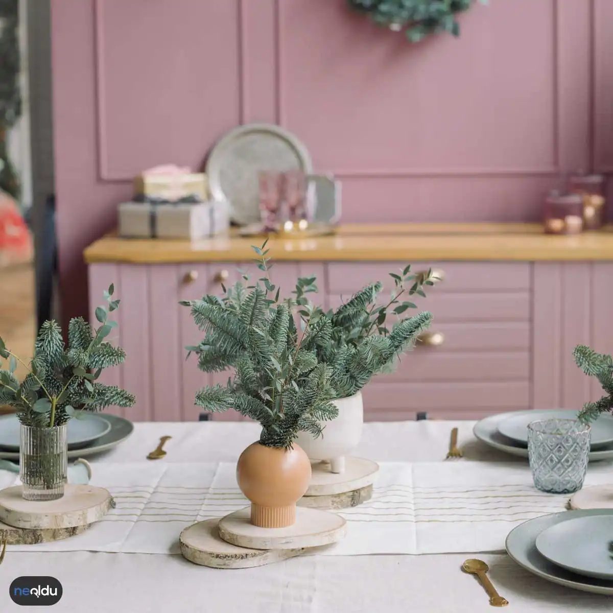
Take pink. Most people dismiss it as a bedroom trend for toddlers. They’re wrong. Pink isn’t just for little girls. It’s sophisticated. It’s warm. It brings a level of elegance that neutral tones simply cannot touch. When done right, pink transforms a space. It stops being a background color and starts being a statement.
The Psychology of Pink in Interior Design
Why does pink work so well in homes? It’s not magic. It’s biology.
Pink sits between red and white. Red is intense. It raises your heart rate. White is sterile. It feels cold. Pink combines the energy of red with the cleanliness of white. The result is calming. It’s soothing. It reduces stress.
“Pink is not just a color; it’s a feeling of safety and warmth.”
In interior design, this psychological effect is powerful. A room painted in soft pink feels larger. It feels more inviting. It encourages conversation. It creates a sanctuary.
Why Choose Pink for Your Home?
You might wonder why you should risk a color that dominates your visual field. The answer lies in versatility.
Pink is not monochromatic. It spans a wide spectrum. You can go deep and moody. Or light and airy. Here is how different shades function in your space:
- Blush Pink: Soft. Delicate. Works well in bedrooms and bathrooms. It pairs easily with white trim and wood floors.
- Dusty Rose: Muted. Sophisticated. Less trendy, more timeless. Great for living rooms and hallways.
- Hot Pink: Bold. Energetic. Use sparingly. An accent wall. A single chair. Never four walls.
- Millennial Pink: The bridge between gray and pink. Perfect for modern, minimalist homes. It adds warmth without overwhelming the eye.
Where to Start: The Psychology of Application
You don’t need to repaint the whole house. Start small.
Consider the function of the room. Kitchens benefit from pink’s appetite-stimulating properties. A pink backsplash or a set of canisters can add personality without clutter. Bedrooms demand calm. Blush walls promote relaxation. Bathrooms feel like spas with rose-gold fixtures and pale pink tiles.
The key is balance. Too much pink can feel overwhelming. Too little, and it disappears. You need contrast.
Pair pink with:
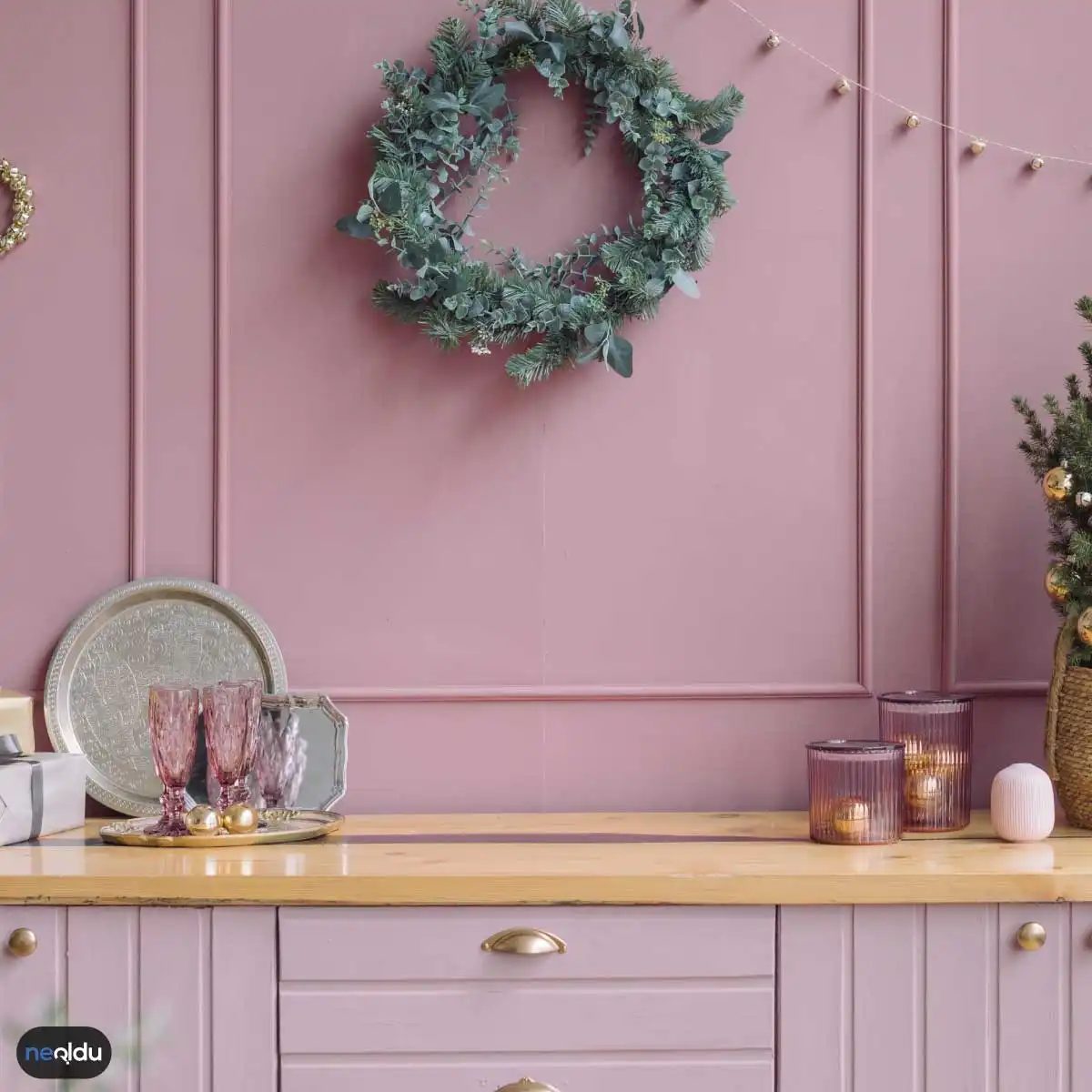
1. Greens: Nature loves pink. Eucalyptus leaves against pink walls look stunning.
2. Grays: Cool tones ground the warmth of pink.
3. Gold: Adds luxury. Think brass lamps or gold-framed mirrors.
4. White: Keeps the space fresh and bright.
This isn’t about following trends. It’s about creating a space that feels like you. If you
Minimalizm, az çok demektir. Ancak bu “az” kavramı, soğuk veya steril bir his yaratmak zorunda değildir. Ev dekorasyonunda minimalist yaklaşımı benimserken renk seçimi, mekanın ruhunu belirleyen en kritik faktörlerden biridir. Özellikle pembe renk, son yıllarda bu sadeleşme trendinde önemli bir rol oynuyor. Sadece bir renk değil, atmosferi değiştiren bir araç.
Pembe, geleneksel olarak feminenlik ve naziklikle özdeşleştirilse de modern yaklaşımda çok daha geniş bir yelpazeye sahip. Renk uzmanları, soluk ve pastel tonların stresi azalttığını, zihni rahatlattığını belirtiyor. Bu psikolojik etki, mekanın işlevine göre stratejik kullanılmayı gerektirir.
Neden Pembe ve Hangi Tonlar?
Pembe tonlarının sakinleştirici etkisi, özellikle yatak odası veya oturma odaları gibi dinlenme alanlarında belirginleşir. Yumuşak pembe tonları, gürültülü bir günün ardından zihni sakinleştirmeye yardımcı olur. Ancak her pembe aynı değildir.
- Soluk Pembe: Stresi azaltır, zihni rahatlatır.
- Pastel Pembe: Huzur ve dinginlik hissi yaratır.
- Canlı Pembe: Dikkat çeker, enerji verir; ancak az miktarda kullanılmalıdır.
Aşırı kullanım, mekanı aşırı duygusal veya çocuklu bir hale getirebilir. Bu nedenle, minimalist bir yaklaşımla pembe kullanırken dengeyi korumak şarttır.
Minimalist Pembe Dekorasyon İpuçları
Minimalizmde anahtar kelime “odak noktası”dır. Pembe aksesuarlar, bu odağı oluşturmak için mükemmel bir araçtır. Duvarları tamamen pembe boyamak yerine, küçük dokunuşlarla renk katmak daha sofistike bir görünüm sağlar.
Aksesuarlarla Renk Ekleme:
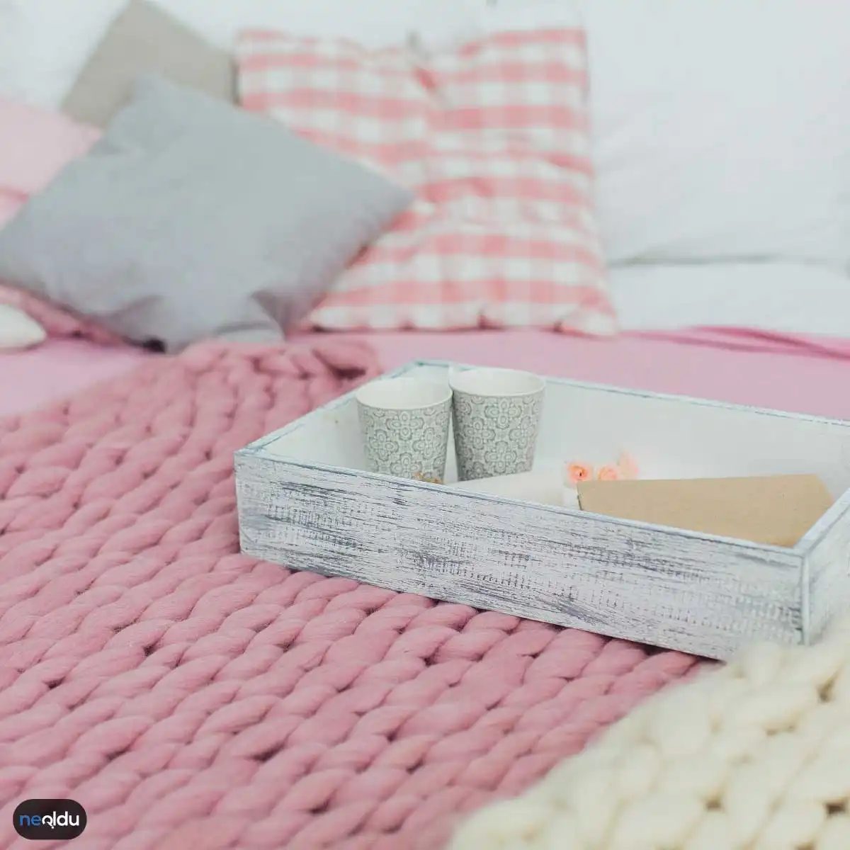
– Yastıklar ve Tekstiller: Yatak odasındaki nevresim takımlarına veya oturma odasındaki kanepe yastıklarına pembe tonlu dokunuşlar ekleyin.
– Duvar Kağıtları: Tek bir duvarda, özellikle yatak başı duvarında, hafif pembe tonlarında duvar kağıdı kullanmak derinlik katar.
– Bitkiler ve Vazolar: Beyaz veya doğaüstü renkli vazoların içine pembe çiçekler, veya pembe saksılarla yeşillik kombinasyonları, mekanın sıcaklığını artırır.
Bu küçük detaylar, mekanın ruhunu değiştirirken minimalist estetiği korur. Renk, sadece görünüm değil, duygu yönetimi aracıdır.
Çiftler ve Aileler İçin Pembe
Pembe, romantizm ve sevgiyle de ilişkilendirilir. Yatak odasında çiftlerin birlikte vakit geçirdiği alanlarda, hafif pembe
Navigating Pink in Minimalist Spaces
It sounds contradictory. Minimalism demands restraint. Pink demands attention. Yet, getting this combination right is less about fighting the style and more about curating it. You aren’t trying to turn your home into a nursery. You are looking for sophistication. The key lies in treating pink not as a wall color, but as an accent.
Think of it as a pressure valve for monotony. When your space is dominated by whites, grays, and raw wood tones, a single pink element doesn’t clutter the visual field. It draws the eye. It breaks the sterility. But only if you pick the right shade.
Choosing the Right Undertone
Not all pinks work in a minimalist context. Hot pink? Too aggressive. It fights for dominance. It breaks the calm you are trying to cultivate. Instead, lean toward the softer end of the spectrum.
- Blush Pink: Subtle. Elegant. It reads as almost neutral until you look closer.
- Dusty Rose: Adds depth without shouting. It has a bit of gray in it, which helps it blend with cool tones.
- Peach Pink: Warmer. Better for creating a cozy atmosphere in bedrooms or living areas.
Avoid anything with high saturation. These colors demand too much energy from a room designed for peace. You want the pink to whisper, not scream.
The Neutral Foundation
You cannot place a pink vase on a rainbow rug and call it minimalism. The foundation must be solid. Neutral tones act as the canvas. Without them, the pink becomes chaotic.
- White: Crisp. Clean. It makes pink pop but keeps it airy.
- Beige: Adds warmth. Softens the contrast between white and pink.
- Gray: Modern. Industrial. It grounds the softness of pink with a bit of edge.
- Light Wood: Oak, ash, or maple. The grain adds texture without adding color noise.
This palette ensures the space feels open. It feels breathable. The pink accessories become the focal points, not the background noise.
Where to Place Your Accents
Start small. Big furniture pieces in pink can overwhelm a minimalist aesthetic quickly. A pink sofa is a commitment. A pink throw pillow is an experiment.
Textiles are your safest bet.
* Throw Pillows: Swap out black or gray pillows for blush ones. Instant refresh.
* Throws: A dusty rose blanket draped over a gray sofa adds texture and color.
* Curtains: Sheer pink curtains can diffuse light beautifully, creating a soft glow.
Decorative Objects.
* Vases: A ceramic vase in a matte finish. Glazed ceramic can be too shiny for some minimalist tastes.
* Art Prints: Look for abstract art that incorporates pink. It adds height to the room without taking up floor space.
* Small Sculptures: Geometric shapes in pink metal or ceramic. They act as quiet anchors in a corner.
The Workspace Twist
A home office often suffers from being too sterile. White walls. Black chair. Cold efficiency. Pink can change that dynamic.
Try a pink desk organizer. Not a neon plastic bin. Think matte finish. Or a pink notebook. These small touches provide a
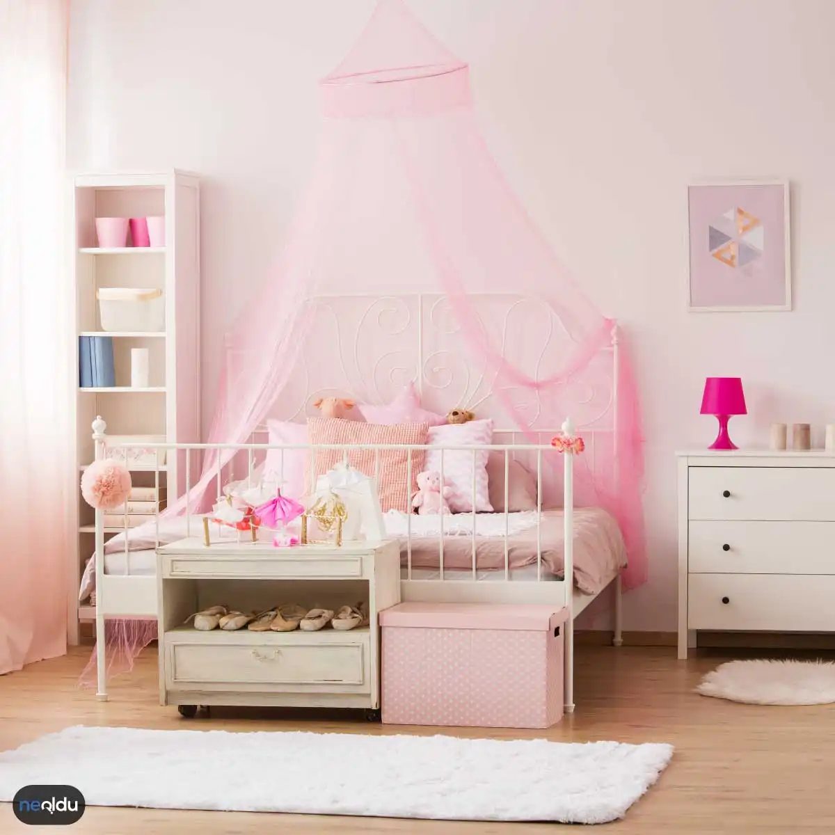
Çocuğunuzun kendi küçük dünyasında güvende hissetmesi, gelişimi için şart. Pembe tonları, özellikle kız çocukları için popüler bir tercih. Ama doğru uygulandığında sadece “sevimli” değil, canlı ve motive edici bir ortam yaratır. İşe temellerden başlamak lazım.
Pembe Duvarlar ve Yüzeyler
Duvarları sıfırdan boyamak en kesin çözüm. Ancak her duvarı pembe yapmanıza gerek yok. Tek bir aksan duvarı, odanın derinliğini artırır. Boya seçerken mat veya satin bitişler, pratik işler.
Eğer boyama işlemleriyle uğraşmak istemiyorsanız, duvar kağıdı veya çıkartmalar devreye giriyor. Desenli kağıtlar, düz boyaya göre daha az dikkat çeker ama dokuyu değiştirir. Özellikle çocuk odalarında, kolay temizlenebilir malzemeler seçmek uzun vadede işinizi kolaylaştırır.
“Pembe bir duvar kağıdı, odanın enerjisini anında yükseltirken, temizlik açısından boyadan daha az maliyetli olabilir.”
Mobilya Seçiminde Denge
Pembe mobilyalar, odayı tamamlayan parçalar. Yatak başlığı, gardırop veya çalışma masası… Her biri odanın karakterini belirliyor. Ama burada dikkat etmeniz gereken bir nokta var: Denge.
Sadece pembe kullanırsanız, göz yorucu bir görüntüyle karşılaşabilirsiniz. Beyaz, açık gri veya ahşap tonlarıyla pembe mobilyaları dengeleyin. Bu, odanın ferah kalmasını sağlar. Örneğin, pembe bir yatak çekmezesine, beyaz bir çerçeveli ayna veya ahşap bir masa ile destek vermek, harmoniyi korur.
Aksesuarlarla Hızlı Dokunuşlar
Büyük harcamalar yapmadan odanın havasını değiştirmek istiyorsanız, aksesuarlara odaklanın. Yastıklar, perdeler, lambalar… Bu küçük detaylar, bütçenizi korurken dekoratif etkiyi artırır.
- Yastıklar: Farklı dokularda pembe yastıklar, yatağa sıcaklık katar.
- Perdeler: Işığı filtreleyen, nefes alan kumaşlar seçin.
- Lambalar: Yumuşak ışık veren, pembe detaylı lambalar, akşam atmosferini değiştirir.
Bu parçalar, odanın genel temasıyla uyumlu olmalı. Aşırı karmaşa yaratmamaya dikkat edin. Her aksesuar, odanın bütünlüğüne katkı sağlamalı.
Duvar Sanatı ve Görsel Odak Noktaları
Çocuğunuzun hayal gücünü tetikleyen duvar sanatı, odanın ruhunu yansıtır. Pembe temalı resimler, duvar çıkartmaları veya hatta çocuklarınızın kendi çizimleri, duvarları doldurur.
Bu görseller, sadece dekoratif değil
Tuning the Mood with Pink Light
Lighting dictates the soul of a room. You pick bulbs, hang fixtures, and suddenly the space feels different. Pink lighting is a specific tool for this. It adds depth. It adds character. And it directly influences your mood. Think of pink not just as a color but as a filter for emotion. It brings calm. It brings romance. It brings peace.
You can achieve this with simple swaps. Change your bulbs. Use pink-hued lamps. Add candle holders with pink glass. The result is soft. Warm. The kind of light that wraps around you.
This matters most in places designed for rest. The bedroom. The living room. Soft pink tones lower stress. They help you unwind. Try using pink light before bed. It can ease the transition into sleep. You might find yourself drifting off faster. The experience feels deeper. More restorative.
Setting the Scene for Romance
Evening changes the game. Pink lighting works best when it’s subtle. Think table lamps. Think candles. Pink candlesticks on a dinner table create an immediate shift. The light spreads. It’s romantic. It’s intimate.
Use it for dinners. Use it for quiet nights in. This type of lighting adds affection. It adds warmth. It turns ordinary moments into memories. You’re not just illuminating the space. You’re curating an atmosphere.
Balancing Intensity
Here is where DIYers often slip up. Intensity matters. Pink creates a cozy vibe. But too much can make a room feel heavy. It can look dull. Avoid overdoing it.
Check your lighting levels. Adjust the brightness. Match the pink light to the room’s overall plan. It shouldn’t fight with other lights. It should complement them. Find the right level. Then step back. See how it feels.
Which Rooms Fit Pink Best?
Pink isn’t just for one space. It works everywhere if used correctly.
In bedrooms, it sets a romantic tone. In living rooms, it adds warmth. Kitchens get a boost of energy. Children’s rooms become playful. The versatility is high. You just need to pick the right shade.
Mixing Colors Without Clashing
What goes with pink? White. Gray. Beige. Gold. Mint green. These neutrals and pastels balance the pink. They keep the look chic. They prevent it from feeling overwhelming.
Try pairing pink pillows with a gray sofa. Add gold frames to pink walls. The contrast creates structure. It looks intentional. Not accidental.
Accessories That Anchor the Look
You don’t need to repaint everything. Accessories do the heavy lifting.
- Pink cushions on neutral furniture.
- Curtains in soft rose tones.
- Rugs with pink patterns.
- Wall art with pink accents.
- Vases in pastel shades.
- Candles in pink holders.
These items add pops of color. They tie the room together. They make the space feel complete.
Walls and Furniture: Making a Statement
Pink walls add life. They add character. You can paint all four walls. Or just one accent wall. An accent wall draws the eye. It becomes a focal point. It changes the room’s energy.
Furniture works the same way. A pink armchair stands out. A pink coffee table grounds the space. Use them as statement pieces. Pair them with neutral surroundings. The result is sophisticated. Elegant.
Who Is Pink For?
Pink isn’t gender-specific. It’s for anyone. Anyone can use it. Anyone can enjoy it. Rooms designed with pink tones often feel welcoming. They feel warm. They feel inviting.
Forget the stereotypes. Pink is a color. It’s a tool. Use it to create the atmosphere you want. Not the one society expects.
Start small. Try a lamp. Add a candle. See how it changes the room. The effect is immediate. The choice is yours.